The interface for typing and sending messages in a chat app has been on my mind lately given Google’s addition of Magic Compose (too crowded) and the redesign Apple is doing in iOS 17 (too simple).
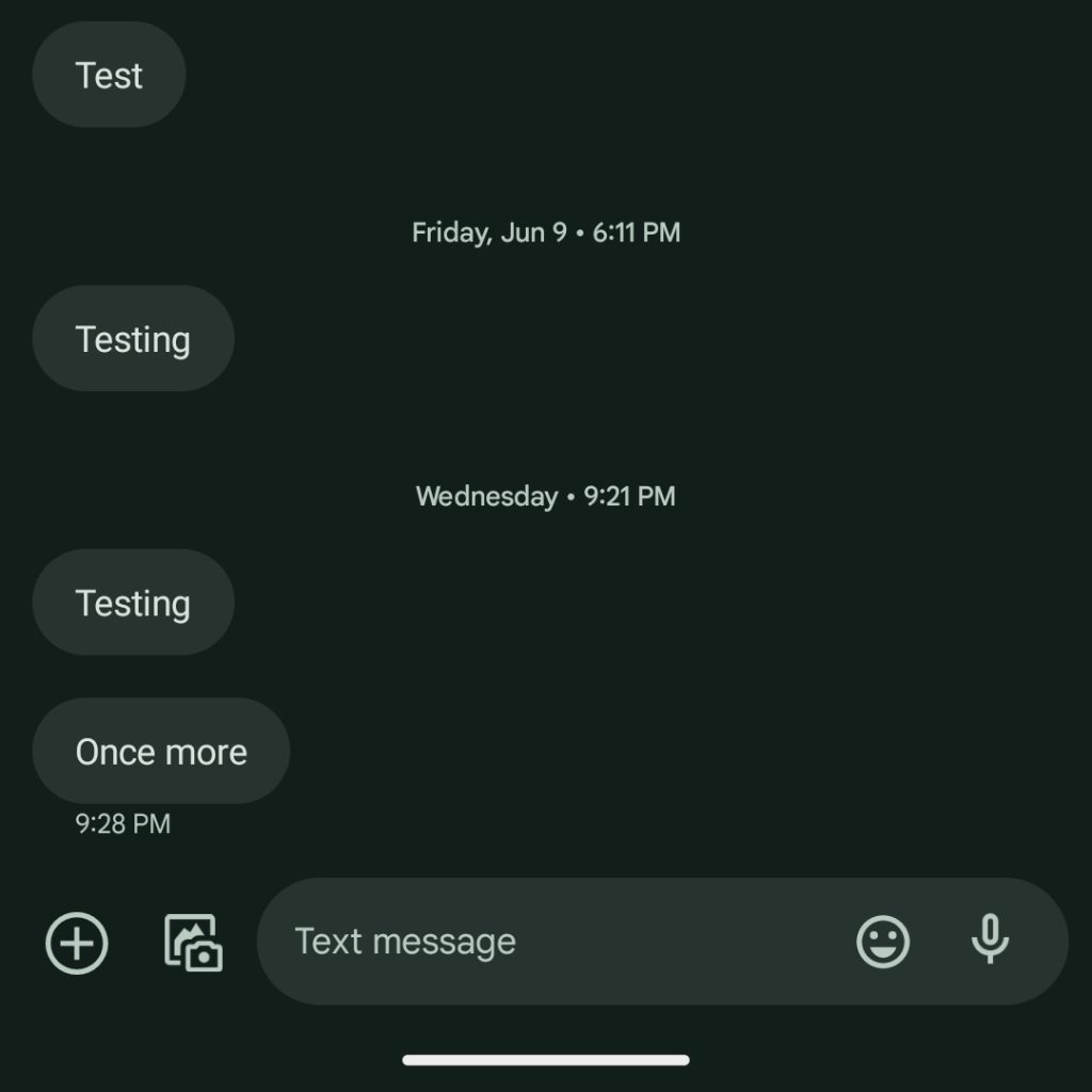
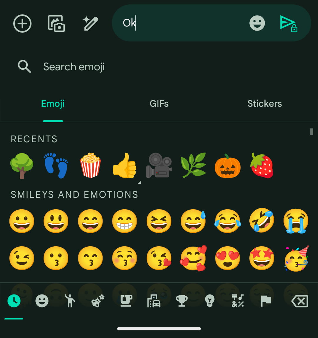
The “Text message” field at the bottom of an SMS/MMS conversation in Google’s app contains a smiley face that opens an Emoji, GIFs, and Stickers picker, as well as a microphone icon that you hold down on to record an audio message.
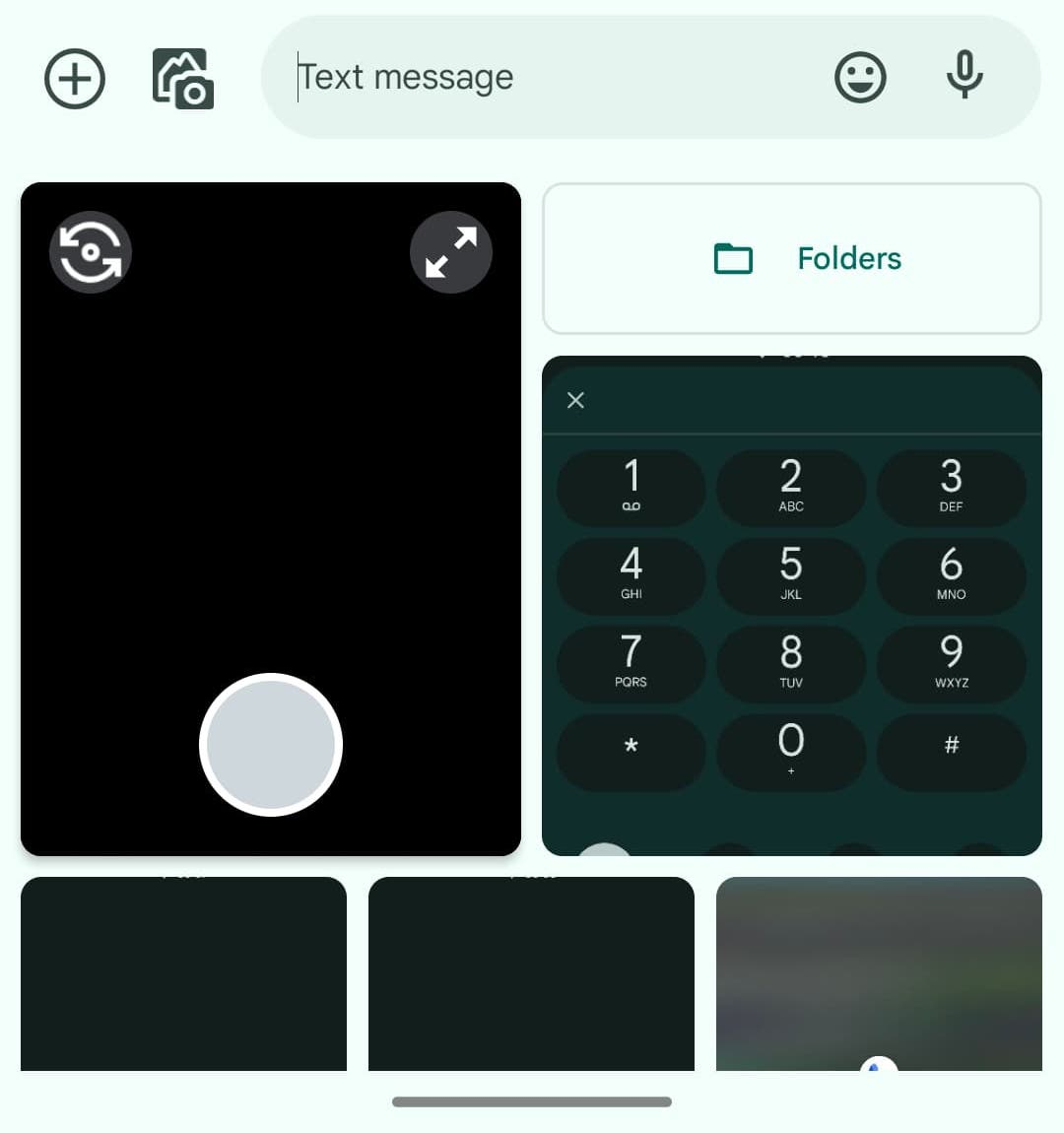
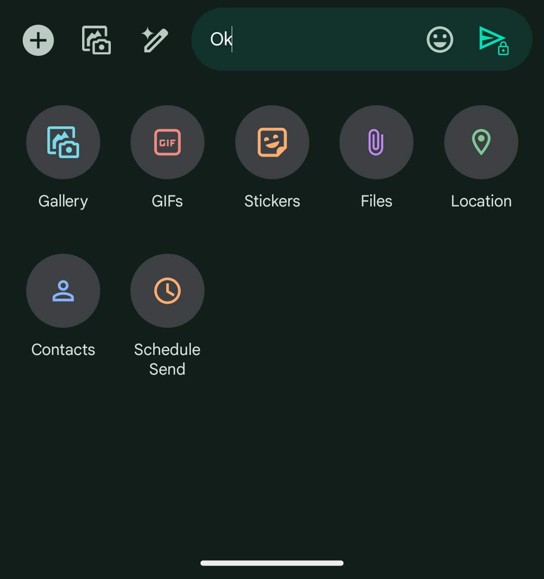
Next to the field is a plus button that opens a grid for things you can send: Gallery, GIFs, Stickers, Files, Location, Contacts, and Schedule Send. Lastly, there’s a dedicated Gallery button that lets you quickly browse recent photos and quickly take a shot.
I’d say this Google Messages UI is fine, but the upcoming addition of Magic Compose to the right of the gallery makes it too crowded. The Messages icon with a sparkle to analyze past messages and generate a reply or the pencil with a sparkle once you enter a message that you want to spruce up overcrowds things.
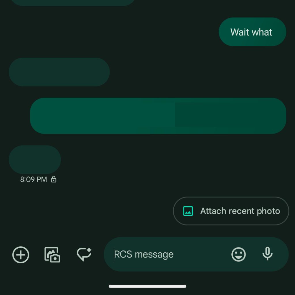
Before Google started widely rolling out the beta, Magic Compose appeared to the left of the smiley icon in the text field. That looked less crowded to me and kept the length of that pill unchanged.

It’s not as simple as removing an icon as each action is critical to some group of users, but some make for better candidates than others:
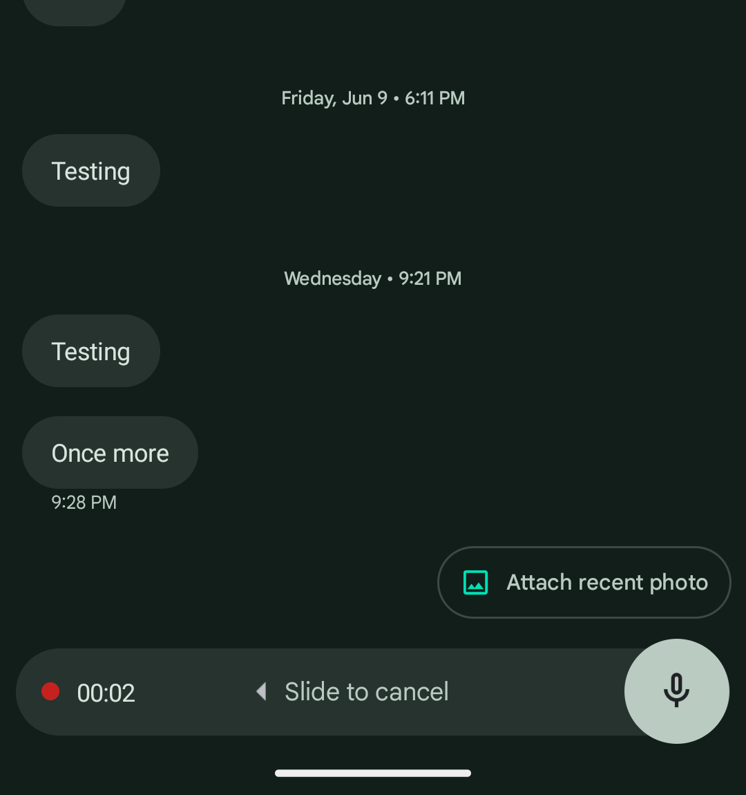
- Sending voice messages is very important for some people. So much so that Google Messages is planning a big redesign that gives it a more dedicated full pane interface where you don’t have to hold down the button as we enabled here. It looks very nice and hopefully launches soon.
- The dedicated gallery cannot be removed as sending images is an absolutely critical shortcut and was recently redesigned.
- While people have other ways to access it on their keyboard, the smiley shortcut to Emoji/GIFs/Stickers presumably sees very high usage, though I’d argue this is what could be removed to make way for Magic Compose. In the case of Gboard, there’s a similar button to the left of the space bar or the ability to place a shortcut in the suggestions toolbar.
- The ‘plus’ button is something I don’t personally use, but it’s the best way for Messages to surface all the things you can send. It’s a necessary educational UI, though Google could supercharge the gallery into a general media section for Files, Location, and Contacts where picking photos is still the primary focus.
Top comment by Jason Baker
They made the already small and crammed typing area even more of a pain to type in. It has a max 4 line height before it forces you to tediously scroll. It also doesn't expand. It is the only thing I hate about Google Messages. Wish they would make it a better typing experience.
One interesting comparison is the upcoming iOS 17 redesign for iMessage. The current Messages UI in iOS 16 features the text field with a voice dictation icon at the right, while you launch the camera from the left and can open a row of iMessage apps next to it. This brings up key actions like browsing your Photos Gallery, sending Audio Messages, Memoji, Stickers, and many other third-party expressing features.
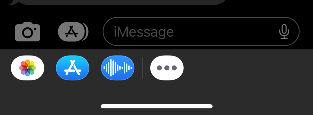
People do not like that the gallery is hidden there, but I’d argue it’s a pretty compact UI. Unfortunately, it would not work on Android because Gboard’s suggestions strip would conflict and result in two carousels, one on top of another, for another crowded UI.
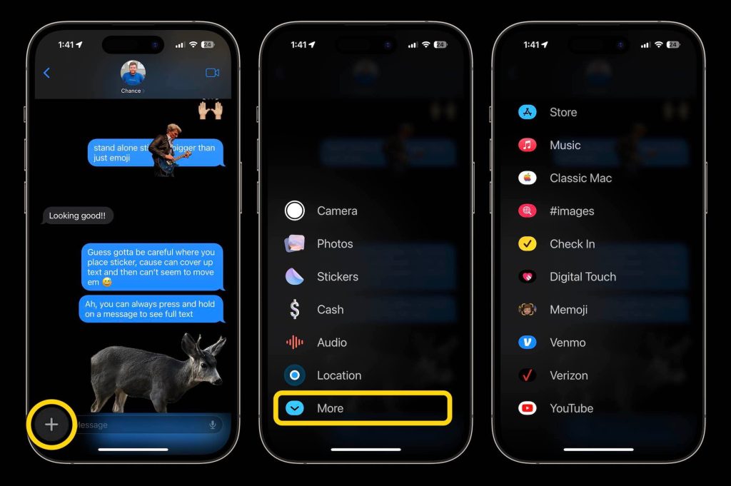
With iOS 17, Apple is getting rid of the camera and apps icon for a single ‘plus’ sign that opens a scrollable fullscreen UI. First-party actions appear first in the list: Camera, Photos, Stickers, Cash, Audio, and Location. Swiping brings up third-party actions with this interface seemingly horrible from a reach and one-handed usability standpoint.
Designing the UI for such a major default app is not an easy task by any stretch of the imagination. Apple is going very minimalist and takes too many steps to access core functionality, while Google Messages is a bit more utilitarian and suffers from being too visually crowded.
FTC: We use income earning auto affiliate links. More.
Comments