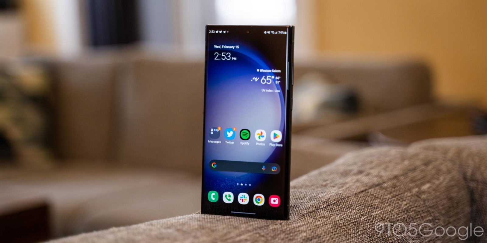
Samsung is pretty widely rolling out its Android 14 update over the past week, but there’s a slight chance you should wait to actually install it, as it seems Samsung has left out a method that prevents burn-in from the status bar.
Burn-in on smartphone displays was once a major problem, with a few years on the same smartphone often resulting in display elements showing up nearly constantly on the screen. A common trick to prevent this is to slightly shift UI elements so they never stay in the same place too long. It’s nearly invisible to the user, but goes a very long way in preventing burn-in.
In One UI 6 (Android 14), though, it seems Samsung might have left this out.
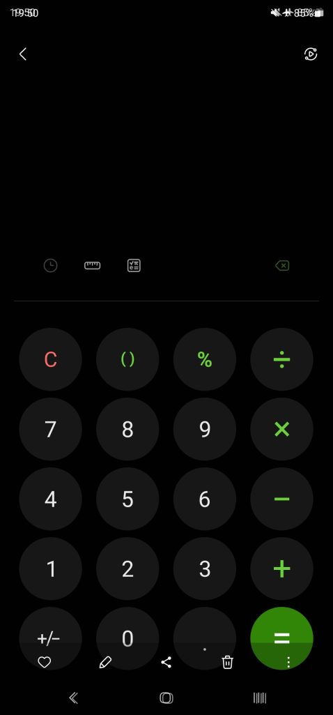
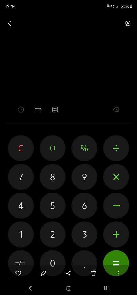
Users on Reddit noticed that the status bar elements (time, battery, etc) no longer seem to shift over time. This was spotted by comparing screenshots over time, with the status bar elements perfectly aligning. Back in One UI 5 (Android 13), comparing screenshots over time showed that the elements would move a fair bit, resulting in an almost blurred effect when stacking screenshots on top of each other as seen below.
Notably, the navigation bar buttons still move, so Samsung doesn’t seem to have given up on this method entirely.
As for what exactly is going on here, it’s really hard to say. It’s entirely possible that Samsung has just adjusted screenshots to where they compensate for status bar elements moving, or that the company is using a new method for preventing burn-in. It’s also noteworthy that the comparison is made on two different devices – a Galaxy S23 Ultra on One UI 6 and a Galaxy Note 20 Ultra on One UI 5.
In any case, it’s at least a little worrying, and we’ll be curious to see if things change with further updates.


More on Samsung:
- Samsung Galaxy S24 Ultra leaks with a thicker-looking design, flat screen [Gallery]
- Samsung posts a new Android 14 update schedule for over 50 Galaxy devices
- Galaxy Watch 6 gets November 2023 update with these changes
FTC: We use income earning auto affiliate links. More.


Comments