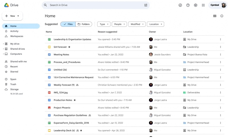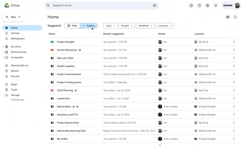
Back in May, Google Drive started testing a new default homepage on the web that automatically suggests files, as well as folders, and it’s now rolling out.
Google Drive’s new “Home” view provides “personalized file and folder suggestions” using “machine learning algorithms” and signals like what you’ve recently opened, shared, and edited, as well as “what documents are attached to upcoming Calendar events.”
You get a high-level “Files” and “Folders” switcher in the toolbar in addition to filters for Type, People, Modified, and Location. Google also touts a “more modern design inline with Google Material Design 3 guidelines that helps you navigate across Drive much more efficiently.”
The goal is to “help you get started quickly.” Notably, going to drive.google.com will open this new Home view by default as your “start page,” but you can set “My Drive” to be your homepage again. A banner explains this when Home is available for your account, while you can change it whenever from Settings.

This is rolling out to “all Google Workspace customers and users with personal Google Accounts” starting today and continuing into January. This follows a new homepage on the Android and iOS mobile apps that’s more compacted with a similar “Suggested” view.
More on Google Drive:
- Google Drive for iPhone adds built-in document scanner
- Google investigating missing files on Drive, caused by desktop app
- Drive on Android tablets now looks even more like the website
- Google Drive adding new ‘Activity’ feed for comments, requests
FTC: We use income earning auto affiliate links. More.


Comments