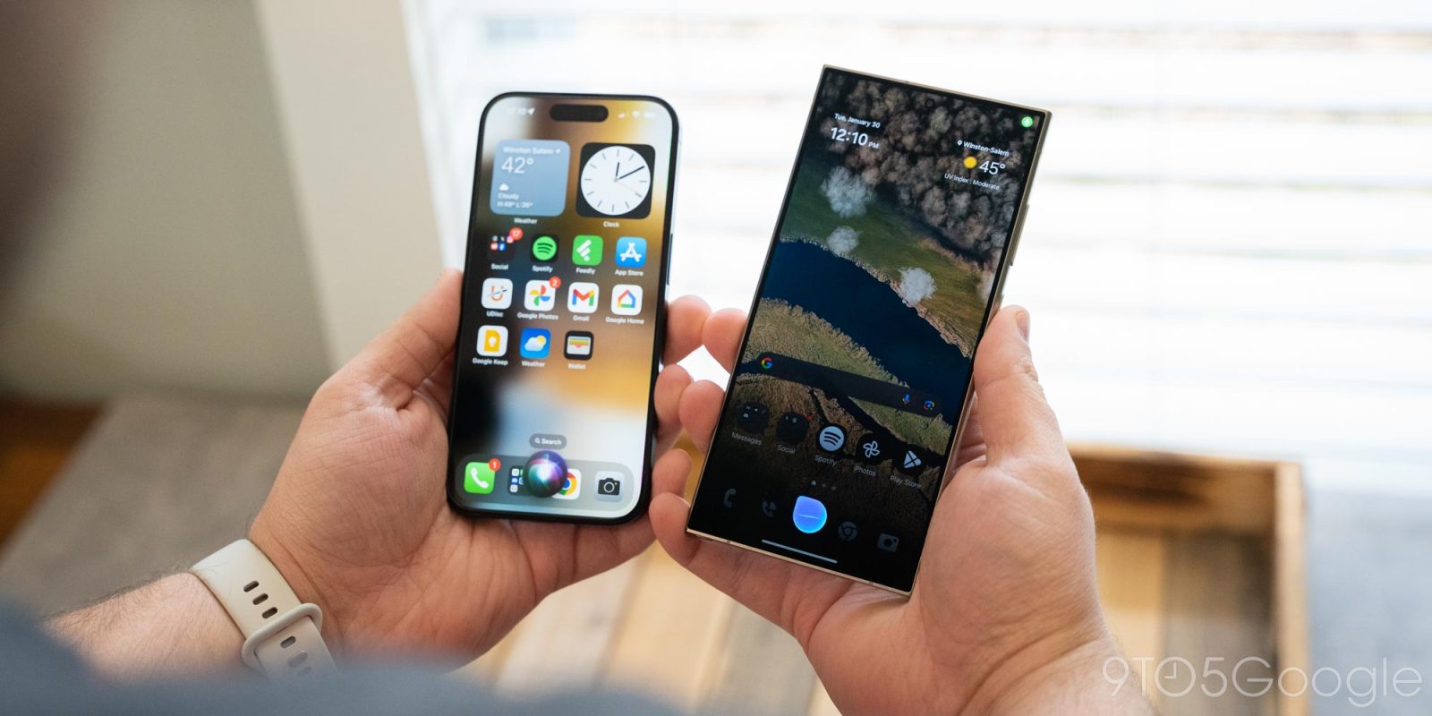
Samsung’s Bixby doesn’t get much attention as a voice assistant, but despite the arrival of new AI features, Samsung isn’t giving up on it yet. And, now, the company is also widely rolling out a big redesign to Bixby that, well, makes it look a whole lot like Siri.
Bixby has been a part of Samsung’s smartphones since 2018, and in recent years has doubled down on supporting the use case of adjusting local settings or automating tasks more so than acting like Google Assistant or Siri. For a while, Bixby’s UI has been a floating UI over the rest of Android with a blue bar used to note when Bixby is listening, as we pictured earlier this month.
Now, though, Bixby shows up in an interface that’s virtually identical to Apple’s Siri.
Like Siri on the iPhone, summoning Bixby by long-pressing the power button shows a floating blue circle until you start speaking, at which point a rectangular box appears with Bixby’s response. The response UI is different from Apple’s, but the listening design is clearly inspired by Siri. Notably, Samsung will still support text input, with a text box appearing after a couple of seconds of silence.
You can see the new design in action below.
The change was first spotted earlier this month but now appears to be more widely rolling out. The revamp appears to arrive with Bixby v3.3.53.16.
This does appear to only be a visual change. Ahead of the Galaxy S24’s launch, Samsung noted in a briefing with members of the media that no functional changes had been made to Bixby amid the arrival of Galaxy AI features.
More on Samsung:
- Here are all of Samsung’s new Galaxy AI features [Gallery]
- Samsung’s next major update, One UI 6.1, is coming to these Galaxy devices
- Samsung’s Android gesture navigation and the ability to hide gesture bar aren’t dead yet
Follow Ben: Twitter/X, Threads, Bluesky, and Instagram
FTC: We use income earning auto affiliate links. More.


Comments