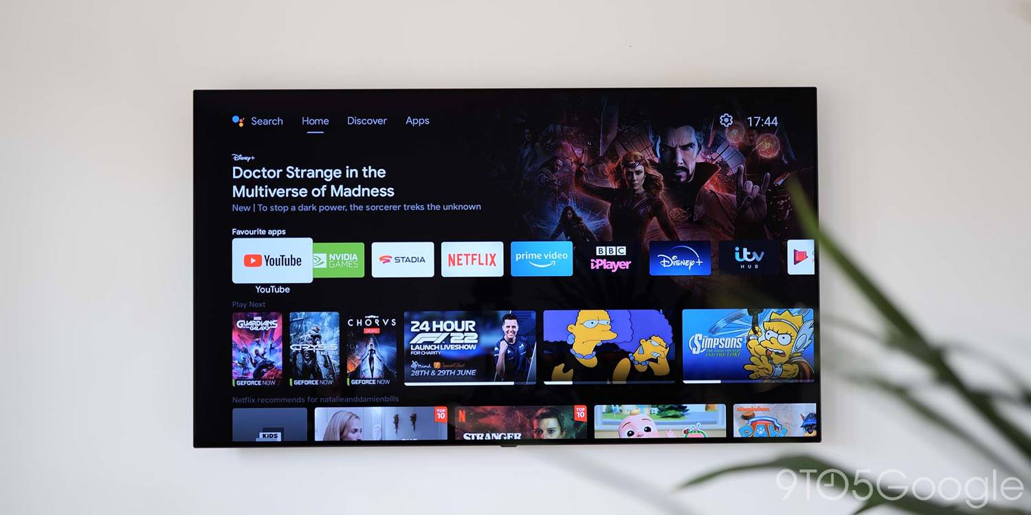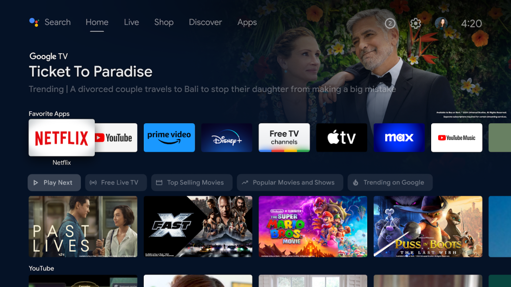
Android TV has been replaced, but it’s apparently still getting new, unique features of its own. Why?
This issue of 9to5Google Weekender is a part of 9to5Google’s rebooted newsletter that highlights the biggest Google stories with added commentary and other tidbits. Sign up here to get it delivered to your inbox early!
Google TV debuted in 2020 as the next step for “Android TV OS,” at least in a consumer-facing fashion. As of 2023, Android TV was effectively dead as new devices were launching almost exclusively with the Google TV experience. Still, Google kept its word and expanded several of Google TV’s most compelling features, such as free live TV, back to Android TV.
But, this week, something odd happened.
Google announced that Android TV’s homescreen would get a new “Quick Access” feature. This row houses filters for the main row of Android TV’s homescreen. It defaults to the current “Play Next,” but also shows content that’s trending when you switch the filter setting.

What’s strange about that is that there’s no feature on Google TV that’s quite the same. Google TV’s homescreen shows trending content, sure, but there’s no way to filter that down, and through various other rows on the Android TV homescreen, virtually all of this content was already accessible, so it’s quite bizarre that Google would develop what is essentially a brand new feature that’s only on Android TV.
In 2020, Google said that Google TV would replace Android TV while the latter adopted some features from the new experience for existing hardware. So, while it’s great that Android TV users seem to be getting continued support, it’s extremely odd that this support is going beyond the bare minimum. To a certain extent, it signals that Google’s plans may have changed somewhat. Is Android TV going to stick around for longer than we thought? Previously, I would have said no, but I’m not so sure anymore.
This Week’s Top Stories
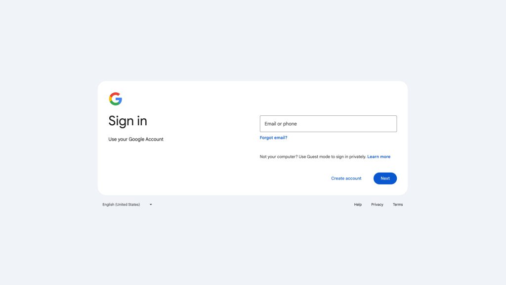
Google launches new account sign-in page
Rolling out now, Google is giving the sign-in page a new look. The updated design, while not a huge departure from what was already in place, brings the modern look that Google promised. The design is rolling out over the coming weeks, but you might still see an announcement banner in the meantime.

Samsung One UI 6.1 is going live for older devices next month
Samsung this week announced that One UI 6.1, the launch software from the Galaxy S24 series, will be expanding in March. The update will roll out to Galaxy S23, Galaxy Z Fold 5, Galaxy Z Flip 5, and Galaxy Tab S9 with a full suite of AI features. See below for more details:
- Samsung launches One UI 6.1 with AI for these Galaxy devices, rolling out in March
- Samsung is bringing these Galaxy AI features to older devices
- Circle to Search is coming to 2023 Galaxy devices – what about older Pixels?
More Top Stories
- No, Gmail is not ‘sunsetting’
- Review: The Galaxy S24+ is the only one I’d buy
- Androidify strikes back: Google now lets you create a custom Android ‘Bot’
- Google now sells an adorable Android ‘The Bot’ figurine, but it’s going to sell out fast
- Hands-on: How the new Android ‘Bot’ figure compares to older collectibles
- Google reportedly shipped a ‘milestone’ of 10 million Pixel phones in 2023
- Gboard rolling out ‘Scan Text’ OCR tool on Android
- GPay app and P2P payments will stop working in the US this June
- Galaxy Buds update brings live translation with AI and Android’s auto switching for calls
- ‘Last Week Tonight with John Oliver’ on YouTube will now be delayed
- Google Keep says lockscreen access for notes is ‘coming soon’
- Android prepares to only support Seamless Updates, but Samsung could still avoid it
- Pixel Fold 2 renders reveal bigger displays, inner bezels, ultra-thin design [Gallery]
From the rest of 9to5
9to5Mac: Here are the full dimensions of the new iPad Air and iPad Pro coming soon
9to5Toys: CRKD’s next-gen Nitro Deck+ with HDMI, new side kick buttons, and more…pre-order now
Electrek: Tesla ramps up Cybertruck production, large fleet spotted
ConnectTheWatts: Strava partners with Fi Smart Collar for pup-tivity tracking
FTC: We use income earning auto affiliate links. More.


Comments