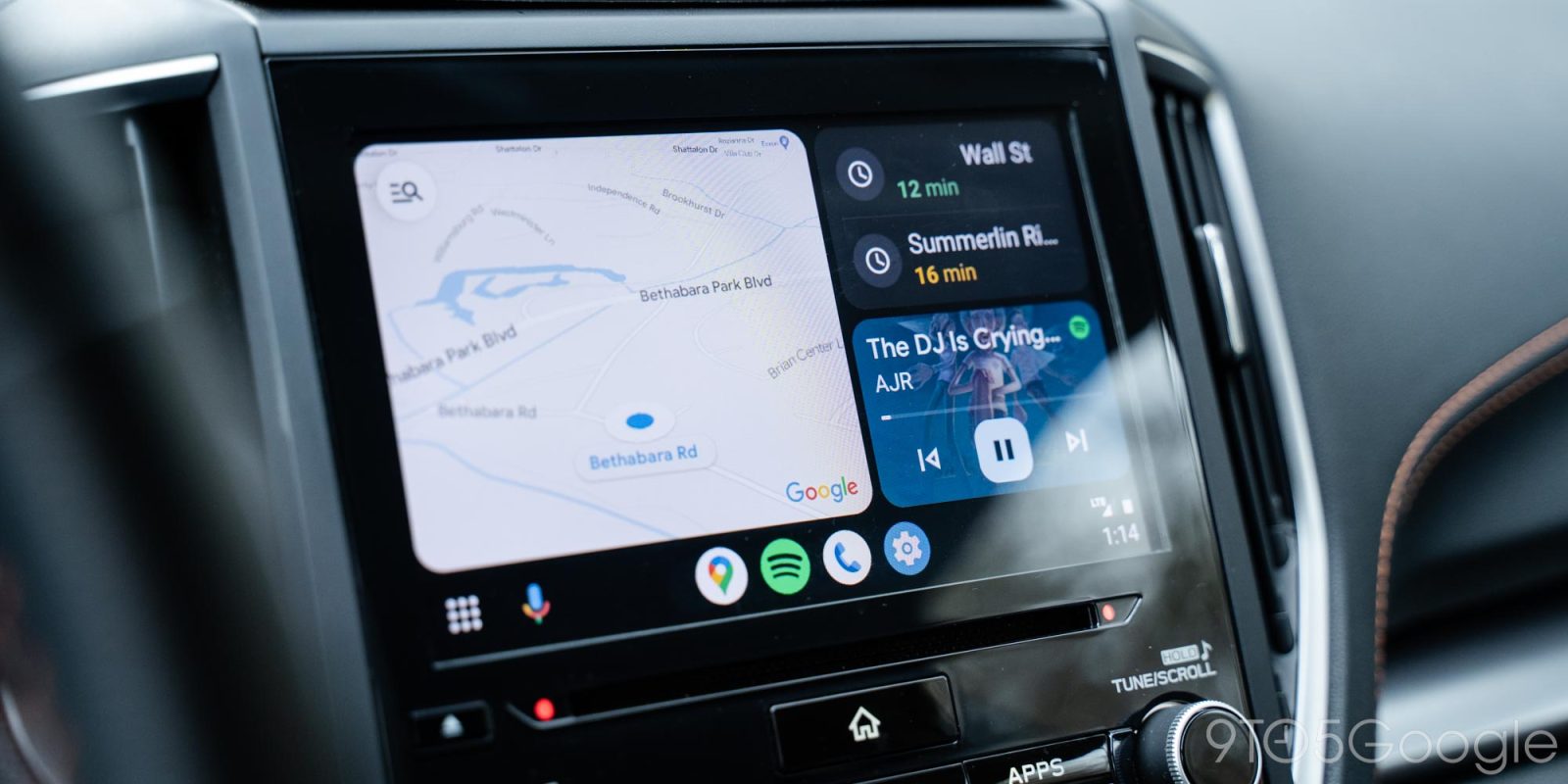
Android Auto is getting a tweak for Google Maps that shows the estimated drive time in the same bolder style as other platforms.
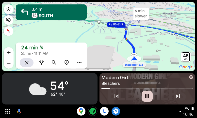
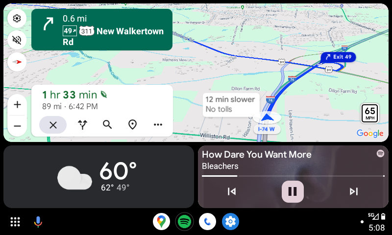
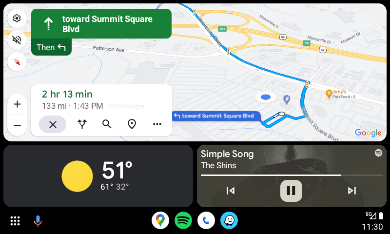
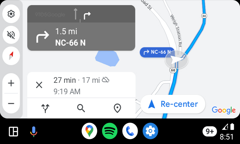
Google Maps has, for a while, shown the estimated drive time with the number in a bold font. But, for whatever reason, this wasn’t the case on Android Auto. Rather, Google Maps would show a constant font across the entire text.
This has changed with recent updates, though.
In the latest versions of Google Maps and Android Auto, we noticed that Google has started showing the bolder number alongside the thinner minutes and hour indicators. It’s a super subtle change, but it’s nice that Android Auto finally matches up with Google Maps elsewhere.
We noticed these changes with version 11.119.0100 of Google Maps and version 11.5 of Android Auto.
More on Android Auto:
- Android Auto AI message summaries are now available – here’s how it works
- Android Auto now shows apps that only work when parked
- Google explains how Android Auto AI message summaries work
Follow Ben: Twitter/X, Threads, Bluesky, and Instagram
FTC: We use income earning auto affiliate links. More.


Comments