Last October, Google boldly stated that the “Pixel 8 and Pixel 8 Pro are the most beautiful phones we’ve ever made.” An interview with Google’s director of Industrial Design, who made that proclamation, reveals some interesting details about the Pixel process.
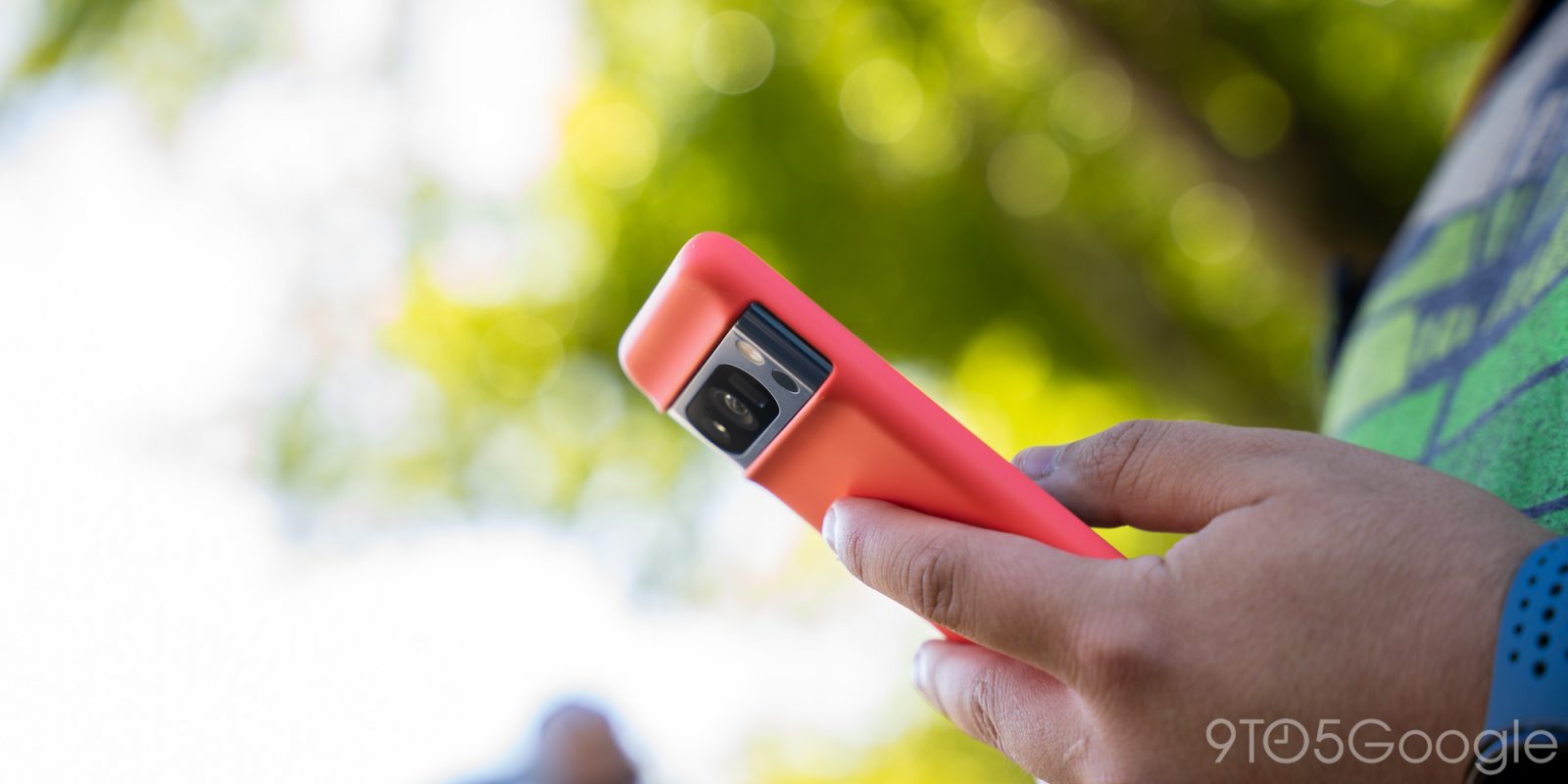
Inverse spoke with Claude Zellweger, Google’s director of Industrial Design, who shared that the team has “begun to design the product with the case together from the beginning” in acknowledgment of how “90 percent of people use cases.”
“So just like color is not an afterthought, cases cannot be an afterthought, because you have to design it as such that it looks great and feels great.”
This started with the Pixel 8 and presumably applies to the first-party cases, and maybe even guidance given to the Made for Google partner program.

Zellweger says that CEO Sundar Pichai “cares about having a really well thought-out and deeply integrated experience” and that he “loves design”:
“He actually has great insights. He will comment on color, ergonomics, on things like that.”
The bulk of this piece has to do with the Camera Bar, which is meant to highlight what the Pixel excels at. Zellweger splits Pixel design into three eras. The first three generations placed the camera arbitrarily “wherever the engineering could fit it because we didn’t have the deep engineering design integration that we have today.”
Top comment by Mason
They should design for the use case of not using a phone case - by not making the back slippery, fragile glass.
With the square on the Pixel 4 and 5, cameras “became one of the primary design elements.” We’re now in the “modern era” of the camera bar.
Finally, Inverse asked about where Pixel design is going in the future:
“…not jumping from one design to another every year is really important. Our customers actually want that continuity. They want progression — the visual progression needs to follow the technical progression underneath and not zigzag all over the place.”
Based on leaks, the Pixel 9 is a big departure save for the camera bar, which is presumably the continuity Google is referring to. As we noted in our Pixel 8a hands-on, it’s a shame that Google is leaving that comfy design language after really refining it.
You can read the full Inverse interview here.
More on Pixel:
- Google’s end goal for Pixel repair is not requiring special tools
- Pixel’s success might drive the final nail in Sony’s smartphone business
- How to maximize your Google Pixel battery life [Video]
- Google removes Pixel 5G country availability list
FTC: We use income earning auto affiliate links. More.


Comments