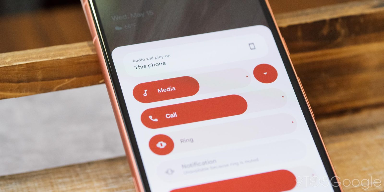
Google has redesigned the volume menu in Android 15 Beta 2 with new features and an improved look, too.
With the launch of Android 15 Beta 2, Google has redesigned the volume menu. This doesn’t affect the slider that appears when you press a volume key, but rather the overflow button that brings up a bigger menu with more options. Google first introduced that overflow menu in Android 10, and the design hasn’t changed a whole lot in the time since.
The new design, live by default in Android 15 Beta 2, adds a splash of Material You to the whole interface. The sliders are now big and vibrantly colored. Functionally, though, they still act the same.
New functionality here includes a shortcut for Live Caption at the bottom of the page and an audio output switcher. Android already supports switching the output via the media widget in Quick Settings, but this new means of access is always available. A slider for Cast volume is also present when the context demands it.
A button next to the “Media” slider allows you to condense the menu down, and the menu will remember what status you’ve picked the next time you open it.
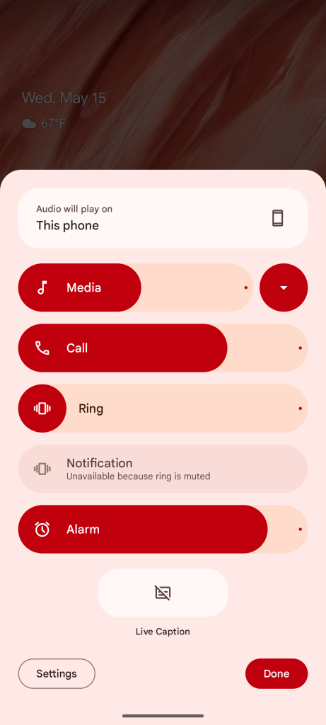
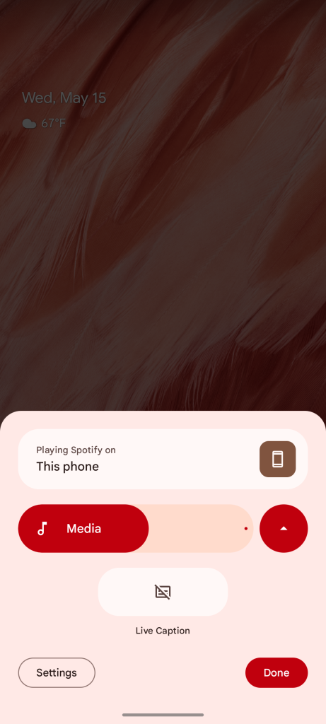
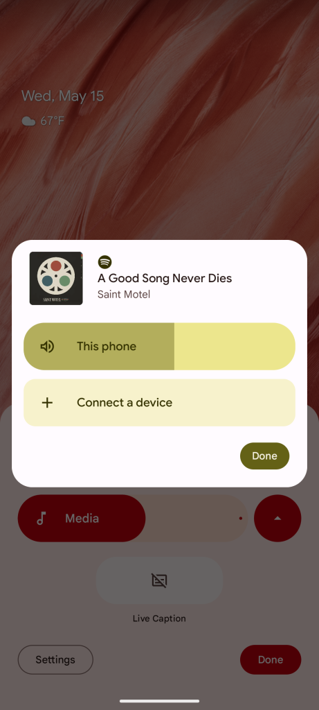
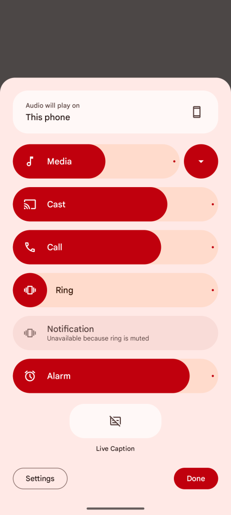
This new design showed up in April but, as usual with these new features, it wasn’t clear when exactly it would debut. The page has also been slightly updated since, adding the Live Caption shortcut mentioned earlier.
More on Android 15:
- Android 15 Beta 2 will now automatically turn Bluetooth back on ‘tomorrow morning’
- Here’s everything new in Android 15 Beta 2 [Gallery]
- How to install the Android 15 Beta on Google Pixel
Follow Ben: Twitter/X, Threads, Bluesky, and Instagram
FTC: We use income earning auto affiliate links. More.


Comments