With the launch of the Android 15 Beta 2 update at I/O 2024, Google has given us what could be the biggest beta update in around two years. Some changes are small; some are pretty big. Here’s everything you need to know.
Since Android 12, we haven’t really seen huge user-facing alterations with each platform release. You could easily pin this on the fact that Android is now so mature that functions are harder to integrate without feeling shoehorned into the system. Personally, I find this complaint quite strange as you can’t quite throw out the fundamentals each year – not that Google hasn’t tried before.
That said, to see so many changes in Android 15 Beta 2 is a refreshing change after the refinement process that has been ongoing since the Pixel 6 series launch. Here is what you need to know.
Table of contents
- Private Space
- Do not suggest app controls in app drawer
- New System UI icon
- Redesigned authentication panel
- Animation easing subtly improved across entire system
- Suggested widgets with categories
- Hearing devices QS tile
- Developer options changes
- Predictive back animations on by default
- Contrast options in Wallpaper & style
- New volume control redesign
- Privacy panel changes
- Bluetooth now automatically turns automatically
- What is your favorite Android 15 Beta 2 change?
Private Space
Private Space is one of those functions that might be great if you have to share a phone with someone and want to keep things completely separate or “safe” from prying eyes. In simple terms, it creates a separate area for Android applications you pick. Google equates it to a digital safe for “apps you don’t want others to access or see easily.” You can access those applications from the bottom of the app drawer after authenticating via fingerprint or a separate password/code.
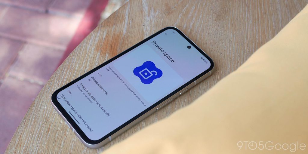
Think of this as a separate profile where you can set aside apps to live within while your Pixel is locked. You might be thinking that this is the same as a work profile, but no, this is more like a the Google Photos Locked Folder feature but for your wider system. Go to Settings > Security & privacy > Private space to set it up.
Do not suggest app controls in app drawer
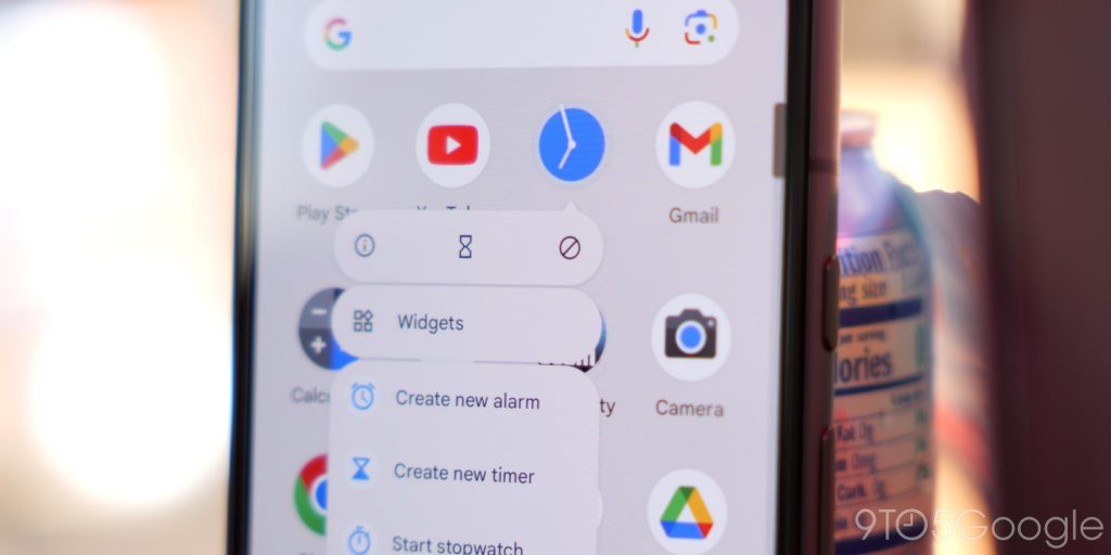
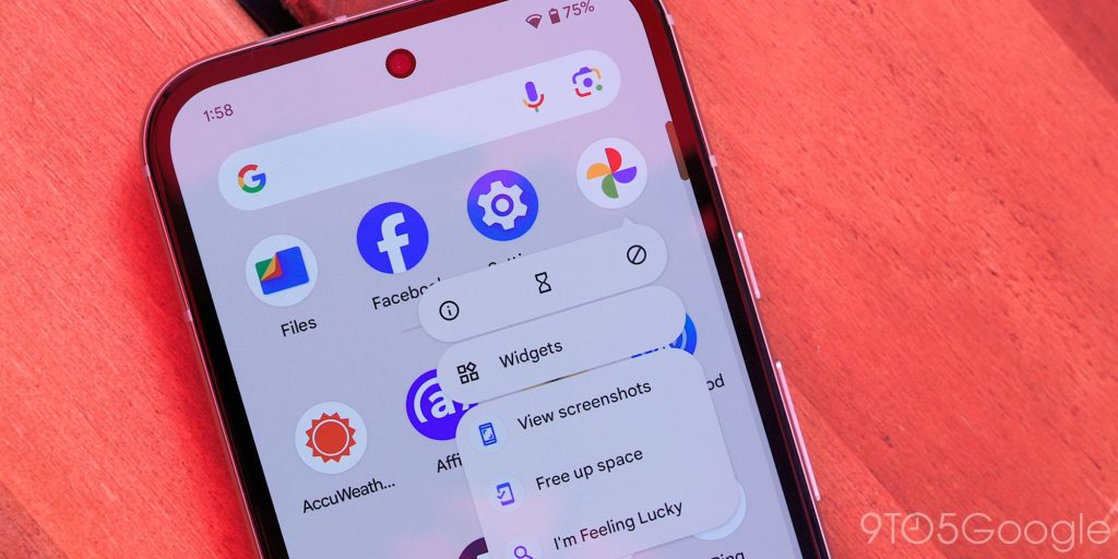
Like me, you might use this option when using the Pixel Launcher, but the top section of the Android app drawer has a suggested row of applications. In previous versions, you needed to drag the app icon to your homescreen and use the “Do not suggest” toggle to make it stop appearing in this little automated menu. In Android 15 Beta 2, this is slightly different.
You can long press the app icon to get a small “no symbol” that does the same thing. On some apps, this will live in the little pop-up quick action panel to make getting rid of some annoying app suggestions and clean up your experience.
New System UI icon
Plug your phone into a PC, Mac, or get system updates, the System UI icon is brand new and ready for Android 15. It’s tiny for now, but expect to see this blown up in more places soon. It’s not technically new, but it’s actually being used over the old Android 14 logo.
Although technically not the same but notable nonetheless, a related change is the return of the Android 15 logo in the System settings app. It’s just a bigger, high-resolution version of the System UI icon, which replaces the Android 14 logo that appeared in recent Developer Previews and Betas. The new icon is still space-based, but long-pressing still activates the Android 14 Easter egg.
Redesigned authentication panel
You know that screen you see when authenticating a payment or accessing section locked behind a passcode or biometrics? The pop-up panel has a minor redesign with an app icon to indicate who’s requesting access, plus larger text and a “confirm” button to continue. It’s another minor UI tweak from Google but a notable change nonetheless.
Animation easing subtly improved across entire system
I love seeing how Google’s animations evolved over the past few iterations and, while it could be a the placebo effect, but it appears that lots of system animations appear to have received subtle touches to the easing in Android 15 Beta 2. It’s super hard to spot but animations feel like they are not as “sharp” with soft closing frames visible when opening the app drawer and certain other UI portions like the Wallpaper & style app.
Suggested widgets with categories
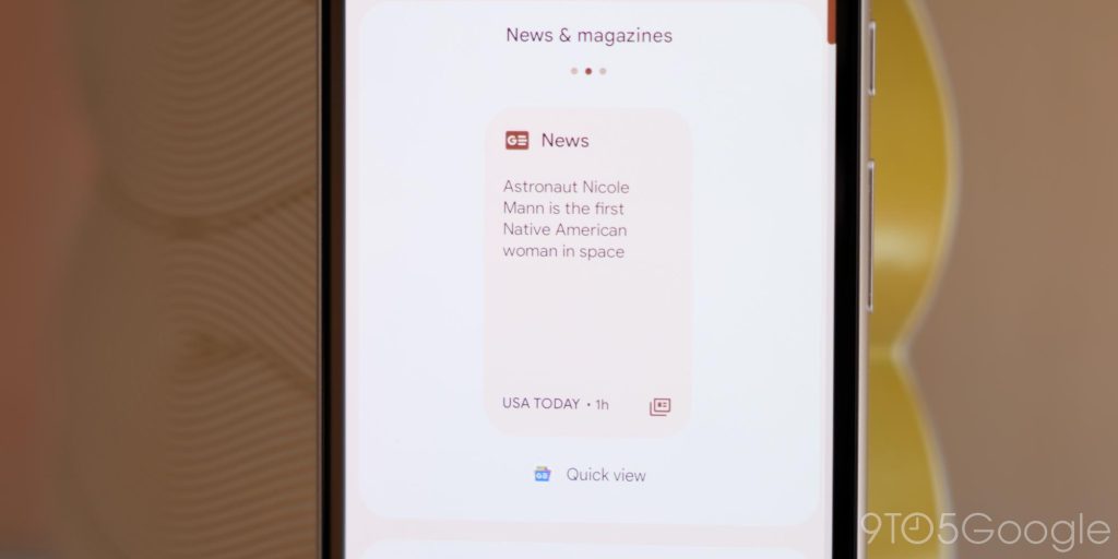
If you want homescreen widgets, there is a change to the suggested widgets pane at the top. With app widgets from your various on-device applications, you can switch between these to see categories such as “Essential” or “Entertainment” right now. There are more categories that’ll appear based on your installed applications and phone usage, but this should make it easier to find stuff quickly and maybe give you some inspiration.
Hearing devices QS tile
There is a brand new Hearing devices Quick Settings tile that should make it even easier to pair with Bluetooth hearing aids and devices. You can add this instantly. Tapping just opens a mini window to get connected to new Bluetooth hearing accessories and should make it easy for those with hearing impairments.
Developer options changes
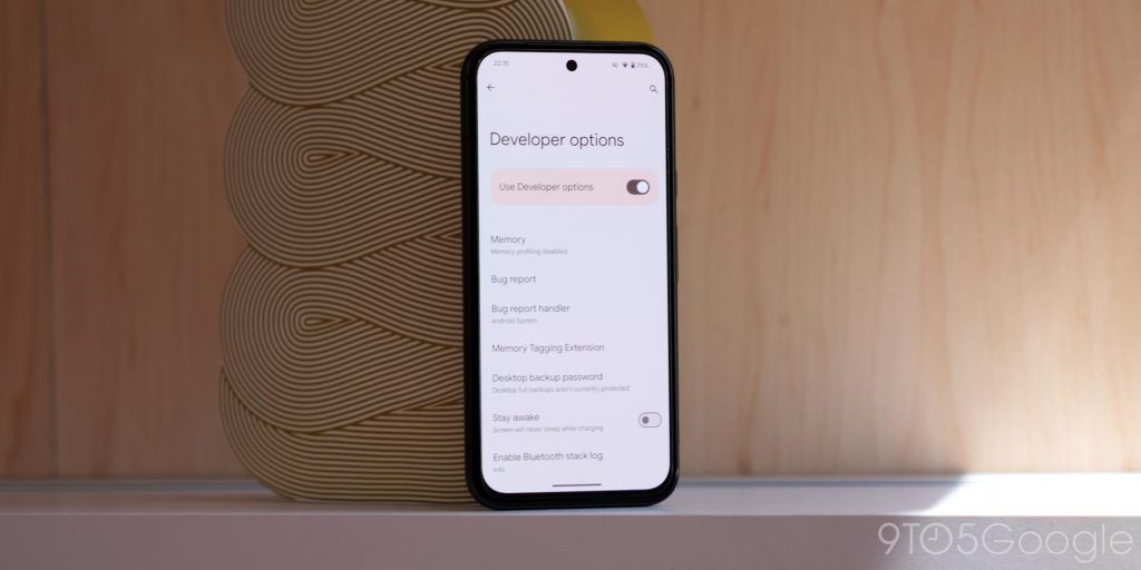
Developer options has a slew of new changes here in Android 15 Beta 2 that you can enable:
First up is a new “Grammatical gender” option that works currently with French. In basic terms, it’ll you set up when the system refers to you, the user, whether masculine or feminine terminology is used. Super limited, but important nonetheless.
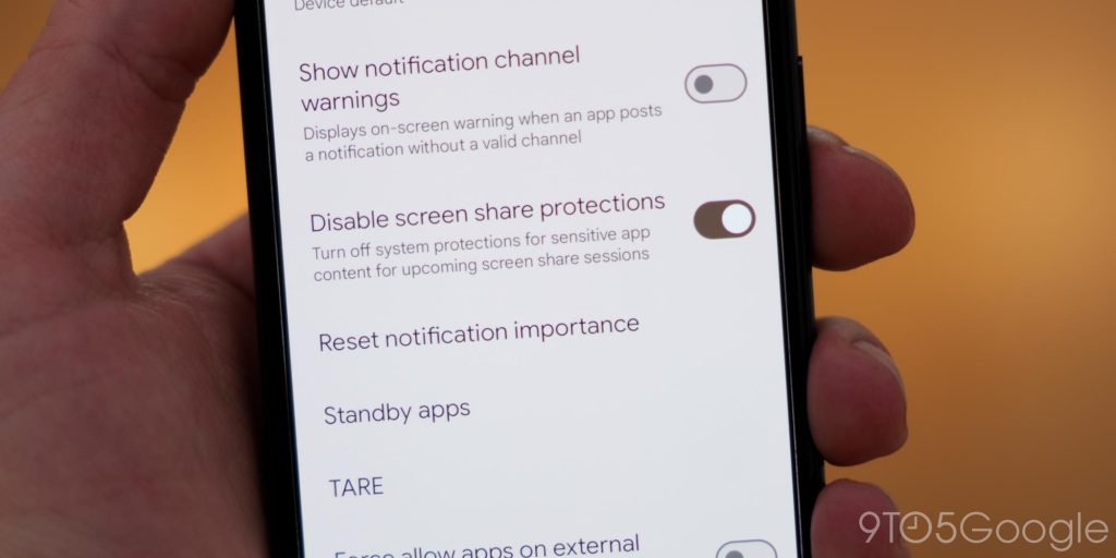
There is also a new Disable screen share protections toggle that applies to Android 15’s upcoming system-level protections around screen captures. Google tells us this Developer option does not disable protections already implemented by apps, but we would suggest leaving this toggled “on” to ensure all of your on-device content is kept secure.
As part of even more privacy control options, there is also a new “Shared data” section in developer options that will let you see what apps have made requests to access files or information. It’s not quite the same as Privacy dashboard which manages similar sorts of on-device requests. This is another Developer option that is likely to get fleshed out more too.
Predictive back animations on by default
Another new change is that Predictive back animations are now enabled by default with the release of Android 15 Beta2. They’re most visible in Settings, but there is also no option to enable or disable them in Developer options. Hopefully, more apps beyond the slew of first-party Google apps will support them soon, as it’s been a long time coming.
Contrast options in Wallpaper & style
The “Wallpaper & style” app now has the Color contrast option that was previously found in Developer options. That’s not all, as it has a more fully formed UI with a preview of the changes you are making. It’s super easy to see just how things will look with apps and toggles. This will affect Dynamic color tuning though so be careful here if you’re tweaking stuff.
New volume control redesign
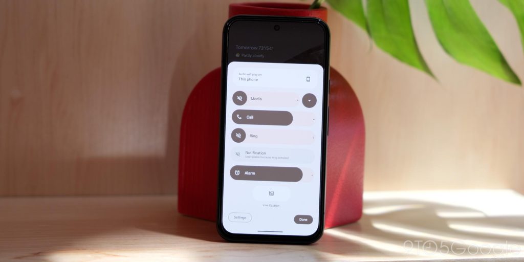
Google has redesigned the volume menu. The good news is that this doesn’t affect the slider that appears when you press the physical volume keys but rather the overflow toggle, which brings up a bigger menu with more options for fine tuning.
There’s a splash of Material You color and shapes, but there is also improved sliders and this is full overhaul to improve the volume control experience. This is one of the best changes here in Android 15 Beta 2 and I’m hoping to see more of this kind of change across other areas of Android 15.
Privacy panel changes
Top comment by Not Benito
This is NOT "the biggest update in years," unless you mean it's a 500GB download.
The privacy section has been elevated in the Security and privacy panel for some reason, this does put important privacy controls front and center so you can quickly enter privacy dashboard and the new privacy space section. No functionality is changed, but it’s just easier to access.
Bluetooth now automatically turns automatically
When you disable Bluetooth in Android 15 Beta 2, there’s one annoying change. It wont stay deactivated indefinitely. Instead, it’ll reactive in 24 hours kind of like how Apple devices enable Wi-Fi after the same period. You will need to go into Bluetooth settings and diable the “Automatically turn on again tomorrow” or it will reactivate and your phone will pair again with your Bluetooth accessories. You have been warned!
What is your favorite Android 15 Beta 2 change?
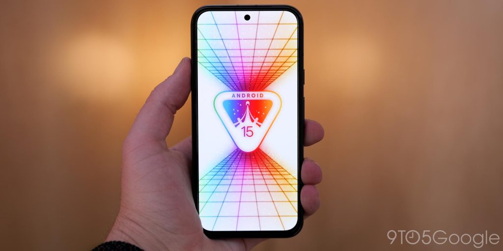
Right at the top I mentioned that this was the “biggest” beta update in a few years. At least in terms of volume of user-facing changes, it is. Sure, nothing here is truly groundbreaking but it feels very much like a bit of respite from the tick-tock approach that has been somewhat disappointing at least since Android 13.
we’re spoiled by Pixel and Android Feature Drops, as those offer new features in-between bigger platform releases. That said, have you flashed Android 15 Beta 2 on your device and what is your favorite new feature? Drop a comment down below.
FTC: We use income earning auto affiliate links. More.


Comments