The Cast menu redesign that first launched in YouTube Music is now rolling out to the main YouTube app on Android and iOS…
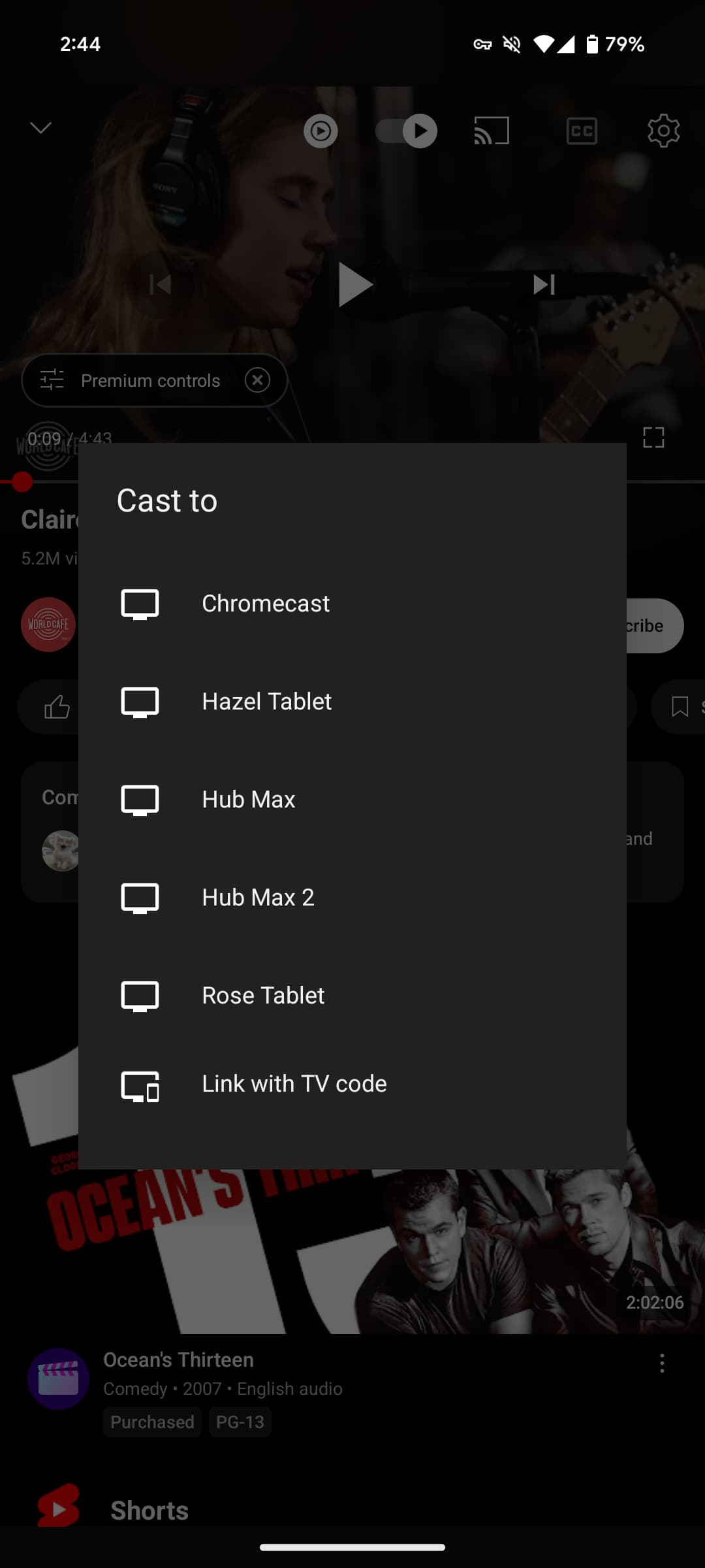
Tapping the Cast icon previously opened a “Cast to” prompt at the center of your screen. Clicking the button after a session begins lets you control the volume, while Voice search and Remote options appear for televisions. Finally, there was a prominent “Disconnect” button in the bottom-right corner.
The new Cast menu is a floating bottom sheet with rounded corners. This “Select a device” menu doesn’t go edge-to-edge.
Old vs. new


Once something is “Playing,” the thumbnail appears with the voice and remote buttons also available in the corner. At any time, you can “Select different device.”
One complaint that has emerged with this design is the lack of a Disconnect button. Tapping “This phone” will move playback to your mobile device, thus making ending playback a two-step process. Previously, Disconnect would stop the Cast session and pause it on your phone.
The alternatives include using the Google Home app or the Android media switcher.


We’re seeing the YouTube app’s Cast redesign on iOS today, while others are seeing it on Android. It’s not yet widely rolled out.
Meanwhile, the YouTube Music team has heard the feedback and introduced an overflow menu next to the volume slider. It’s home to “Send feedback” and “Disconnect from TV.” However, it works differently than before by only disconnecting your phone and continuing playback on the Cast speaker. This will presumably be added to the YouTube version.


More on Cast:
- ‘Google Cast’ is replacing the ‘Chromecast built-in’ brand
- Google Cast is coming to Android Automotive and Rivian vehicles, new apps too
- Pixel Tablet getting Tap to Cast with UWB Pixel phones
FTC: We use income earning auto affiliate links. More.


Comments