While Google has generally been moving away from navigation drawers on Android, they still exist in several big apps. Nav drawers definitely have their place, but I wish first-party applications implemented them in a much more consistent manner.
9to5Google has a rebooted newsletter that highlights the biggest Google stories with added commentary and other tidbits. Sign up here!
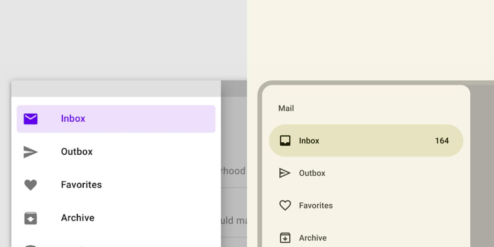
With Material 3 (as shown above), navigation drawers switched from square to rounded corners. Several apps have not made that change, including Google Docs, Sheets, Slides, Chat, and Gmail.


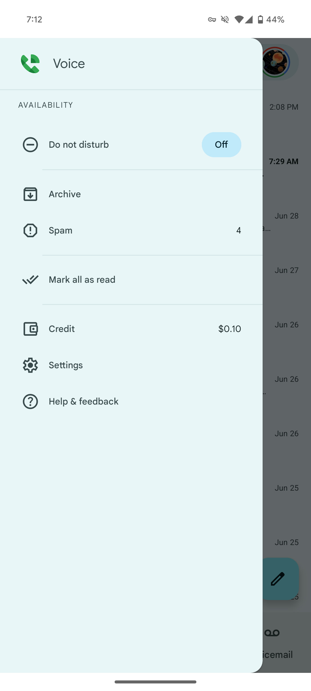
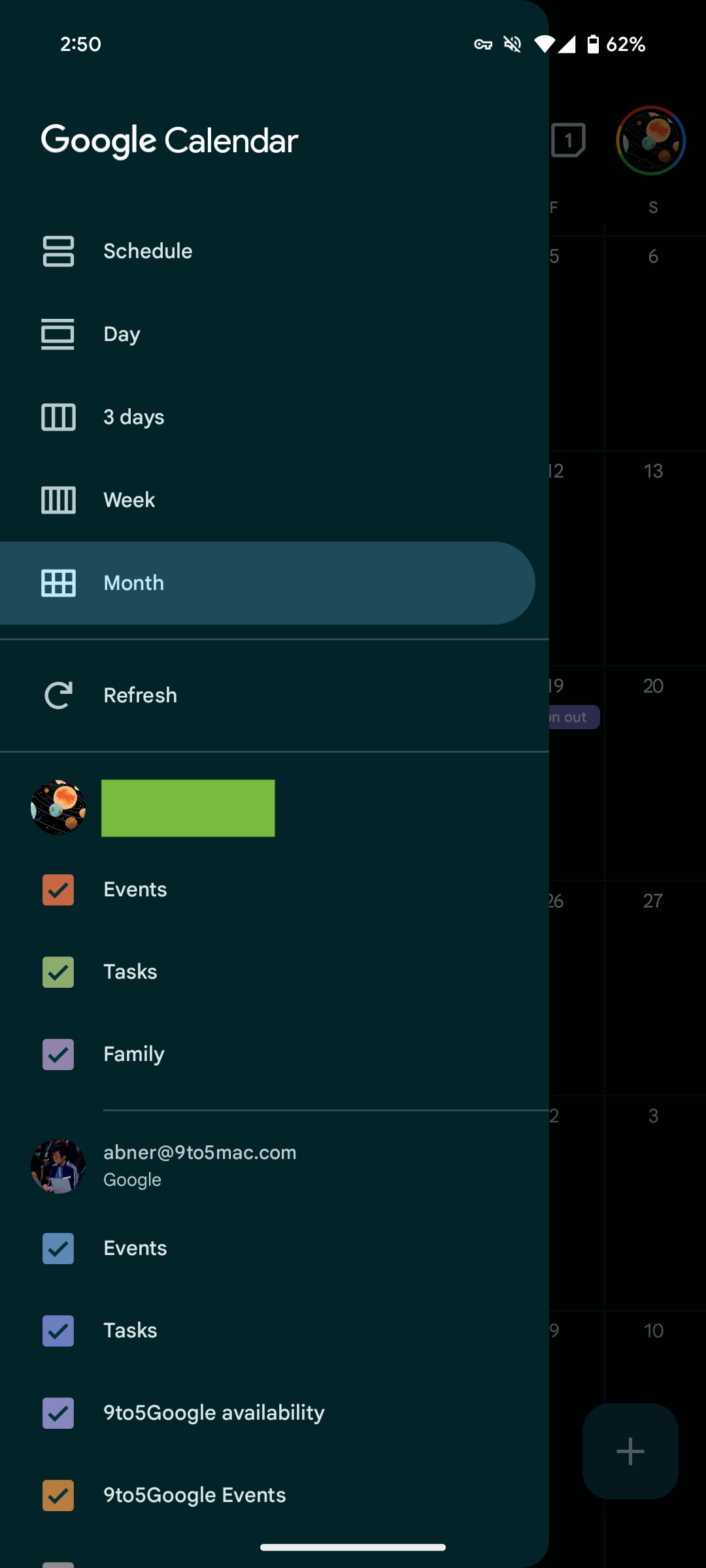
Meanwhile, there are three distinct ways that drawers interact with status and navigation bars. You can see the stark difference between Gmail and Google Calendar, while Drive, Meet, Voice, and Files avoid the system bars entirely.
The wide variance between the Google Workspace apps, which usually are more consistent than other Google apps, is unfortunate.


Almost every Google app now uses Material 3’s pill-shaped active indicators instead of rectangular ones. Google One’s nav drawer – like YouTube’s — is firmly in the M2 style, though the app has a large M3 bottom bar.
Top comment by Pete4live
Google is known for not following their own Material 3 guidelines in their own apps, but from an UX and accessibility standpoint the inconsistency is infuriating as well.
Ultimately they should only be used for longer lists like tags and folders and nothing else. Drawers with 5 items or less should just be a bottom bar and items like settings, feedback support, etc. should be accessible through the account menu only.
I wish the drawers were all the same width. In general, most are unnecessarily wide and obscure the background so much that not enough context is preserved.


Google Messages dropped its nav drawer as part of a redesign in late 2023 after surprisingly adding it in early 2022. Everything has been moved to the account menu for a cleaner homescreen. A more recent example is Google Contacts switching to a series of filters and sheets. (While we’re talking about Contacts, it should update the blocky scroll bar that lets you quickly browse the alphabet. The Phone app leverages a thinner, more modern design.)
That said, navigation drawers still have their place, with Google recommending them for:
- Apps with 5 or more top-level destinations
- Apps with 2 or more levels of navigation hierarchy
- Quick navigation between unrelated destinations
I’m personally not a fan of navigation drawers that stop below the status bar. It prevents the app from offering a fullscreen experience. My preference would be for apps to take after Google Calendar and Keep.


FTC: We use income earning auto affiliate links. More.


Comments