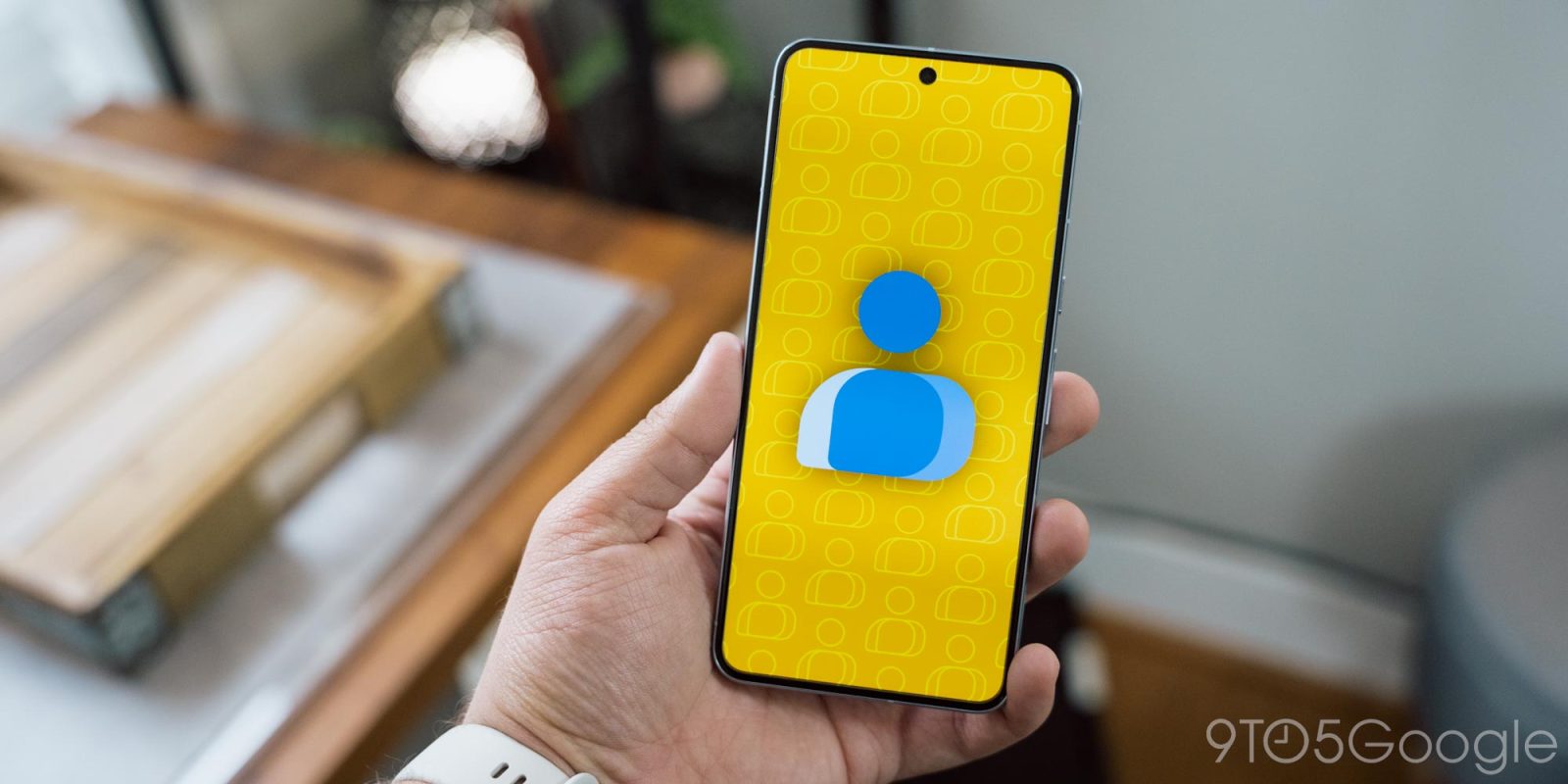
Following Messages last year, Google Contacts is now the latest app to replace its navigation drawer as part of a small redesign today that really simplifies things.
Previously, the main “Contacts” tab used a navigation drawer to show available accounts and labels. The hamburger button at the left of the search field is replaced by a magnifying glass icon to match the “Highlights” tab.
Meanwhile, there’s a new dropdown to switch between “All contacts” and any other accounts you have on the device. You’ll also find “Customize view” here instead of the overflow menu next to your profile avatar.


To the right is a label picker that brings up a new sheet with the ability to create a new one. Finally, there’s a new icon at the end of that row to show/hide the filters for Phone contacts, Email contacts, and Company.
These changes — the last one especially — help clean up Google Contacts. The top of the app now looks much cleaner and less cluttered. Meanwhile, the slow move away from nav drawers continues.


Meanwhile, on tablets, the floating action button (FAB) moves up to the corner without the hamburger icon.
This navigation redesign is rolling out with version 4.27.26.x of Google Contacts for Android. Force stop from App info to load the new design.


More on Google Contacts:
- Google Contacts is making it way easier to set custom contact ringtones on Android
- Google Contacts cleans up contact info with new ‘Connected apps’ section
- Google Contacts widgets will soon show that person’s last sent message
FTC: We use income earning auto affiliate links. More.
Comments