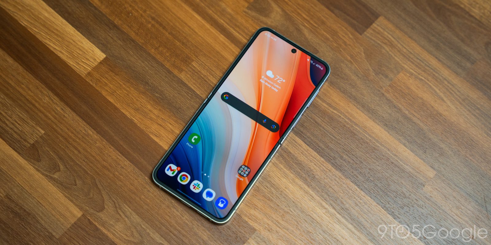
Following a flood of leaks, Samsung is expected to launch its big One UI 7 update in beta this coming week. Based on what we’ve seen so far, how do you feel about the changes?
Samsung’s take on Android has always been a reasonably polarizing one, but also the most popular in the world. The company’s last major redesign was in 2018, when One UI debuted alongside Android Pie (9.0). The update was widely regarded as a major improvement over TouchWiz, which came before it. That’s largely because the update delivered a cohesive revamp to the company’s Android skin that was headlined by genuinely good changes, like improving one-handed usability and drastically improving the design, especially in cluttered areas such as the Settings app.
In the years since, Samsung has tweaked that design with each new generation alongside adding new features.
Now, alongside the launch of Android 15, One UI 7 is set to be the biggest revamp to Samsung’s skin since One UI’s initial launch. And, well, it’s polarizing to say the least.
One UI 7 has leaked a lot over the past week, with details and pictures revealing some of Samsung’s upcoming changes. You can see our coverage through the past few days for all of the details but, to summarize, there are about half a dozen notable changes which include:
- Updated homescreen icons
- Using Android’s status bar chip to act like iOS’ Dynamic Island
- New battery indicator with percentage in pill
- Option to show homescreen icons without names
- Redesigned camera app
- Updated lockscreen shortcuts
- Notifications and Quick Settings are now on separate panes
Visually, it does seem like One UI 7 will be at least relatively similar to One UI 6, but it’s pretty surprising to hear how many functional changes there are. The new “Dynamic Island” clone and the split notifications and Quick Settings panes follow increasingly common trends in Android skins, while a lot of other changes, like the look of the homescreen icons and the ability to hide app names, just feel lifted out of recent Apple designs and features.
Perhaps the best change, at least in this author’s opinion, is the redesigned camera app, which looks way better for one-handed use.


But how do you feel about it?
Samsung’s new design is probably going to be met with a ton of mixed opinions from longtime users and onlookers alike when it is fully released. In the meantime, though, we’re certainly curious to hear your thoughts on what we know so far.
Comment below if you have more to say about One UI 7!
Samsung is expected to launch the One UI 7 beta on Monday, July 29, likely starting with the Galaxy S24 series in select regions.
More on Samsung:
- Samsung’s Android 15 update splits Quick Settings and notifications
- Latest One UI 7 leak showcases Dynamic Island clone, more interface alterations
- Samsung’s One UI 7 update has new icons and iOS features in early leaks [Gallery]
Follow Ben: Twitter/X, Threads, Bluesky, and Instagram
FTC: We use income earning auto affiliate links. More.


Comments