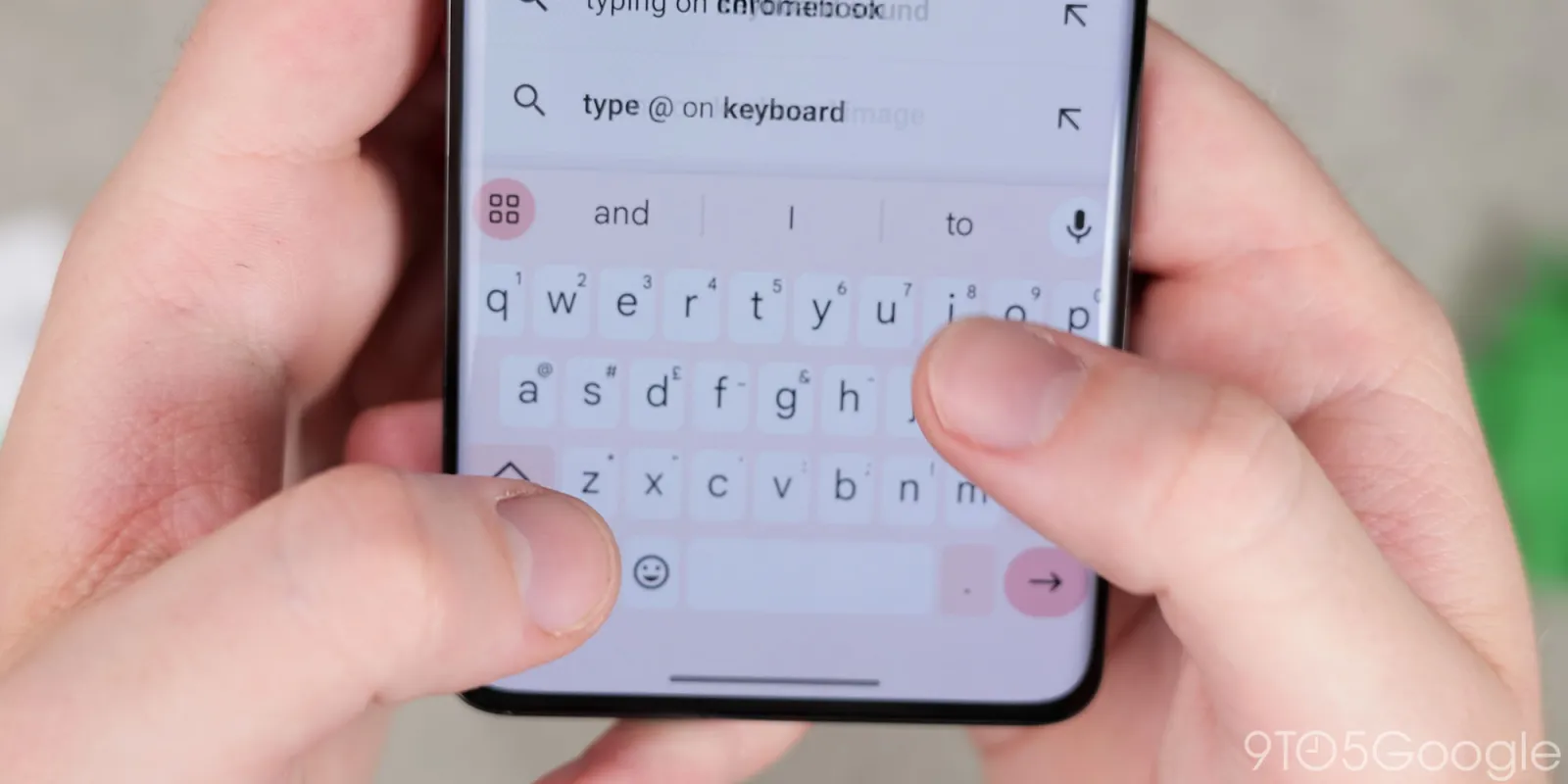
If Gboard for Android looks ever so slightly different in recent days, it’s because the button for accessing the various keyboard tools is now themed with Dynamic Color in dark mode.
In dark mode, the 2×2 grid icon was previously not themed. Like the microphone on the right, it was placed in a circle with a slightly lighter background than the rest of the shortcuts in the strip.
That button now shares the same background as the enter key in the bottom-right corner, with ‘?123’ being the other themed button in Gboard (though with a less vibrant shade).
This was already the case when the light theme is enabled (as seen above), but Google has now brought this behavior over to the dark side. It’s not clear if this is an intentional change or a bug.


Old vs. new behavior
It’s a small change, but one you’ll absolutely notice. The highlight is presumably meant to convey that you can tap the button to access other Gboard capabilities like Google Translate, Proofread, Scan Text, and the Clipboard. There’s also access to Resize, One-handed, and Floating modes.
You’ll get used to this aesthetic change, but it’s certainly distracting until then.
As of the latest Gboard beta (14.4.08.x), we’re seeing this Dynamic Color button in dark mode across all devices. The old behavior is still in place in the stable channel.
More on Gboard:
- Passkeys will show up in Gboard on Android 15 and come to Wear OS 5
- Gboard ‘Fix it’ gets Gemini-esque glow-up
- Why doesn’t anyone else have a keyboard experience as good as Google Pixel?
- Gboard losing granular ‘Vibration strength’ setting in Android 14 QPR3
FTC: We use income earning auto affiliate links. More.


Comments