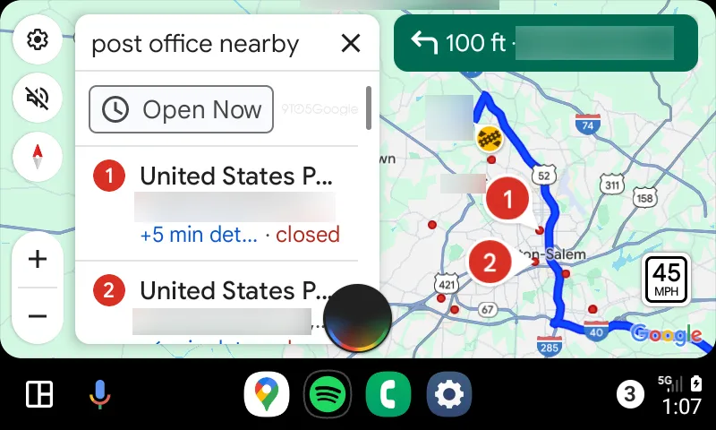
Google has added a new UI for Assistant on Android Auto that appears during voice interactions, and it looks suspiciously similar to Apple’s Siri.
Recently, Google has updated Android Auto with a new UI for Assistant. This is separate from the UI that appears at the bottom of the screen, which is still available for initial commands. Rather, this new UI appears when Google Assistant is waiting on a reply from you.
In the screenshot below, we asked Google Assistant to find a nearby post office, and the new UI appeared when Assistant asked for which location I wanted to navigate to. It reacts when the Assistant speaks and during my reply, and then goes away when the reply is processed.
It feels just a little reiterative when Google could just keep using the bottom bar, but it’s still a nice design.
That said, it is a little hard to ignore the elephant in the room, which is that this is exactly how Apple shows Siri on CarPlay.

We’re not sure how widely this new UI has rolled out, but we’re seeing it on Android Auto v12.5 on a Galaxy Z Fold 6.
More on Android Auto:
- New Google Maps incident reporting comes to mobile & Android Auto
- Android Auto requirements have been updated, now requires Android 9.0 or higher
- Android Auto appears to be adding support for controlling your car’s radio
Follow Ben: Twitter/X, Threads, Bluesky, and Instagram
FTC: We use income earning auto affiliate links. More.


Comments