Password managers are time-saving, security-enhancing tool that everyone should be using, but every time Android refuses to play nicely with a password manager, I’m reminded why so many people don’t bother.
This issue of 9to5Google Weekender is a part of 9to5Google’s rebooted newsletter that highlights the biggest Google stories with added commentary and other tidbits. Sign up here to get it delivered to your inbox early!
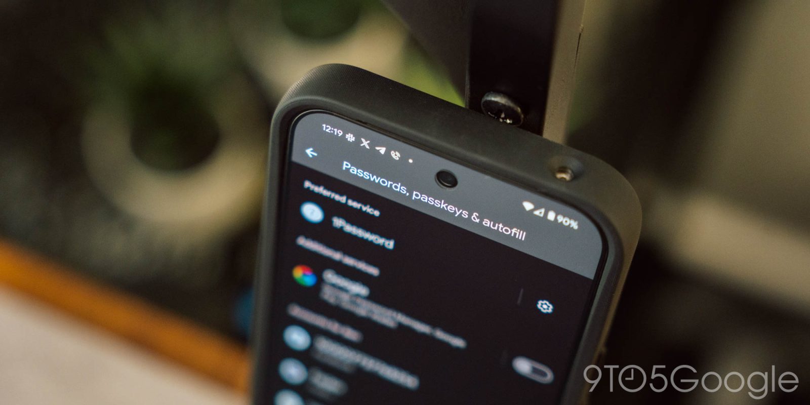
The idea behind a password manager is reasonably simple. A digital “vault” to house your various passwords so you can not only keep track of everything, but also improve security by enabling you to create more complex passwords since you don’t have to remember every single one. Personally, I’ve been using 1Password for a while, but there are countless options for this functionality.
But a good password manager is only as useful as it is easy to use.
On Android, Google introduced “Autofill” back in Android 8.0 (Oreo). The feature promised to not only improve security for password managers, but also to make it slightly easier for these apps to input your usernames and passwords in apps and on the web. Over time, Google has made adjustments such as integrating Autofill into the keyboard (such as Gboard) in Android 11.
For me, though, Autofill on Android has always felt incredibly messy, to the point where using a password manager with the service almost becomes a chore.
That’s because Autofill is very inconsistent, coming down to a handful of factors.
Firstly, how well Autofill works well depend on the services you’re using. I use 1Password and Gboard, which seems to be one of the better-performing options out there, but if you switch to say, LastPass, the experience can be very different. That’s what I was using prior to 1Password a few years ago, and there was a noticeable improvement in Autofill recognizing my logins after I made that switch.
Secondly, how Autofill works with Android apps can vary wildly between apps.
In most apps, a username and password can be entered on the same screen, but others might put it behind two or three different screens. That can quickly ruin Autofill. For example, Twitter/X has up to three screens where you’ll have to input information if you’re using two-factor authentication (which you should, everywhere). I can’t recall the last time I was able to successfully use Autofill to input anything except my username in this app, forcing me to manually open 1Password to get my password, then open it again to get my 2FA code.
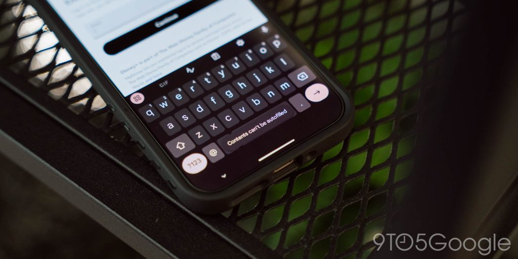
Then, you’ve got all of the apps that just do not work with Autofill at all, like Disney+. Why Google allows apps to block a system service from inputting information is beyond my understanding, but it’s absolutely infuriating, and just discourages the use of these tools.

Another big headache is Google Chrome, which constantly wants to fight your password manager. By favoring Google’s password service, Chrome will ignore your system-chosen preference with no easy way to access the app you actually want to use. I suspect this is part of the problem as a whole, as Google’s password manager works better with Android Autofill than anything else does.
To Google’s credit, though, improvements are coming in regards to Chrome.
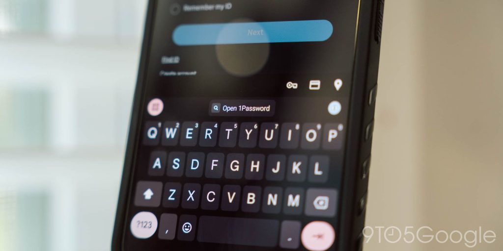
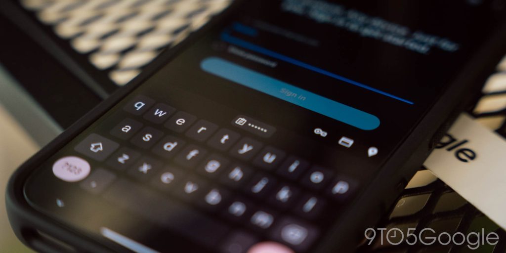
Ultimately, though, I think the problem with Autofill on Android is that you can’t just tap a button to use it. There’s an “Autofill” shortcut in the same menu as copy/paste, but it doesn’t always work – I’d argue it rarely does, in fact. Plus, since many password managers automatically toss a 2FA code into your clipboard, apps with two-step login screens will often not let you access the password manager a second time, on the page where you input your password, because there’s something new in your clipboard. A dedicated button would quickly solve that! There is one dedicated button, but it only shows up in Chrome, and only works with – you guessed it – Google’s password manager.
This is where Google should honestly just take notes from iOS. Apple provides a simple shortcut to your password manager in the keyboard which doesn’t care what password manager you’re using. Just one tap and you’ve got your passwords, all ready for input. And that’s assuming you have to use it in the first place. More often than not, iOS recognizes you’re on a login screen and pulls up the relevant login info before you even have a chance to think about it. It’s consistent, fast, and easy to use, as password managers should always be, and a way better experience than Android is currently offering.
The benefits of a password manager, for me, still far outweigh the downsides of not using one, but that math is probably very different for a lot of people. The headache of using Autofill on Android could easily lead to someone who’s giving a password manager a try for the first time to simply getting frustrated and avoiding it altogether.
Will Google ever fix this? Honestly, I’m not confident it’ll happen seeing as the company’s attention appears to largely be on passkeys instead.
What do you think? Do you struggle with Autofill on Android with your password manager, or does it work pretty well?
This Week’s Top Stories
Pixel 9a leaks
This week we saw a few Pixel 9a leaks that revealed color options, the design, and a very early release date.
- Google rumored to launch Pixel 9a in March 2025
- Pixel 9a reportedly slightly bigger, comes in four colors including purple ‘Iris’
- Pixel 9a design leaks with flat cameras that ditch Google’s most recognizable design [Gallery]
Samsung confirms massive delay to Android 15 update
At its annual developer conference, Samsung showed off its One UI 7 update based on Android 15, but also finally offered a timeline for its release. A beta will be coming before the end of the year, but the full release won’t be coming until 2025.
- Samsung’s Android 15 update is delayed until 2025
- One UI 7 beta with Android 15 officially coming by ‘end of this year’
- Samsung shows off more ways that One UI 7 copies iOS including multitasking [Gallery]
More Top Stories
- Handy Android Auto trick lets you easily look ahead on your Google Maps route
- Google Phone appears to be testing a new incoming call UI
- AAWireless ‘TWO’ adapter for wireless Android Auto launches October 20 for $65
- ‘Google’ settings on Android get Material You redesign [Gallery]
- Verizon shutting down Message+ in favor of Google Messages
- OnePlus has been forced to stop selling phones in Germany… again
- Gemini Live & new voices now available for all free users on Android
- Removed songs coming back to YouTube and YouTube Music after SESAC deal
- YouTube mistakenly bans accounts & removes channels for ‘spam’
- YouTube TV starts slowly rolling out background play on Android and iOS
- The Oura Ring 4 launches with improved accuracy, still requires subscription
- Samsung brings watch faces from Wear OS 5 to Galaxy Watch 4, 5, and 6
- Chromecast vs. Google TV Streamer: Are the upgrades enough? [Video]
From the rest of 9to5
Top comment by Sominemo
My personal complaints:
Passwords are supposed to appear at the top keyboard row and they don't always do it reliably. Sometimes closing and opening keyboard back works. I experienced it with different password managers in different apps.
The horizontal carousel is very hard to use when you have more than two options, and scrolling all the way to the end to access the vault is a pain. There needs to be an easily accessible button that allows to expand the autofill UI and pick the credentials from there.
9to5Mac: Apple has never had a bigger software year, here’s how it’s going
9to5Toys: Anker unleashes next-gen ANC Liberty 4 Pro wireless buds with touch control display case
Electrek: Hyundai’s new US-made IONIQ 5 is getting the Waymo robotaxi treatment
Follow Ben: Twitter/X, Threads, Bluesky, and Instagram
FTC: We use income earning auto affiliate links. More.


Comments