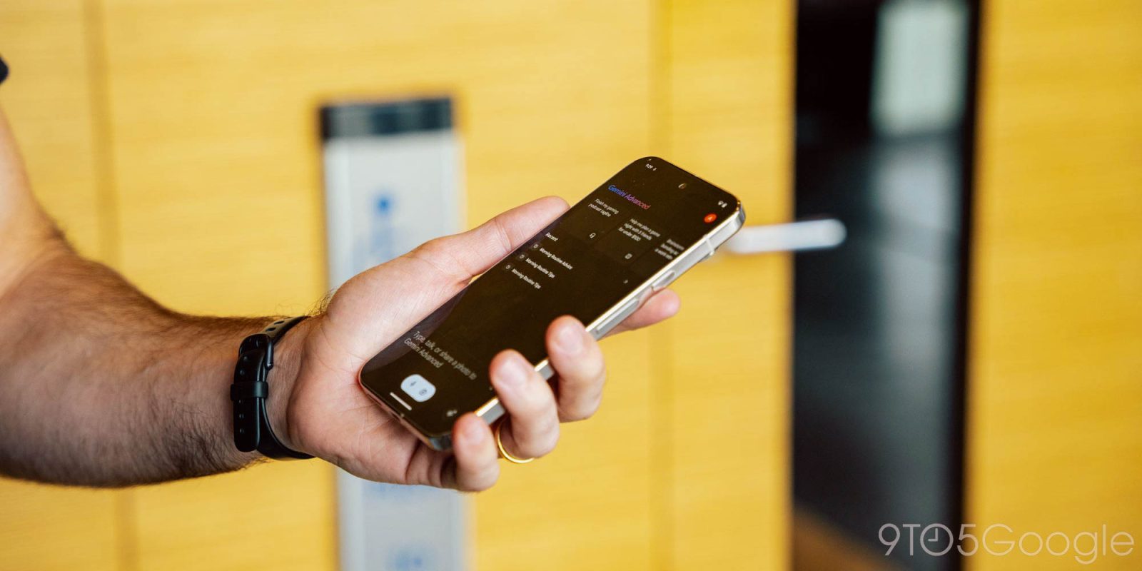
After switching to an “Ask Gemini” prompt at the start of this week, Google is making even more tweaks to Gemini on Android that make the app look better in dark theme.
The ‘plus’ sign at the left that lets you upload files/images is no longer housed in a circle. (There are no changes to the gemini.google.com interface.) As such, it gets a little but bigger, with this change made throughout the mobile Gemini experience, including in conversations.
Meanwhile, the microphone and camera pill drops the light blue background. It’s now a very light gray that matches the Gemini Live button. This design is not as distinctive as before, but is straightforward enough and ever so slightly better for the dark theme.
Monday vs. Friday


We’re seeing these ‘plus’ and dark theme changes in Gemini with Google app beta version 14.42.
Google has been making a slew of tweaks to the Gemini app in recent weeks, with simplification apparently being the overarching goal.


More on Gemini:
- Report: Google targeting December launch for Gemini 2.0
- Are you actually using Gemini and, if so, what are you doing with it? [Poll]
- OnePlus is the latest Android brand ditching Google Assistant for Gemini
- Google redesigns Gemini homescreen to be even simpler on Android
FTC: We use income earning auto affiliate links. More.


Comments