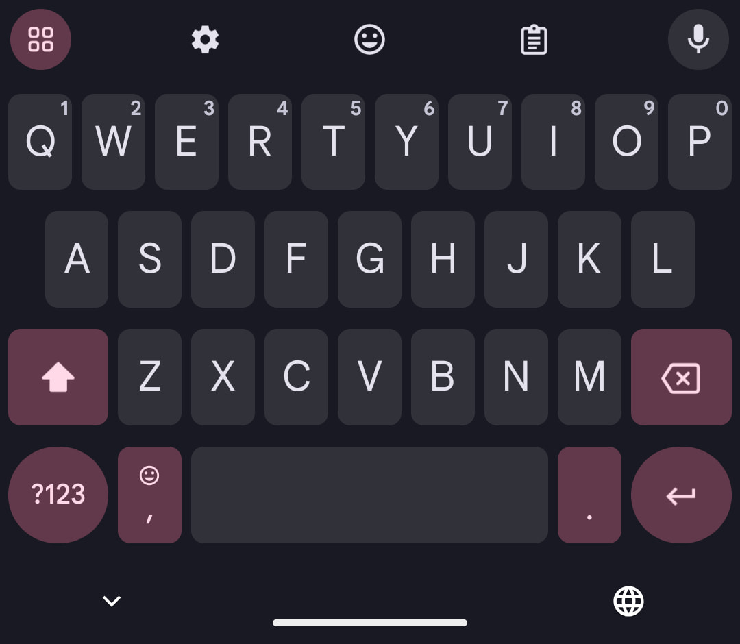
The themes in Gboard for Android haven’t changed in quite a bit — save for a splash, but Google is now testing a redesign of the existing Dynamic Color light and dark themes.
With this updated Dynamic Color theme, the keys for shift, ?123, comma/emoji, period, enter, and backspace, as well as the menu button in the shortcuts row, are all themed the same color. In the case of the dark theme, it’s much darker than before, which is fitting.
Old vs. new
(Same wallpaper/color in dark & light themes on different phones)


The previous design used three different sets of color for those buttons, with all of them different from the background for letters.
This new single color for non-letter keys is still selected from the Dynamic Color palette, but doesn’t show as much range. It does result in a more uniform and cohesive look for Gboard that might be less distracting.


Across several Pixel phones, we’re only seeing this new Dynamic Color theme on one device running the latest Gboard beta (version 14.7.10.x).
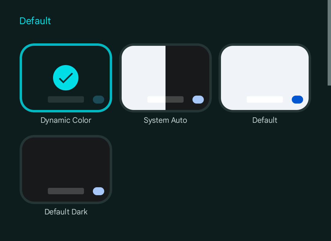
Meanwhile, there are no changes to the “Default” themes that only accent the enter key.

More on Gboard:
- Gboard beta adds a limited font switcher
- Gboard for Android gets a redesigned emoji & GIF picker on tablets and foldables
- Passkeys will show up in Gboard on Android 15 and come to Wear OS 5
- Gboard ‘Fix it’ gets Gemini-esque glow-up
FTC: We use income earning auto affiliate links. More.


Comments