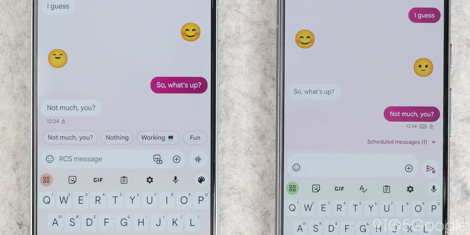
With the latest beta version of Google Messages, some users are seeing the old text field accidentally return.
Update 10/29: This bug remains a problem, especially with the latest beta version 20241024_01_RC00. After yesterday’s update, the old text field returned on all our beta devices. We’ve seen server-side updates restore the updated design, and don’t think Google plans to revert back to the old look after all this time.
Original 10/10: This one-line design starts with the ‘plus’ menu and is followed by the gallery/camera, while Magic Compose appears on compatible devices. The “Text or RCS message” field houses the picker for Emoji, GIFs, Stickers, and Photomoji, as well as the audio recorder.
Upon entering text into the field, the three actions at the left disappear and are replaced by a chevron that brings back the first two shortcuts.
That text field is pretty narrow given those three actions — it looks fine with two, but does have the benefit of being right-aligned and therefore matches the side where your sent messages appear.
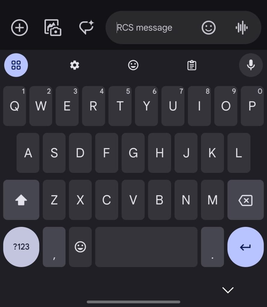
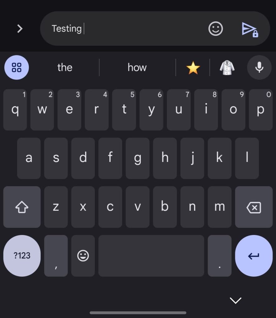
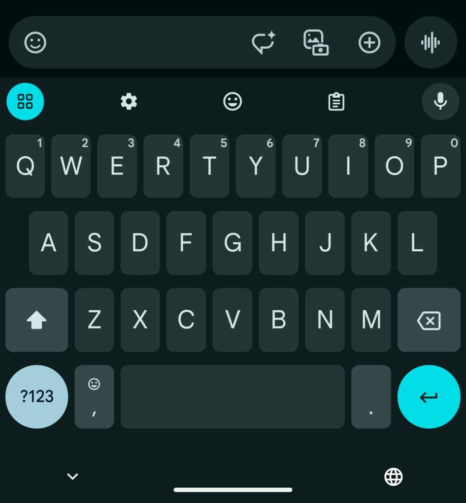
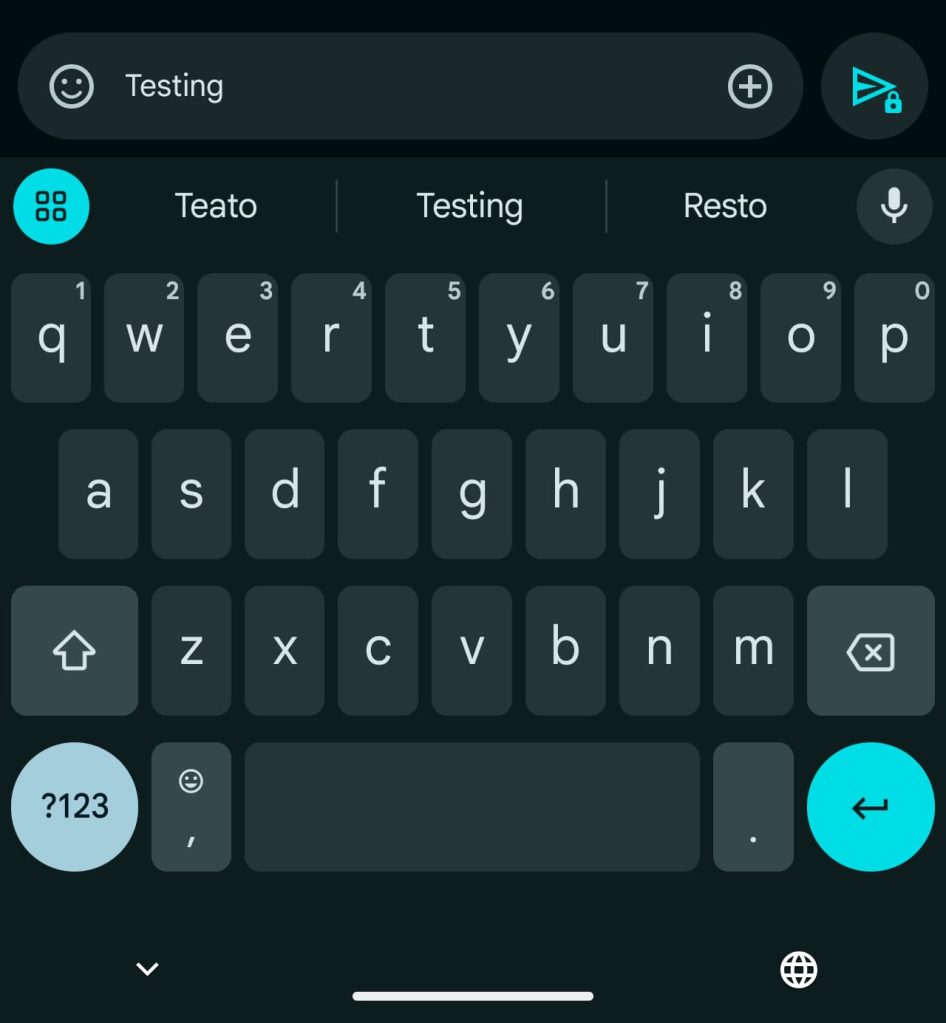
Some beta users are seeing this design return with version 20241008_00_RC00 of Google Messages. That update rolled out Thursday morning. Of two devices we checked today, it’s only appearing on one.
This is most likely a bug as Google looks committed to the current left-aligned design. That look was finalized after a two-line variant with a shortcuts bar was pulled after user complaints.
More on Google Messages:
- Google Messages text field expands with ‘Magic Rewrite’ change [U]
- Verizon shutting down Message+ in favor of Google Messages
- Gemini in Google Messages sends out welcome message
- RCS messaging from Android to iPhone: Everything you can currently do [Video]
FTC: We use income earning auto affiliate links. More.


Comments