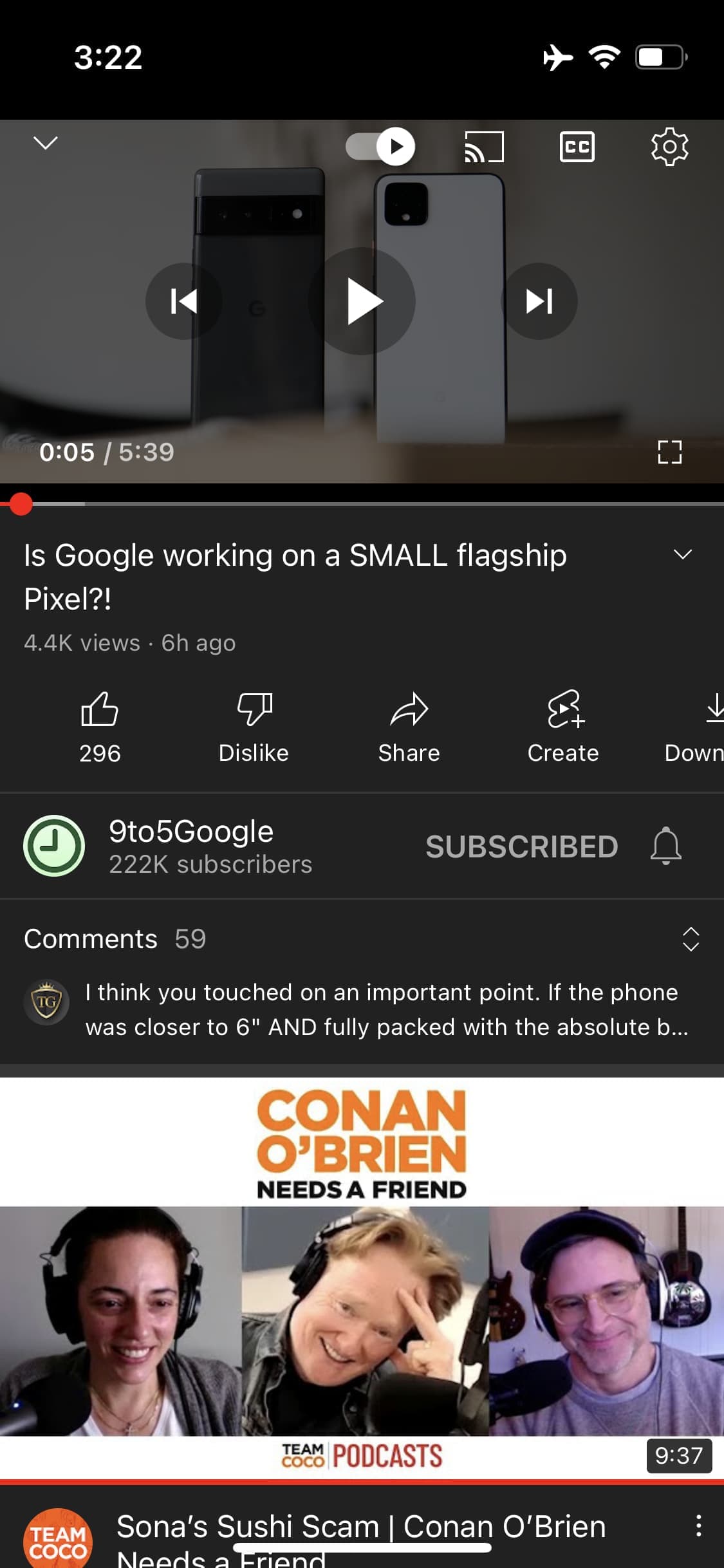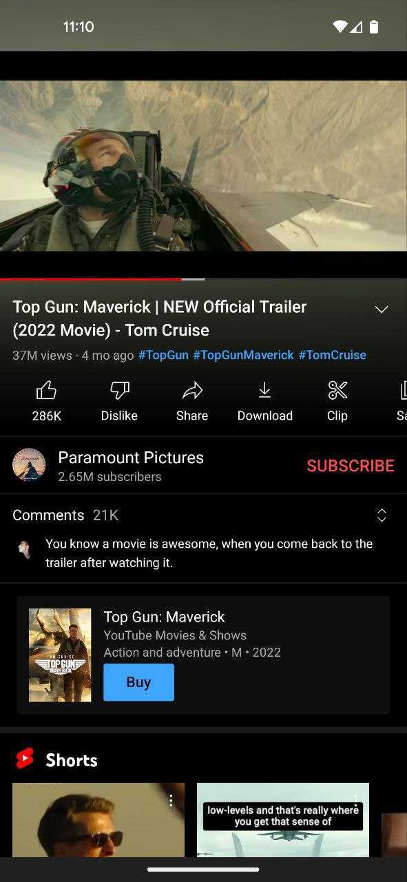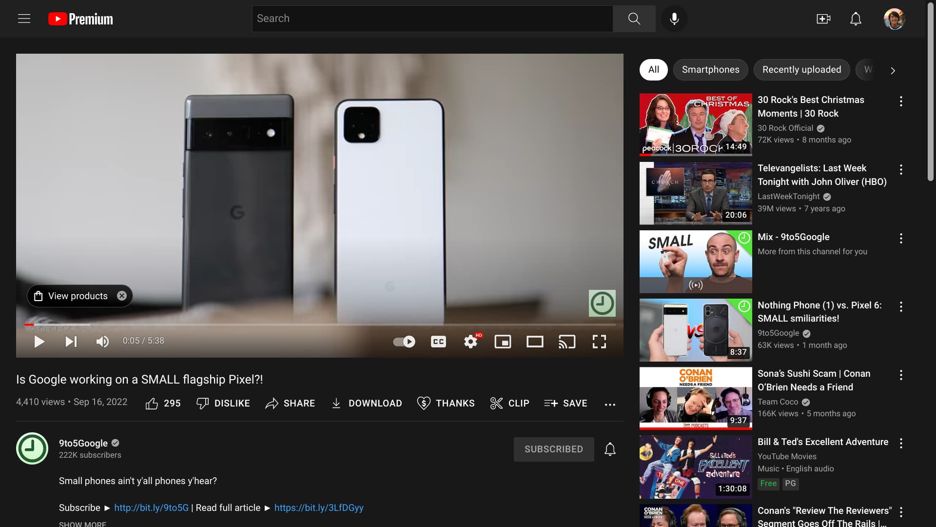
In recent weeks, YouTube has been slowly rolling out a new video page that tweaks several elements and, most notably, unifies the design across Android, iOS, and the web.
The highlight of this redesign is the use of pill-shaped buttons for key elements. For example, instead of being two distinct buttons, thumbs up/down and the like count are housed in one container. Share, Create (Shorts), Download, and other things you frequently interact with get the same treatment.
Meanwhile, that carousel (on mobile) is now underneath channel details with that information coming after video title, view count, publish date, and hashtags.
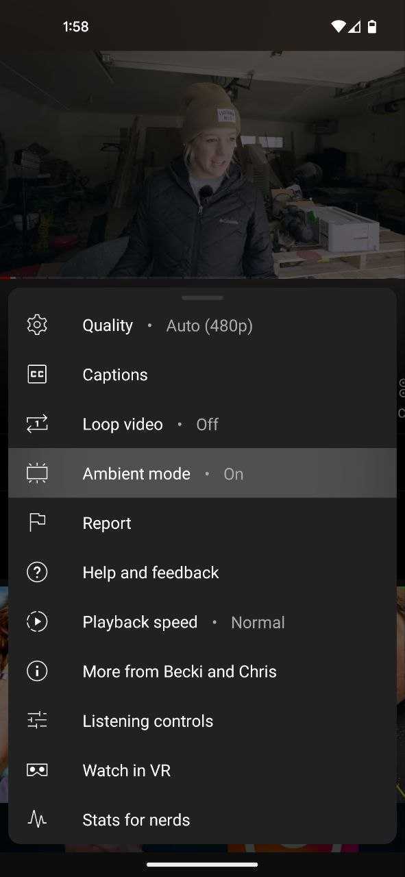
This new design might also coincide with “Ambient Mode” that allows the bottom of a video to bleed into the description section and system status bar for a more immersive experience. Fortunately, this can be optionally enabled/disabled from the overflow menu.
Another key change with this revamp places the top comment in a more prominent container that really stands out on the screen. This technique might ultimately prove successful in getting people to engage more.
Things are slightly different on desktop with the video description getting the visual call out, something that Creators should benefit from.
This revamp has been slowly appearing for more users in recent weeks but is not yet widely rolled out. However, this appears to be the direction YouTube is opting for with its new video page. The current look dates back to 2020.
More on YouTube:
- YouTube says it has ‘concluded’ a test that saw as many as 10 unskippable ads in one break [U]
- YouTube Music for Android bug keeps your screen on [U]
- YouTube Shorts and Music integration lets you quickly save songs
- YouTube Music gets Instagram Stories sharing for songs, albums, and playlists
Thanks Mohsin, Philip, and RKBDI
FTC: We use income earning auto affiliate links. More.


Comments