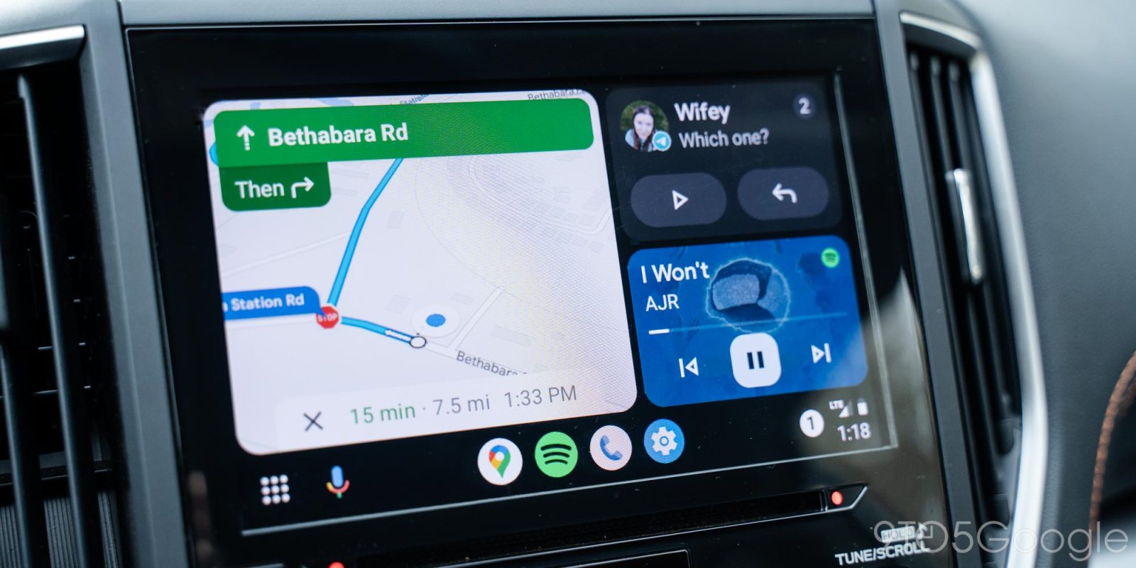
While the design of Android Auto has remained mostly static for much of last year, Google has switched things up a bit with the new Android Auto redesign that looks entirely different. This redesign shifts the information you’d need at a glance around, making it easier to navigate and use.
How did I get the new design?
Android Auto’s new redesign – codenamed “Coolwalk” – become available for users to try in beta back in September 2022. Following that, the design has shifted to its full release phase and has since been pushed via a server-side update. In our experience, the new design took no action on our part and simply appeared one day, though the rollout is still ongoing. For some, it’s already appeared while others haven’t seen the new update.
The new design may have come as sort of a shock, with your vehicle turning on as normal and your head unit suddenly displaying what looks like a broken-up puzzle of music and map info. This new look does serve a purpose, as there is more information on display than previously.
Related: Review: Android Auto’s dashboard redesign keeps everything important in view
Now, Google Maps takes up about 75% of the screen while the other 25% is shared between points of interest – temporarily – and a media app of your choice. Doing so allows you to visually take in more data at a quick glance, as having to dig into your apps while driving doesn’t exactly make for a great user experience.
How to navigate Android Auto’s new look
Even though Android Auto looks different, the basic mechanics are still very similar. At the bottom of the screen, you’ll see the familiar taskbar. With apps aligned in the center, you can tap any one of those to open in full screen. These apps generate based on what you use most often. For instance, if you use Spotify every time you drive, you’re almost guaranteed to see the app icon in the suggested section.
From any fullscreen app, you can hit the dashboard button on the far left, which will bring you back to the paneled layout. Tapping the farthest left icon again will bring you to your app drawer, which houses all of your available apps – each is taken directly from your connected phone. Opening these up takes you to a fullscreen version of that app. Google plans on adding the paneled functionality to certain navigation apps like Waze, though this hasn’t happened quite yet in its full release. There is currently a beta version that makes it possible.
When in the dashboard, you can also tap any of the three boxes that appear. Depending on the size of your display, you may see one large box to the left and two smaller ones to the right or one large at the top and two smaller apps at the bottom. Generally speaking, vertical displays lend themselves to the second layout and are much better suited for that structure.
Top comment by Jimmy cychowski
It's pretty good, I like it, the only thing missing is the weather & it's icon, that is no longer available, I also would like the current speed to be included in Maps, like it does in driving Mode, showing the current speed.
At the very right, you’ll see the time, battery status of your phone, and connection strength. Tapping it brings you to your notifications page, which will house any notifications you’re received via messaging apps or calls. This is useful when you need to go back and see who texted you while you were making a sharp turn or merging onto the highway.
Can I switch back to the old design?
While the new look is promising for utilizing space and making it a little easier to see information quickly while on the road, some may not like the new changes. After all, taskbar widgets are possible yet unstable in Android Auto’s current form.
Unfortunately, the answer is “not really” as the Android Auto update was pushed on the server level, not from an app update installed directly to your connected phone. While you could technically revert to an older version of Android Auto, the switch from Coolwalk to the previous design is not guaranteed in any way and if it did, it would be temporary.
Whether we like it or not, Android Auto’s redesign is here to stay. As time goes on, Google will implement small changes to refine the overall structure, hopefully perfecting its functionality.
More on Android Auto:
- Android Auto – How to fix a lost GPS signal or Google Assistant not responding
- Android Auto connection errors plague some early Galaxy S23 buyers
- Android Auto redesign rolling out and getting WhatsApp calling with Pixel, Samsung
FTC: We use income earning auto affiliate links. More.


Comments