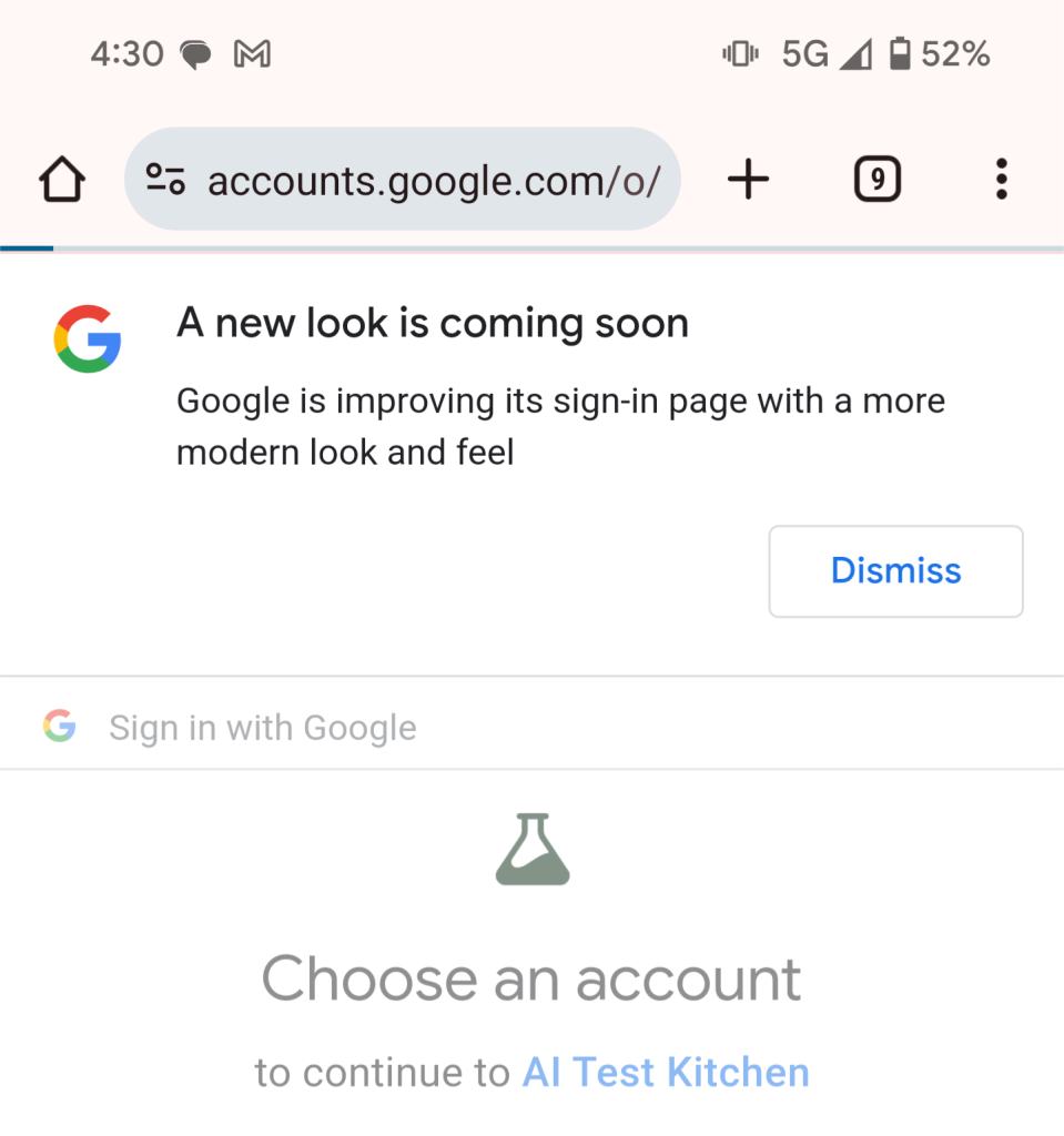
Google has begun teasing that its sign-in page is about to receive a redesign.
In the past few days, many people who have used the company’s “Sign in with Google” OAuth option to log in to a website have been greeted with a message informing them of a new redesign.
A new look is coming soon
Google is improving its sign-in page with a modern look and feel
For now, Google hasn’t offered any details on what this new sign-in page redesign will entail. The only option in the banner is to dismiss.
In recent years, the company has steadily incorporated Material You design elements into its web apps, and it would make sense for the login flow to follow suit. This would fit in with Google’s teaser of introducing “a more modern look and feel.”

Overall, it’s quite wise on Google’s part to let people know about the upcoming redesign in advance. One of the better ways to keep yourself safe from phishing schemes is to notice when something looks different or out of place. If Google’s sign-in page suddenly changed overnight with no warning, some may be suspicious that they’ve clicked onto a website trying to steal their Google Account.
What would you want to see from a redesign Sign in with Google flow? Let us know in the comments below.
FTC: We use income earning auto affiliate links. More.


Comments