Since the big revamp last September, Fitbit has been updating more and more of the mobile app. The latest example is a Material You redesign of Fitbit app settings on Android.
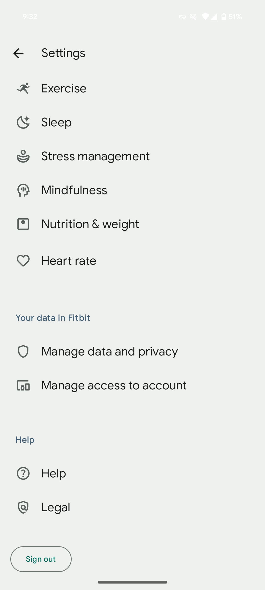
Tapping your profile picture in the top-right corner for Fitbit settings reveals a page redesigned with Material You and icons accompanying each line. Note how the white text of the status bar is barely readable (just like on the new Sleep page).
Up first is a shortcut to the Play Store’s Subscriptions page, while the “App settings” section groups together:
- Date, time & units
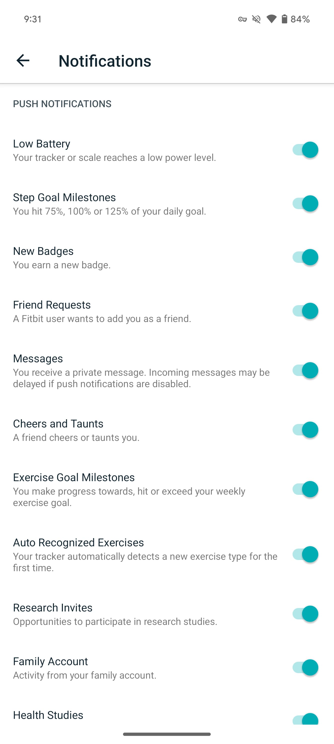
- Push notifications
- Email notifications
- Social & sharing


The first three pages are entirely new, while the last one is a holdover from before. Material 3 toggles are used throughout.
Next you have health-related “Preferences” that are unchanged from before, though Mindfulness is new:
- Activity
- Exercise
- Sleep
- Stress management
- Mindfulness
- Nutrition & weight
- Heart rate


Finally, you have links to “Your data in Fitbit,” “Help,” and a “Sign out” button at the very bottom.
Zooming out, Google still needs to redesign Health Metrics and several other stats pages, like Heart. We’re seeing this Fitbit settings redesign with version 4.19.
More on Fitbit:
- Fitbit app replacing fitbit․com web dashboard in July
- I hope the Fitbit logo remains or: The boringness of the ‘G’
- Hands-on: The Fitbit Ace LTE is Google’s most complete launch in ages [Gallery]
FTC: We use income earning auto affiliate links. More.


Comments