Gboard introduced a Material 3 Expressive redesign of shortcuts in January that is now seeing wider availability for beta users.
Update 6/3: With the latest Gboard beta (version 17.5), this redesign has returned and is now accompanied by a “Customize your menu and shortcuts” message. This banner suggests a wide launch is imminent, though we’re not seeing in the stable channel yet.

Update 5/26: Beta Gboard users as of version 17.4 have lost this shortcut redesign in the past day. Stable users have yet to see this revamp. This is hopefully a sign that Google is ready to widely roll this update out.
Original 5/18: Gboard previously used a grid layout for the shortcuts page. Each item was placed in a small rectangular card, and you could adjust the keyboard (make it taller in Resize) to fit in one view without vertical scrolling.
The Material 3 Expressive redesign places everything in a rounded pill, with two shortcuts fitting into each row. You now swipe left to see the next page of tools.
Old vs. new


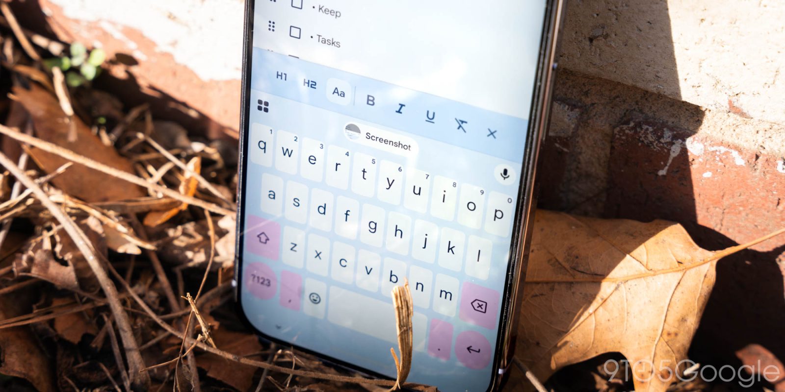
The actual icons are unchanged, with the text labels significantly larger at the right. Unfortunately, some shortcut labels will scroll because they do not fit the container.
You can tap the pencil icon to make edits with more M3 Expressive containers leveraged on the “Hold and drag to customize” page.
Meanwhile, shortcuts in Gboard’s suggestions strip drop their containers, with the back button replaced by a close ‘x’ in the top-left corner.
This follows the Material 3 Expressive redesign of the Gboard Settings page. Over the past week, this redesign has widely rolled out to beta users of Gboard (version 17.3). It is not yet appearing in the stable channel.


FTC: We use income earning auto affiliate links. More.

Comments