
One of the main reasons why so many people love Android is its famous customisability. Google’s OS is notoriously flexible, and despite being already available in a variety of different forms thanks to the OEMs’ re-skinning, the hundreds of apps present on the Play Store allow for further personalization in almost every corner of the system. Toggles, widgets, icon packs and entire lock screen replacements are just a few of the categories of things Android can be user-modified with.
However, particularly after Material Design‘s introduction and a general push towards cohesiveness and consistency across the system, the diverse adaptations of the OS have started to look more and more similar; be it thanks to whiter, more card-based menus, the use of similar toggle icons or the widely adopted carousel-like task switcher, among others, Android has finally started to look and feel instantly recognizable, even when buried deep underneath the oft-poor design decisions made by third parties…
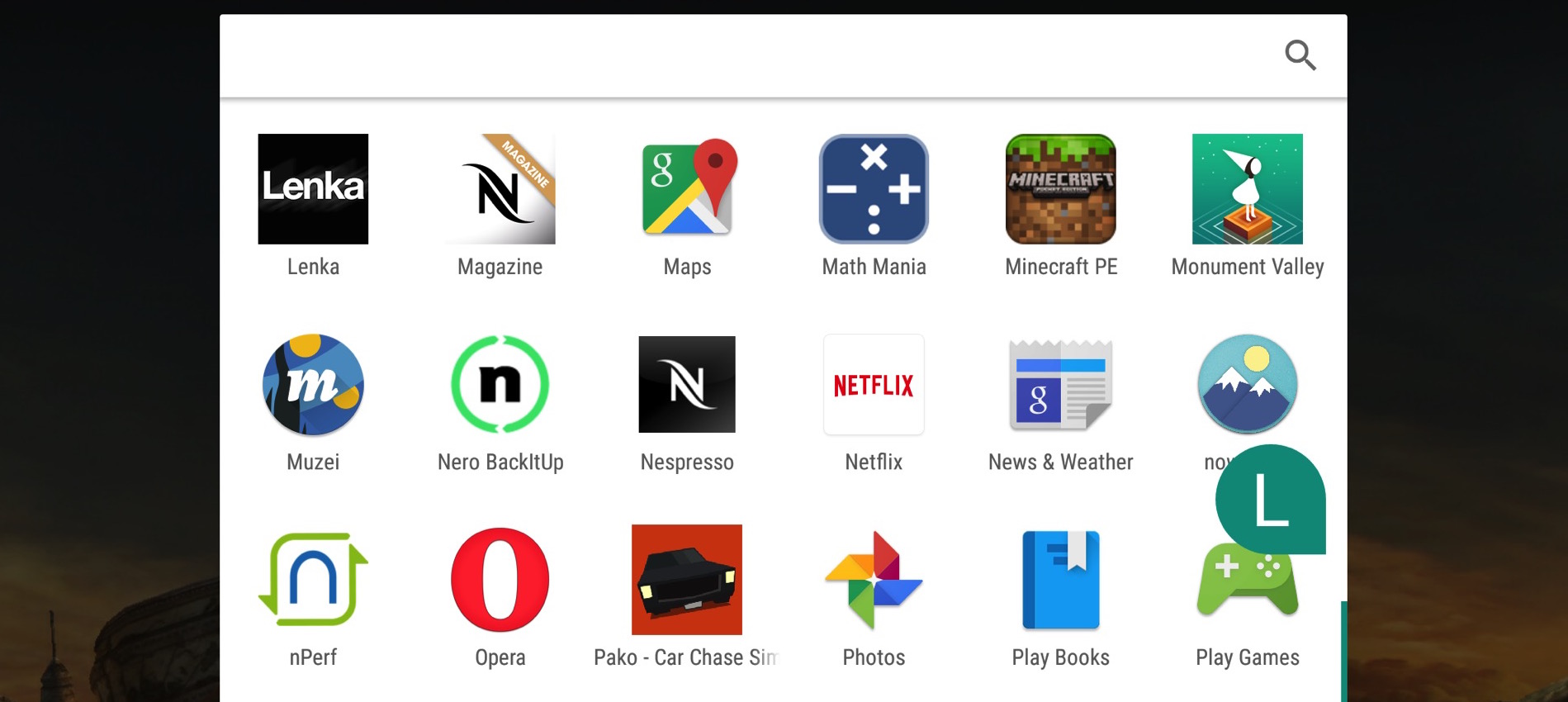
It would be hard, however, not to argue that a distinct characteristic of Android in general is – and has always been – its clear distinction of two separate ‘areas’ of its main screen: a proper home screen on one side and an easily accessible, organized and separate app drawer on the other.
Unlike iOS, which simply stacks all of your apps in an endless grid of non-freely-adjustable icons, Android could always brag its extra oomph of visual appeal thanks to the infinite combinations that custom home screens allow, while keeping all your apps in order in a dedicated, conveniently located place at the same time.
However, rumour has it that Google may be ditching this concept entirely by the time Android N lands, and the recent wave of newly-introduced smartphones may be the biggest indication of this actually happening.
Some initial reports, namely Android Authority‘s, started circulating on the web a few days ago, claiming that current pre-releases of N being tested internally at Google are indeed not using a drawer. That might be just a weird, overlookable thing, but other than a simple hearsay it could be something more solid, as evidence is slowly piling up.
Last Sunday LG introduced its new Marshmallow-running flagship, the G5, which doesn’t use an app drawer at all to begin with, unless you revert back to the so-called “EasyHome”. On the same day, the Galaxy S7 and S7 edge have launched, and Samsung has nested an option in the settings to have it removed. The same goes for Sony and the new Xperia X line: the software is not yet final, but it presents a “Classic” as well as a “Modern” layout nonetheless, with the latter curiously lacking the drawer. Not to miss the party, HTC‘s new One X9, although having the possibility to opt-in, has no drawer by default either.

Now, given that the ones named above are arguably among the biggest Android OEMs on the planet – without mentioning Huawei and its famous EMUI, that long-ago dropped the drawer – I would be crazy not to think that this has got to be something more than just a coincidence; just as I would be crazy not to point out how stupid this entire idea sounds to me.
What scares me the most is thinking that all these ‘experimental’ features introduced with Marshmallow could become default, possibly without even an opt-in option, were Google to formally kill the drawer with Android N’s stock launcher.
For one, the drawer is intrinsically useful. It allows for the homescreen to stay clean and compact, without endless pages of icons placed in a row, while keeping itself logically organized (either alphabetically, according to the user’s usage or just by personal taste) somewhere else.
Removing it could result in a messy iOS copycat, where apps and widgets are blunderingly smashed together. Picture this: you still want your ‘main home screen’, which you will more than likely be able to keep as you love, and then other pages, presumably on the right, where your apps are somehow organized. The moment you decide you want to have your apps set in a different way, say switching from alphabetical order to a most-used-on-top order, how does that change affect your said ‘main home screen’? Does it leave the first screen intact? (And if so, what is the point of ditching the drawer at all?) If it doesn’t, then should we expect to have our home screen constantly messed up? Would app icons still duplicate between the main screen and the other pages?
All these questions raise my second point, which is, of course, the design of it, which here shows all of its power outside of mere aesthetics. In a way, iOS still manages to look clean, both because it doesn’t have widgets (or at least, it does solely in the dedicated part of the notification center) and since all the icons have the same shape. A similar situation on Android would look chaotic to say the least. App drawers helped us prevent exactly this kind of visual hell, and their apparent lack – at least to me – of a clear flaw really makes me wonder why Google would want to move in that direction. Could it be somehow related to a yet completely unknown Android N feature? Maybe; but I would still love to understand why deleting such a landmark, intelligent feature would help achieving any goals.
On the flip side, I have to say that I’m far from a lover of Google’s stock launcher, and least of all the other OEMs’; most lack basic features such as the possibility of removing unwanted apps from the drawer, have no support for gestures and don’t make using custom icon packs possible. Launchers like Nova, and perhaps most notably Action 3 have worked heavily on this, introducing a ton of incredibly smart and useful tweaks I simply could not go back from at this point, — including Action’s side, alphabetically-ordered drawer, one of the most clever ideas I’ve seen executed in a while — all with a brilliant touch of Material love. To see their sales boosted would fill my heart with joy, but the fact remains that this sounds like everything but an intelligent idea.
UI paradigms that are so deeply integrated in the system define patterns that millions (and, speaking of Android, over a billion) of users rely upon, and I cannot think of a single reason why such a drastic — and yet, somehow, massively and rapidly adopted — change would truly be beneficial. I just hope toggles in the notification center won’t be next.
FTC: We use income earning auto affiliate links. More.


Comments