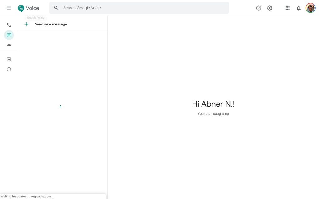
Following design tweaks on Android and iOS over the past month, the Google Material Theme is now rolling out to Google Voice on the web. This is not a drastic redesign, but aids in ensuring visual consistency across all three platforms.
The most notable difference is how the updated side rail features much smaller icons to switch between Calls, Messages, and Voicemail. This Material Theme revamp also adds shortcuts for Archive and Spam that are always visible, instead of being hidden in the side menu.
Users can click the hamburger icon in the top-left to expand the navigation drawer and always display the text labels, but they otherwise appear as you hover over an icon. This expanded view also features the shortcut to “Legacy Google Voice” and a debug option.
Elsewhere in the interface, the “Search Google Voice” field features rounded corner, while help and settings have been moved to the right of the app bar next to the web app launcher and avatar icon.
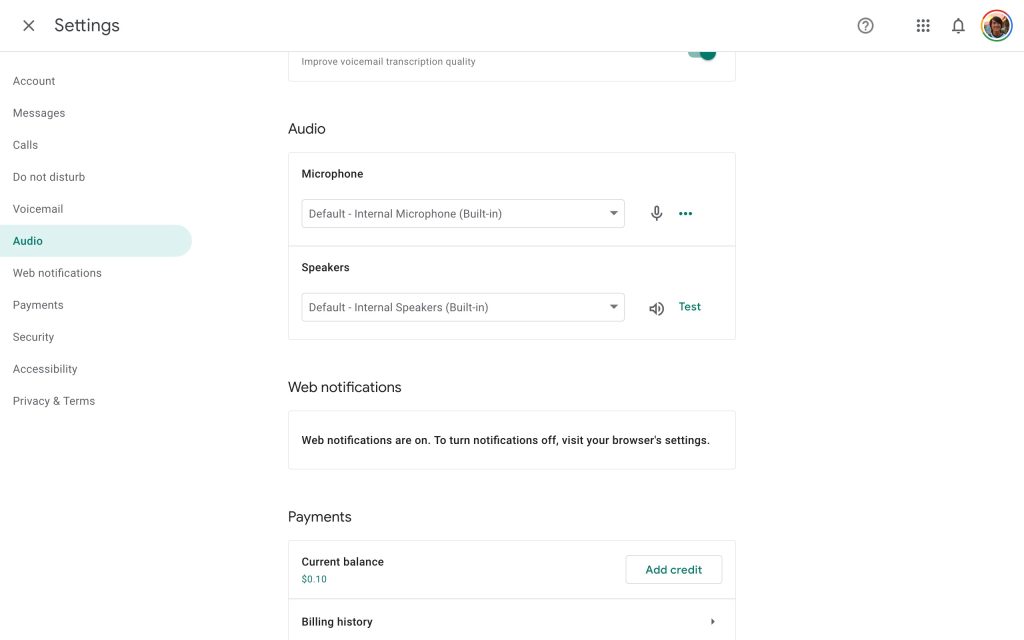
The full-page settings screen makes use of the rounded selection indicators, while the new Material Theme icons with thick outlines and hollow interiors are present throughout. Compared to other apps, Voice mostly retains its green accent color.
This Google Material Theme redesign of Google Voice on the web is beginning to roll out today.
Thanks tipster
FTC: We use income earning auto affiliate links. More.


Comments