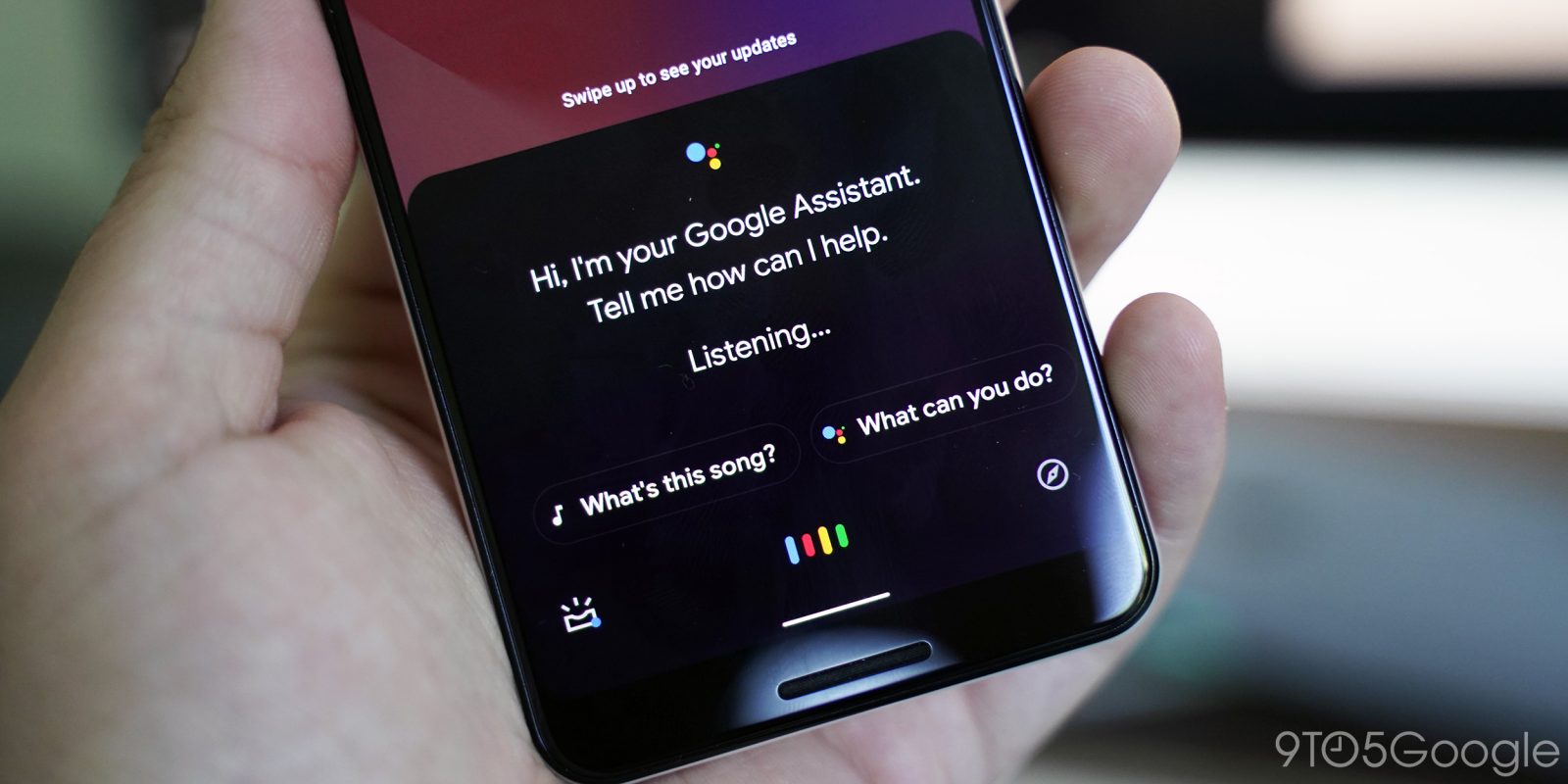
With the launch of Android 10 last week, Google teased night-friendly looks for Gmail and Maps. A dark theme for Google Assistant and Search is now beginning to roll out for some users.
We’ve been tracking development on a dark mode for the Google app, which incorporates Assistant, since April. Limited testing began in June and a wider launch might now be underway. There are several reports on Pixel and Samsung devices with both Search and Assistant adopting it simultaneously.
Update 9/24: After appearing for the first users on September 12th, many on the Google app beta are now encountering the Search and Assistant dark themes. It’s appeared on both Pie and Android 10 devices running Google app 10.65.8 for us. That latest beta release began rolling out last night. In our brief testing, sideloading that version does not enable it, but existing users are having some luck.
Update 10/16: That 9/24 rollout eventually disappeared for most users after several weeks, but it now appears to be returning for beta users of the Google app (currently 10.77) today. Initially, you might notice how Google Discover in the full application shows black article cards, but a white background. Closing the app from Recents will resolve this visual bug.
Google Discover adopts a dark theme that is similar to what’s long been at the left of the Pixel Launcher. The background and bottom bar leverage a deeper shade of gray, like other first-party apps. It’s also applied to the top bar and menu in Chrome Custom Tabs.
Another improvement is in Google Search when browsing through web results. Carousels and colors in Knowledge Panels are adjusted accordingly. Search from the Pixel Launcher has had this look for quite a while now and it was always jarring opening bright results.
Google Podcasts unfortunately does not have a dark theme, but the status and gesture bar are grayed out.
Lastly, the Assistant dark theme was partially live for beta users earlier this year. It’s much needed as the white panel that slides up is very stark against apps that already adopted night modes. It also extends to the Assistant Updates feed of proactive information where the same gray is leveraged.
There are preferences under Google app Settings > General > Theme. Like other first-party clients, options include Light, Dark, and System default.
- Previous
More dark themes:
- Here’s every Google app with a dark mode, and how to enable it
- Here are some third-party apps that support Android 10’s dark theme toggle
- Gmail for Android dark theme begins rolling out [Gallery]
FTC: We use income earning auto affiliate links. More.


Comments