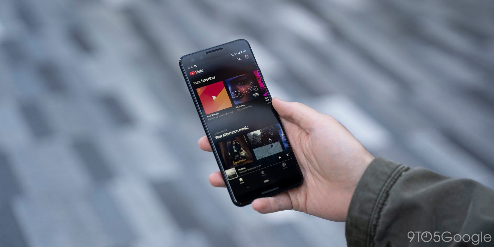
YouTube Music for Android gained adaptive icons this May, but an update in recent weeks broke the implementation. Version 3.43 addresses that issues and adds a dark theme for settings.
Before this release, Android 10 Pixel owners that used an icon shape other than circle — “device default” — just had the logo placed in a white teardrop, squircle, or rounded rectangle. This was an inelegant solution that shrunk and minimized the app’s branding.
Version 3.43 addresses YouTube Music’s adaptive icons issue today, and also tweaks the implementation so that the YouTube Music logo better uses the shape by being edge-to-edge. It’s a minor change, but a pleasant visual detail.
May 3.15 adaptive icons
November 3.42 adaptive icons
Meanwhile, there’s a darker look for settings. The app already has a gray background, but that did not extend to preferences. This is not a dark theme in the strictest sense as there is no light equivalent when the Android 10 option is disabled. Google removed the “General” header, and pitched from dark green toggles to blue accents. Otherwise, it’s just white text against a black background.
There are no other changes this release with YouTube 3.43 widely rolling out via the Play Store.
More about YouTube Music:
- Google’s FreddieMeter AI Experiment rates how well you sing ‘Bohemian Rhapsody’
- New YouTube Music playlists celebrate ‘Songs of the decade’
- YouTube Music rolling out desktop PWA with keyboard shortcuts
- YouTube Music 3.39 for Android adds homescreen widget
FTC: We use income earning auto affiliate links. More.


Comments