
It looks like some users are now seeing a slight redesign of the Google Pay application mimicking that of the Cards & Passes pop-up window with a distinct lack of bottom tabs for browsing.
Unlike the web redesign that has dropped the sidebar tabs, some mobile users are seeing the disappearance of bottom bar tabs for navigation. It’s a far cleaner look that will let you view all of your payment and loyalty cards in one convenient space.
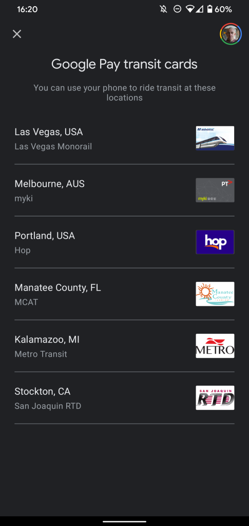
[Update 09/17]: This new Google Pay redesign is now rolling out far more widely for those using the contactless payment platform to manage all of their cards, passes, gift cards, and transit cards. The refresh was initially heading out in a limited capacity but should now be on your device — or will be soon if you haven’t already noticed the change when firing up Google Pay.
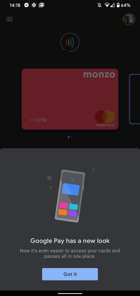
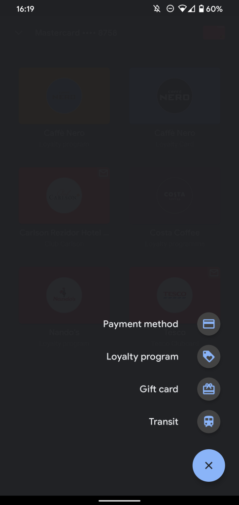
The first time you launch Google Pay after the redesign makes its way to your device, you’ll get a pop-up menu telling you that “Google Pay has a new look” with a “now it’s even easier to access your cards and passes all in one place” message. As we mentioned previously, to add a new payment card or anything else, you can use the FAB menu to add any one of the four cards and passes options (via Android Police).
If you’ve been using the Power Menu shortcuts to access your payment cards and passes, now might be the time to fire up Google Pay and see if you do have this latest UI refresh.
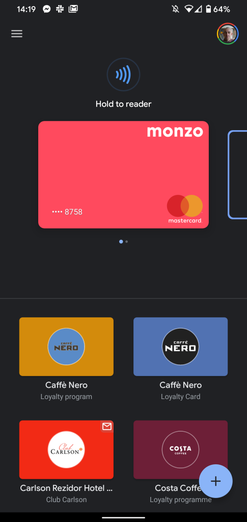
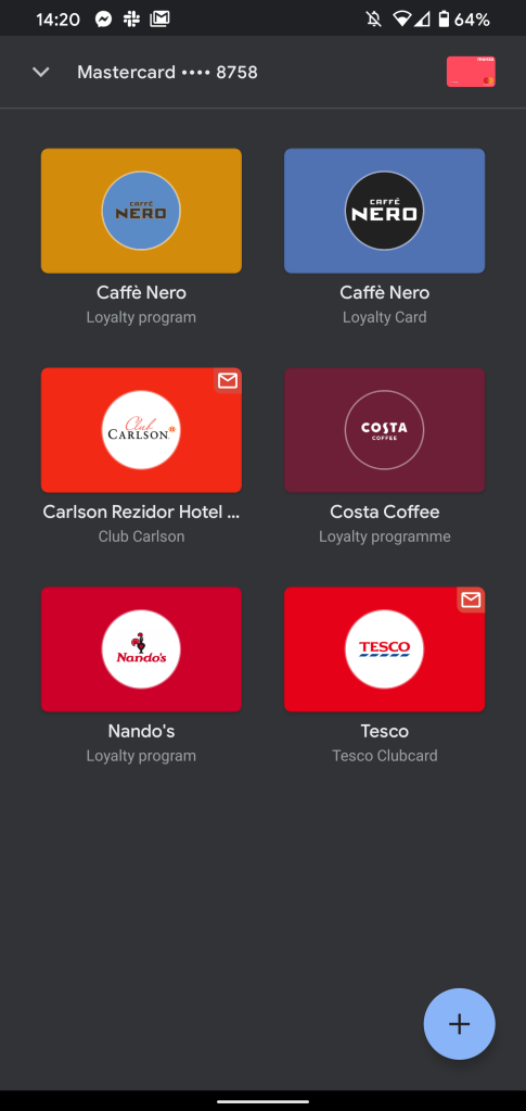
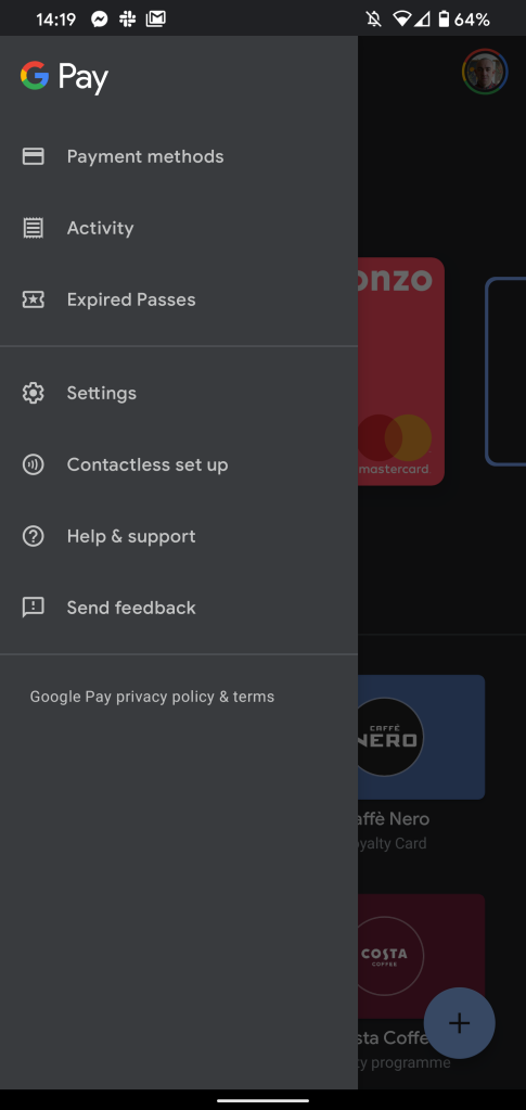
According to Android Police, the rollout of the Google Pay redesign appears to be limited right now. However, they have already spotted the refined UI on their own devices, which moves the “Home,” “Payment,” and “Passes” sections into the side hamburger menu with all of your cards and passes visible in one viewpane.
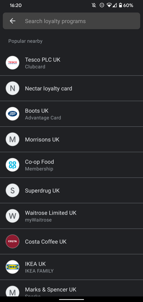
A floating FAB menu will let you add new payment methods, loyalty cards, or passes that will save a few taps and make it easier to manage all of your Google Pay additions. You can still access numerous settings from the side hamburger menu, though.
It also appears that this redesign is being handled by Play Services, rather than Google Pay itself, which Android Police noted when opening the recent app menu. As they note, this fits with the existing implementation within the Google Pixel Power menu, which makes a lot of sense.
Some are reportedly seeing the Google Pay redesign after updating to v20.30.19, but some people running this build have yet to see any changes. We can only assume that this is the result of a server-side change or potential A/B test before a potentially wider rollout.
More on Google Pay:
- Fossil restarts Gen 5’s fall Wear OS update after fixing Google Pay issue
- Google Pay appears to be broken w/ Fossil Gen 5’s latest Wear OS update
- Google Pay to launch digital bank accounts in 2021
- Clean Google Pay web redesign drops sidebar for tabs
FTC: We use income earning auto affiliate links. More.

Comments