Although not necessarily the best calendar experience, Google Calendar is a solid digital diary, but a recent shift to the search button to the top navbar might be one of the best simple UI changes in recent updates.
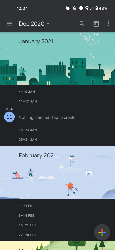
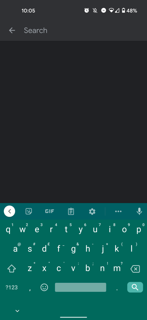
A recent change has now moved the search button (the little magnifying glass that denotes search) from within the side hamburger menu to the top navbar within your main calendar and agenda viewpane. Given that Google is the market leader in Search, it’s kind of weird that it has taken so long to make this kind of usability change.
The change was spotted by Android Police and appears to have rolled out with the latest version of the Google Calendar app on Android. It hasn’t yet been updated on iOS versions of the app, but dedicated support pages are now live, suggesting that it will rollout very soon to all users. You can see the admittedly small search button at the top of the Google Calendar navbar in the gallery below alongside the calendar “Jump to today” button and kebab overflow menu.
Changes have been made to the search feature for Calendar Android! The search icon has now moved to the top of your calendar to make it more easily accessible.
The search icon updates will be launched to Calendar iOS shortly.
We’re sure that this might actually make people more willing to use Google Calendar over other options, simply as the search button is more accessible right from the get-go. As we have mentioned, while the option should be available to everyone already, you may need to update your Google Calendar app to see the new UI button.
More on Google Calendar:
- Android 11’s work profile adds support for showing personal Google Calendar events
- Google Calendar side panel adds powerful Google Maps add-on
- Google Calendar officially rolling out Tasks integration on Android and iOS
FTC: We use income earning auto affiliate links. More.


Comments