
Google is making a tweak to Search on desktop web that sees the results page adopt a more responsive design. Still in testing, it follows the homepage abiding by the same principle.
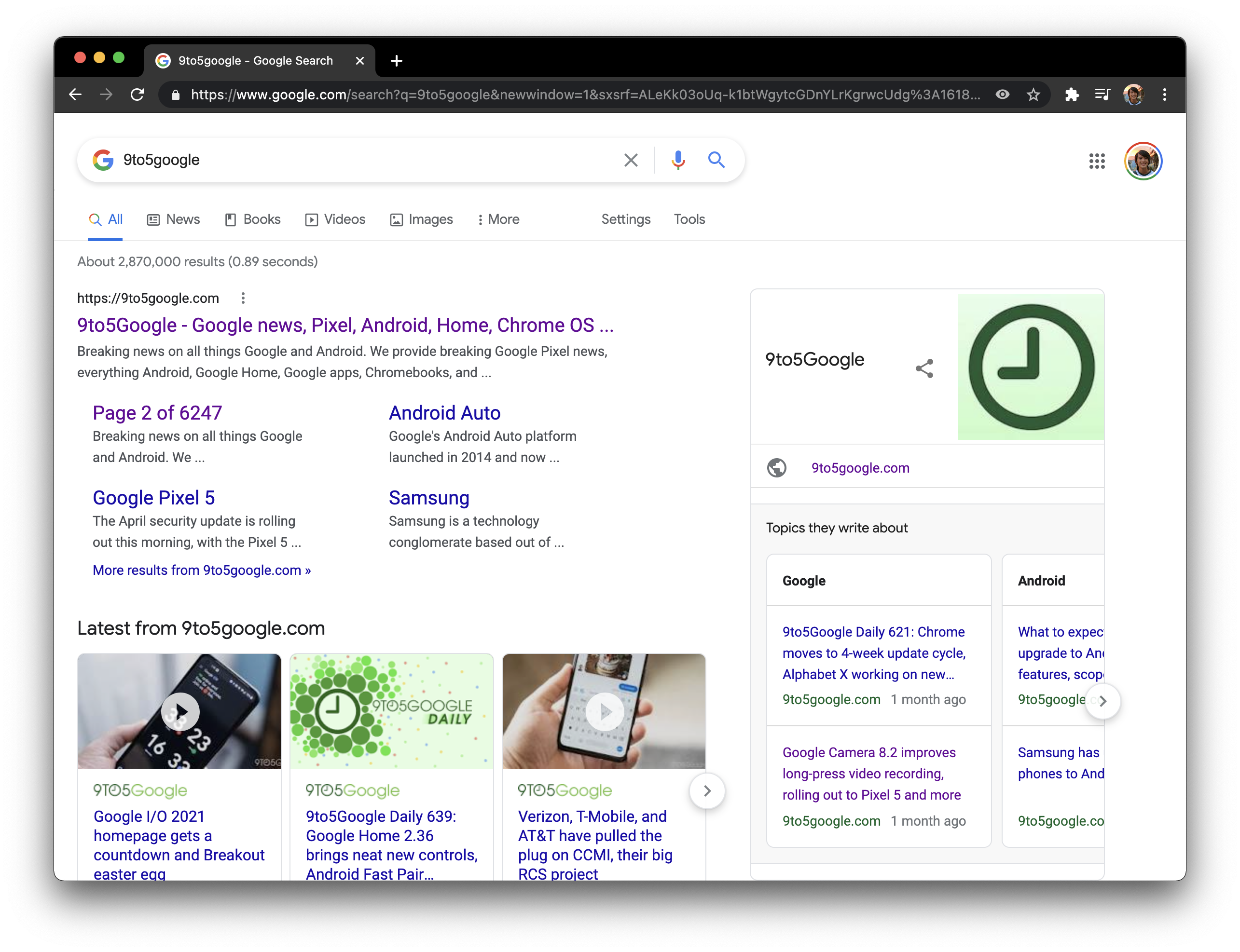
Desktop Search today requires a certain width to show everything, especially for queries that feature Knowledge Panels. Even searches without them tend to hide your profile avatar in the top-right corner.
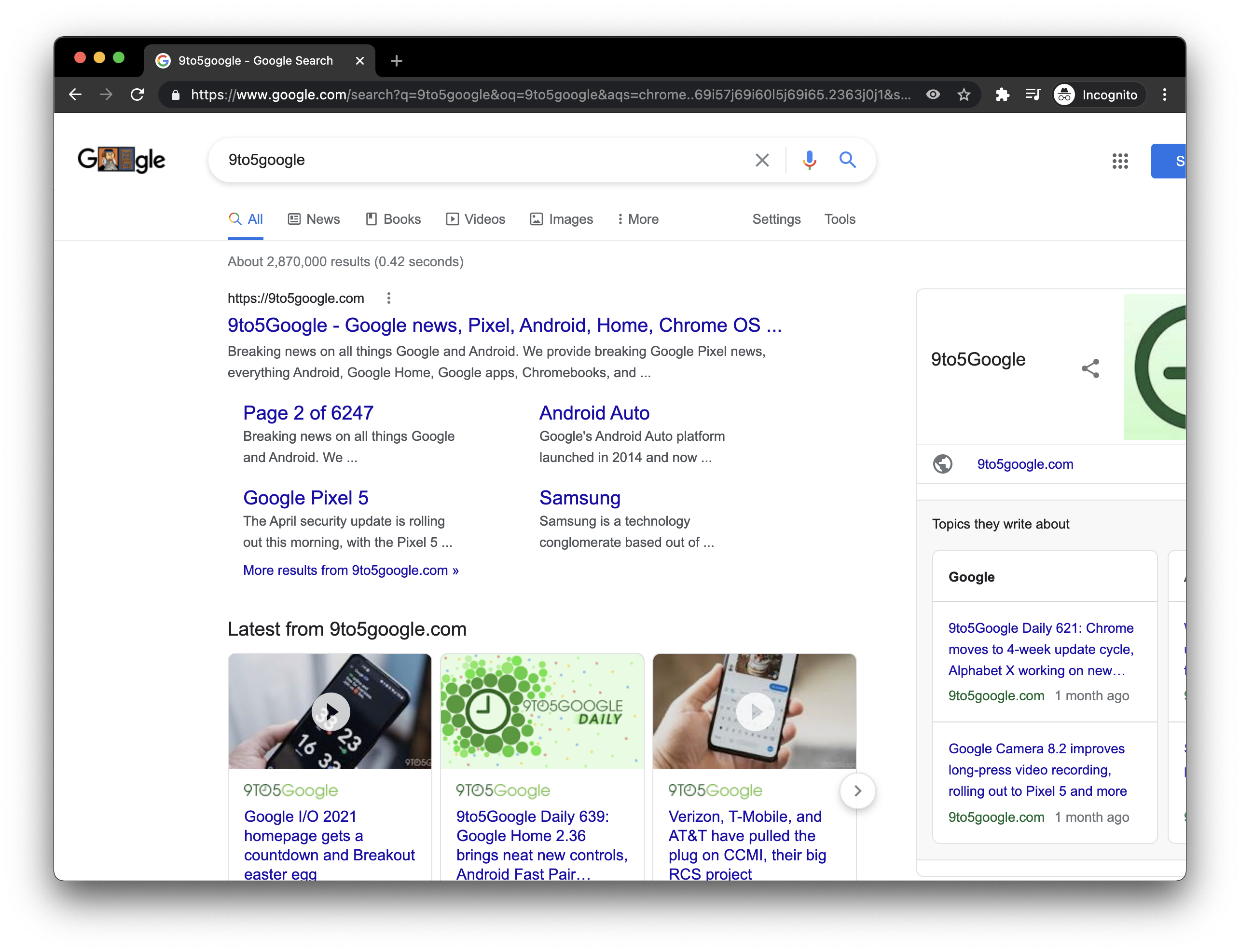
The (mostly) responsive design sees Google get rid of the left column. This removes the blank space to the left of results but also hides the Google logo/Doodle. In its place is just the search pill with a “G” at the left.
This is not a true responsive design in that the desktop Search page does not switch to a mobile layout — where Knowledge Panels move to the top — when you narrow the window all the way. However, it helps show more of Search for those that don’t browse fullscreen on smaller (13~”) laptop screens.
The Google homepage already has a responsive design that’s widely rolled out, but the one for Search results is still being A/B tested.
More about Google Search:
- Search now prioritizing in-depth research when ranking product reviews
- Google Search easter egg celebrates ship getting freed from Suez Canal
- ‘Greatest product of all time’ bracket: Google Search beats Windows in finals [Updated]
- Google adds practice problems, more step-by-step math explainers
FTC: We use income earning auto affiliate links. More.

Comments