
The latest Android 12 Developer Preview 3 build has added a whole heap of features; some are hidden but could soon arrive in upcoming Beta builds — so we’ve been diving in.
While we have already done a deep dive into what we’d formally consider the top user-facing features, the Android 12 Developer Preview 3 also includes a fairly small selection of other additions that we didn’t initially spot or were hidden within the OS behind adb shell commands. Some of these features look as though they are being actively worked upon by Google engineers, and we’re hoping that many will arrive as part of the upcoming Beta program.
As we have mentioned when certain features are uncovered or come to light, there are a few that you won’t be able to get working or enable unless you know your way around adb commands and are happy to tinker with your device. Our disclaimer ahead of time is that we won’t be sharing some of these due to the buggy nature of many of the features that are clearly meant for internal usage. Luckily, evidence and previous years’ previews indicate that some may arrive in the aforementioned Android 12 Beta phase ahead of the full release later this year.
Summary
Video — Hands-on with more features in Android 12 Developer Preview 3
Subscribe to 9to5Google on YouTube for more videos
Android 12 Developer Preview 3: Things to come…
Not everything that arrived in the first Android 12 preview is intended to be user-facing. Much of the new additions are under the hood. Some are outright unavailable and in various states of development. We dug into the first preview, though, and have enabled some features that look likely to arrive in either a future preview of beta build.
Quick Settings overhaul
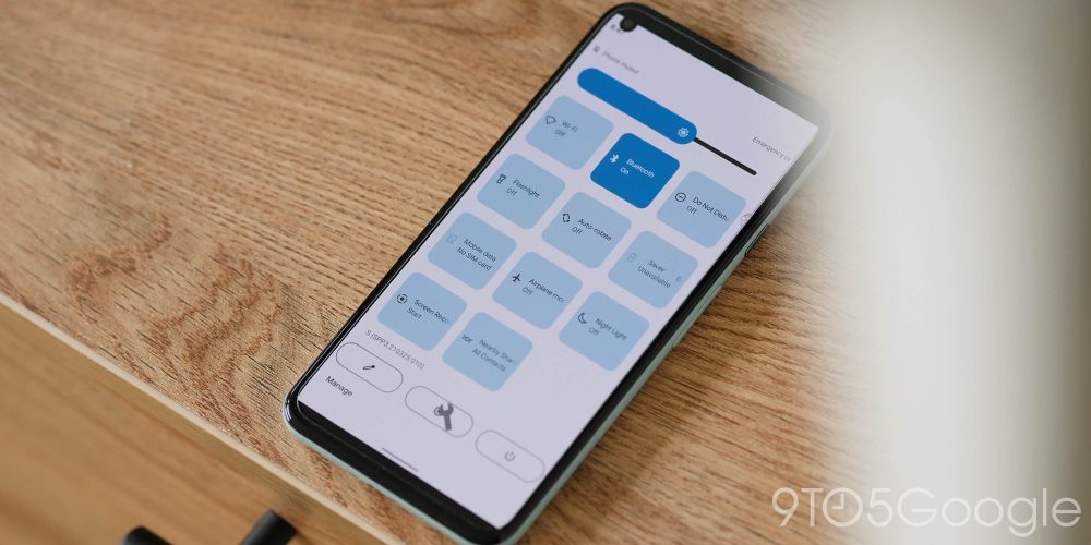
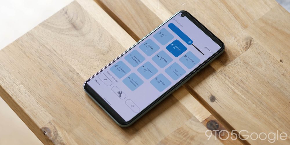
The Quick Settings panel hasn’t changed too much so far throughout the Android 12 Developer Preview phase, but we could soon see a ton of changes that could eventually arrive in future Beta builds. Google could soon be changing the tried-and-tested circular icons in favor of large, squircle-style buttons that take up a far greater portion of the notification shade/quick toggles panel.
You can also see certain UI portions have greater prominence including the “Edit,” “Settings,” and “Power” toggles — the latter option being a brand-new toggle. The brightness control slider has also had an overhaul to match or at least follow the new “bubbly” system UI design and feel. It would be easy to note the similarities between the rounded corners and those of iOS, but there is much more utility on offer here.
It also looks like some system-level quick toggles are set to join the fore, as there is evidence in the Android 12 Developer Preview 3 of a Google Pay and Clock toggle for the Quick Settings panel. This should make wireless payments easier but also allow you to disable the option quickly, while the Clock toggle will likely let you quickly toggle preset alarms and timers.
As part of the “monet” system-wide subtle theming system, you can also see the Quick Settings panel also has a hue that is determined or at least affected by the color of wallpaper you have set. This accenting applies to everything save the actual toggles, which are set within the Wallpapers & themes section. Considering just how much your wallpaper affects the entire system color scheme, it seems like you’ll be able to match up the UI to even greater levels in Android 12.
Game Mode
First spotted in the Android 12 Developer Preview 2, in Preview 3 there is little more information to be gleaned about a potential gaming or Game Mode for future OS builds. We’ve seen multiple Android OEMs build out dedicated gaming modes for devices.
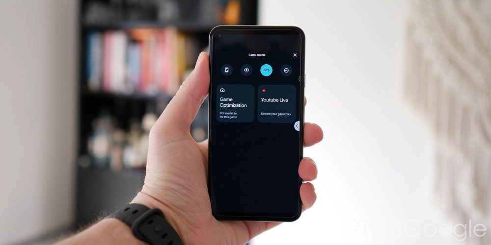
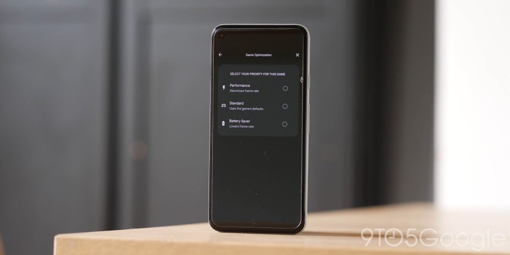
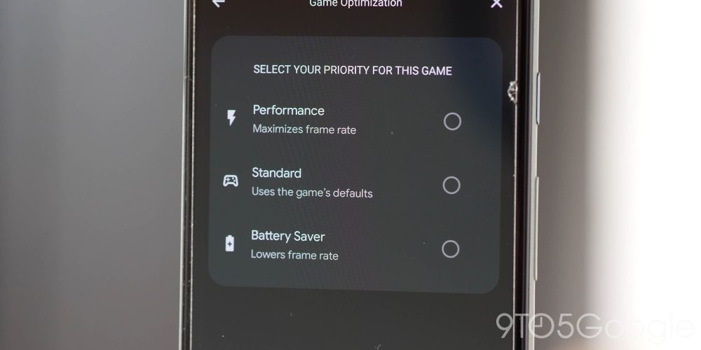
A dedicated gaming mode was one such feature that we had on our Android 12 wish list, and it looks like this new mode will introduce a number of controls and hardware enhancements to get more from mobile gaming. It’s nothing that we haven’t seen from other OEMs like OnePlus and Xiaomi, but the Game Mode in Android 12 will give you option for “Game Optimization.”
The “Performance” mode will maximize game frame rate — likely at the cost of graphical fidelity. While the “Battery Saver” will lower frame rate to ensure that gaming has the lowest impact on your smartphone lifespan. While the “Standard” mode simply uses the game default settings with regard to graphics and frame rate.
This added Game Mode looks like it will also allow for direct YouTube streaming, something that was spotted in the first and second Android 12 Developer Previews but notable nonetheless. A floating toolbar is also present with an option to quickly grab a screenshot, record your display, and a frame rate indicator. There is also the option to enable Do Not Disturb from this menu so that notifications don’t ruin your in-game experience and UI elements are not obscured.
Android 12 Developer Preview 3: Features you may have missed
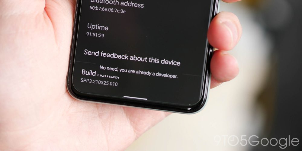
Dark mode now finally includes toast messages
After a long wait, when you see a pop-up “toast” message on-screen, the mini message or warning will now adhere to your preset system theme. “Toast messages” if you were unaware, are basically the little pop-ups that appear at the bottom of the screen with messages/warnings.
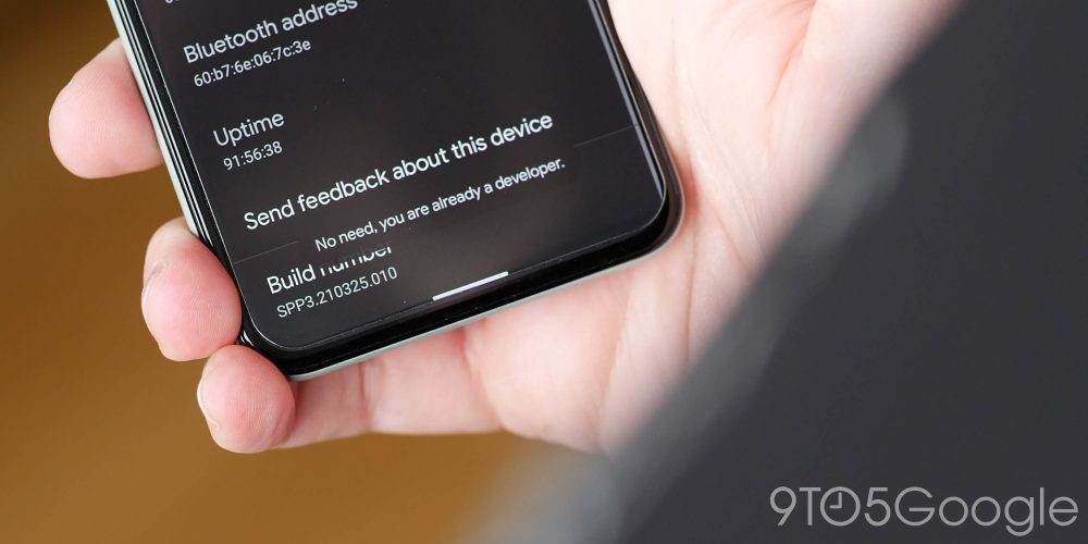
In Android 12 Developer Preview 3, these pop-ups have been on the receiving end of a design tweak that places them slightly higher up on your screen, with a tweaked font. More noticeably, the message now matches your system theme, meaning Android toast messages now support a dark theme. It’s a minor tweak, of course, but it’s one that really helps with overall consistency. One thing to note here though is that the toast message will only appear darkened if the app generating the pop-up supports a dark theme too.
Verified links

In Android 12, Google is making the process of sharing content and opening the right app a little smoother by adding “verified links” that open directly in their designated apps instead of showing an options dialog pop-up. Effectively, the URL that dictates when an app should be opened is now “verified” and will specifically target that app without bringing up the “open with” dialog. It should help simplify and streamline the process of opening links on your smartphone.
Count for bundled notifications

Another minor change but an important one nonetheless. When you receive multiple notifications and are running Android 12 Developer Preview 3, the bundle of these will display a small “count” in the notification shade to inform you just how many message/emails or other are waiting for you within said application. A nice quality-of-life inclusion that helps you prioritize specific apps, contacts, or conversations.
Toggle on/off indicators
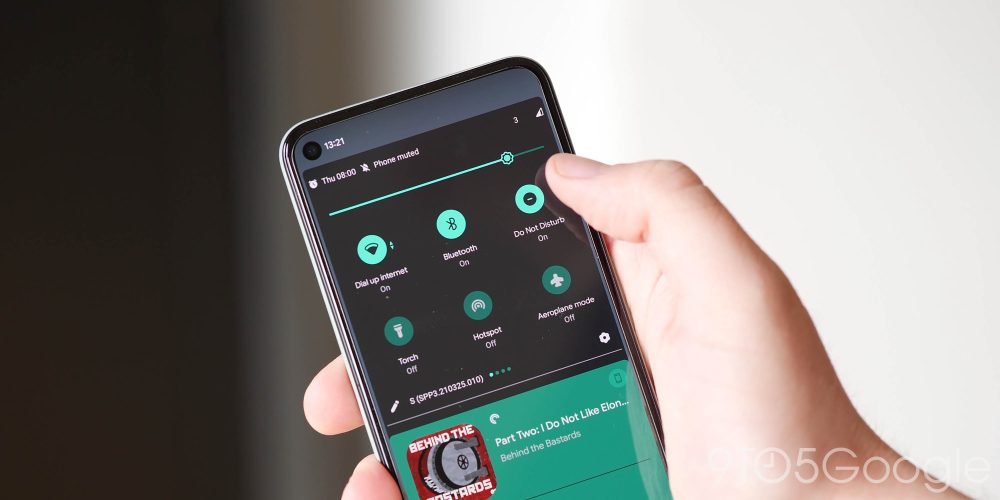
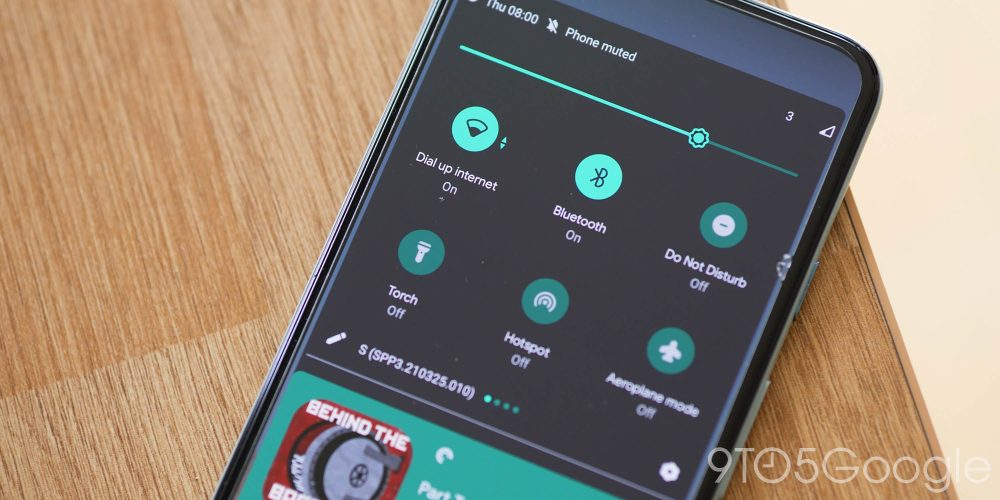
In a future Android 12 build we are fully expecting the massive notification shade Quick Settings overhaul (as above), but for now the only minor change is that of “On” or “Off” text indicators when you have certain things activated.
The text indicators are only available when you fully expand the notification shade. However, they are a helpful aide beyond the fairly obvious visual indicators, especially for those not confident using their smartphone like elderly or very young people. After all, not everyone understands every aspect of their smartphone.
Further Pixel Launcher layout options

The Pixel Launcher gained a 4×5 grid option with Developer Preview 1 in February and is now picking up a second 4×4 layout in Android 12 Developer Preview 3 that notably shrinks the size of app icons. While the Pixel Launcher isn’t exactly the best third-party homescreen option even for Pixel owners, it’s still fairly solid. We’re expecting a few more updates and changes though as the Beta phase opens, but more options are always a good thing.
Audio crossfade with all media players

Probably one of the more frustrating elements when playing audio on Android 12 Developer Preview 3 will be that of the poorly implemented audio crossfade applied to all media players. It’s a tough one to properly explain without audio cues, but if, for instance, you’re playing a podcast in Pocket Casts and tap to play a song in YouTube Music, the audio will crossfade for a couple of seconds before making the full switch.
It actually doesn’t fully crossfade as the outgoing audio will only fade by a few decibels before abruptly cutting out, while the incoming audio starts almost at full volume. It’s quite messy and definitely needs a lot more work before it’s ready. To prevent this, you’ll need to pause one app, enter another, and then press play.
FTC: We use income earning auto affiliate links. More.


Comments