
The long road to a stable Android 12 release is punctuated by the preview phase and the very latest is Beta 5. An already stacked OS is getting yet more tweaks and refinements before it’s ready for the public, and so we’ve been delving into Android 12 Beta 5 to find all the new features and functions.
You have had it drummed in that Android 12 is going to provide one of the biggest updates to the mobile platform for years. It’s drastically different-looking than you’re probably used to. You might hate it or you might love it, there doesn’t seem to be consensus either way at this stage, but new things often warrant some level of critique.
Because of that and the fact that we’re now in September, it feels very much like this has been the longest preview phase to date, and releases have been ridiculously thick and fast. Based upon previous years, we kind of expected Android 12 to be here already, and we now have Beta 5 to get to grips with. If you have already enrolled, you should soon receive an OTA update that contains the latest September 2021 security patch, plus all of the new UI and system-level tweaks coming with this latest update.
If you haven’t already tried the Android 12 Beta and want to sign up, we have a short little guide to help you get enrolled, but this process is very quick and easy. Basically, head to the Android 12 Beta sign-up page, and you can opt-in – or out – to try the latest pre-release OS build for yourself. That is, provided you have a Pixel 3/3 XL or a newer Made by Google phone.
Video – Android 12 Beta 5 hands-on: Top new features!
Subscribe to 9to5Google on YouTube for more videos
Universal device search
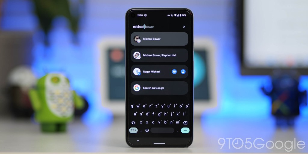
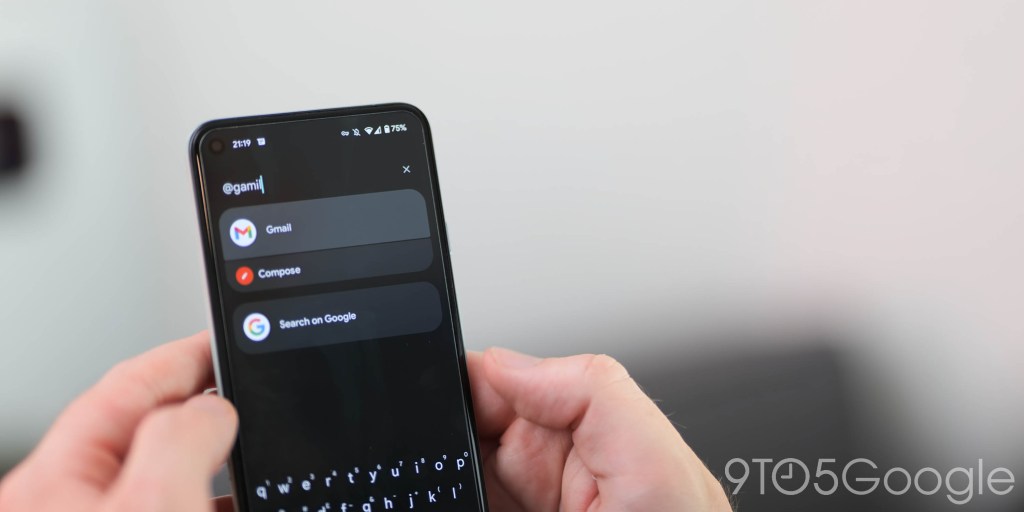
After being spotted in progress with previous releases, the universal device search feature is now fully live and working in Android 12 Beta 5 within the Pixel Launcher app drawer. When swiping up into the app drawer while using the default Pixel Launcher, you can use the top search bar widget to locally search for apps, contacts, and more with ease.
There’s also the option to “Search on Google” should you want more than just local results. You’re also able to set the keyboard to always show when swiping up into the app drawer. The “Preferences” panel allows for finer controls over what will appear in your device searches.
New and updated clock widgets
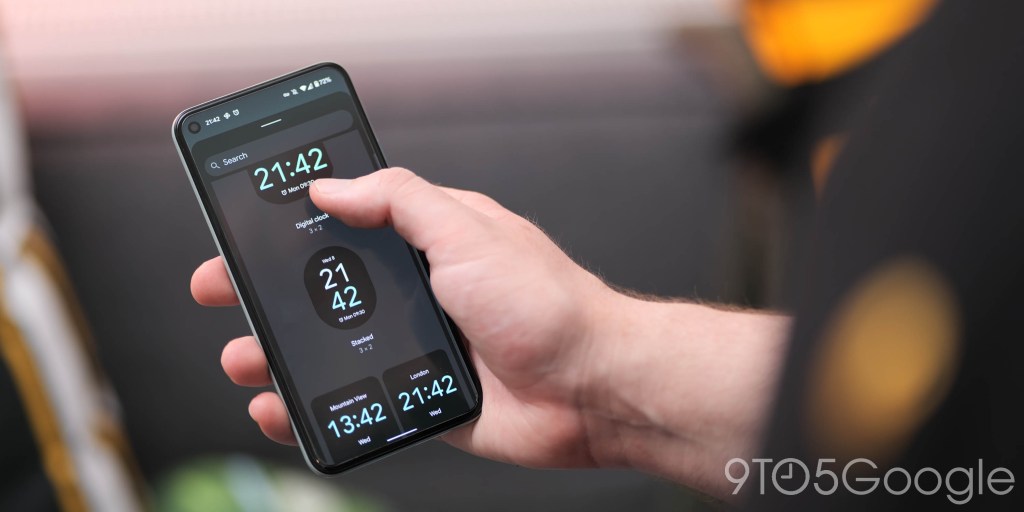
Hinted at in the announcement of Material You back at I/O 2021, the highly anticipated Google Clock widgets have arrived with Android 12 Beta 5. There are four widgets in total; Analog, Digital, Stack, and World. The last one will show time zones outside of your home region if you’ve added them within the Google Clock app. The theme will automatically change slightly between the two widgets, too.
As with just about everything in Android 12, all the colors are a key component. But the colors appear to be pulled directly from your device wallpaper in a more direct sense, rather than the basic color scheme determined by your system theme.
Google Clock 7.0 makeover

With Android 12 Beta 5, Google Clock is yet another app that has picked up a fairly substantial Material You update and UI overhaul. The app includes Dynamic Color tweaks and tuning with all toggles and accenting adhering to your wallpaper-pulled theme.
Rounded corners play a big part with the theming extending to all toggles and preset alarms. The bottom navbar also gets a little softening as when you’ve selected a section, a pill-shaped highlighted icon will be present. But adding to that lovely little animations initiate when you’re switching between “Alarm,” “Clock,” “Timer,” “Stopwatch,” and “Bedtime.”
A neat little easter egg of sorts is that if you have a lockscreen widget on your homescreen and swipe to exit from the “Clock” tab, you’ll get an incredibly slick animation that folds the app into the widget, which is a delightful extra touch.
New Alarm UI
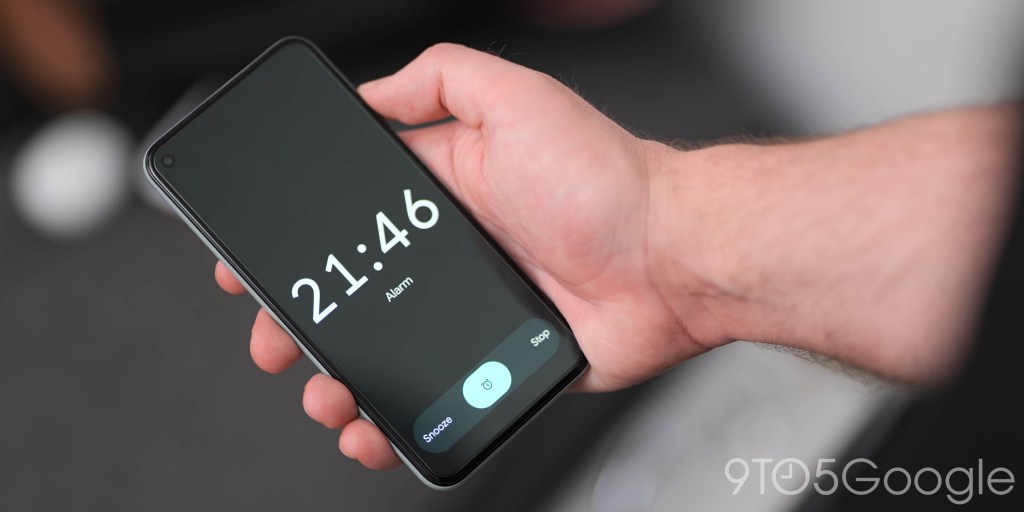
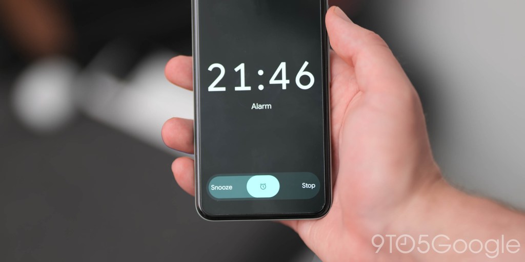
Google has spent a ton of… time on the clock and alarms in Android 12 Beta 5 with a brand new UI coming allowing you to “Snooze” or “Stop” a preset alarm on your device.
Calculator Material You redesign
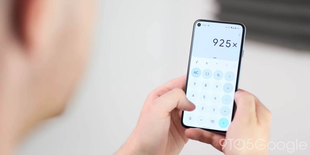
In much the same way other stock apps in Android 12 have been themed to better suit the Material You redesign, Beta 5 now brings us an updated Calculator app. The resesign starts with all of the keys, with circular shapes that now mimic the PIN entry screen but with a slightly different animation.
The expressions are hued to align with your theme, while the number pad is plain and functional. The “AC” and “=” keys are most prominently themed with a colors to differentiate between the two key functions.
Nearby Share pop-up redesign + tweaks
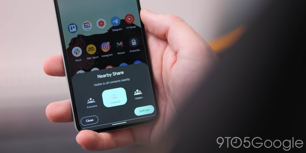
Making it even easier to share things with Android users in your vicinity, the Nearby Share pop-up now includes an “Everyone” toggle when you tap the Quick Settings toggle. This replaces the “All contacts” option, which is now just “Contacts” rather than “Some Contacts” seen prior. The pop UI is also more rounded to better suit the rest of the Material You makeover with animations subtly indicating or highlighting your preference.
Lockscreen AOD tweaks
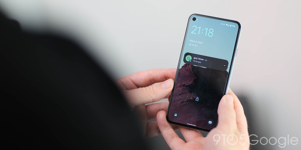
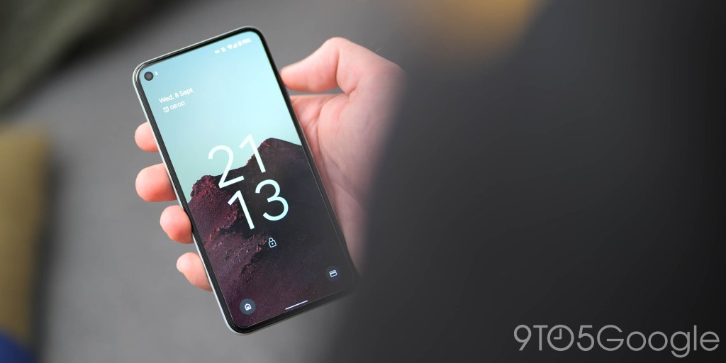
The lockscreen Always-on display is receiving some fine tuning compared to previous updates with the large digital clock moving further down the display and closer to the padlock-locked device indicator. On top of that the date is now slightly larger and in a more prominent upper-left position, but it seems as though local weather conditions are omitted. It’s unclear if this will return in the full Android 12 release or not.
On top of those changes, notifications have moved down to a more central position away from the clock and date widgets. These changes are very minor and make very little difference, but the removal of temperature and weather information is a frustrating one – even if it is temporary.
Home controls on lockscreen
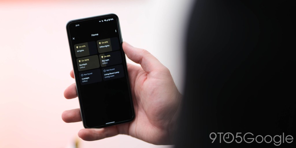
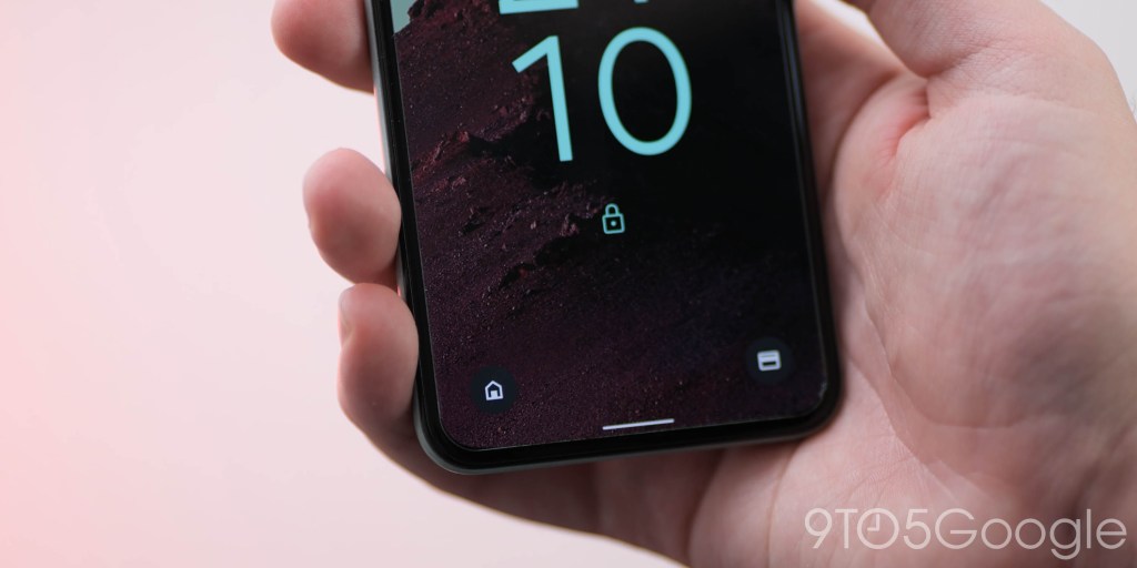
We lost out on the Cards & Passes power button long-press in Android 12, but the new solution is to add lockscreen toggles for similar quick access. Following on from the addition of a wallet icon to the lockscreen, there is a new “Device controls” icon on the left of your lockscreen that will give quick access to any of your connected smart home tech.
The pop menu is the exact same as the one seen when tapping the Quick Setting toggle, with any connected smart home tech able to be controlled after you have entered your device PIN code or unlocked using biometrics.
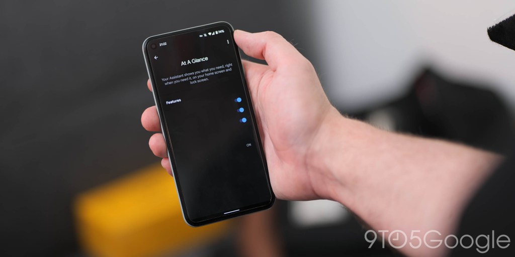
Pixel Launcher ‘At a glance’ customization
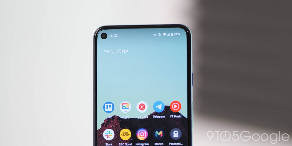
You might argue that the “At a glance” widget that has been a stalwart of the Pixel Launcher for some time doesn’t need to be changed. However, it has received some attention in Beta 5 and maybe not for the better.
The time has been removed and now just includes the day and date information. It’s smaller and in an upper-left position that somewhat mimics the lockscreen. Weather conditions and upcoming calendar events are also a glaring omission in what feels like a substantial step backwards.
We have some good news though as there might be some ongoing work to come with the widget. Accessing the “Customize” screen shows what appears to be some unfinished options and toggles. However, none of these appear to be live in Android 12 Beta 5, so lets hope that the full release returns the existing customization options.
System navigation updates animation

It’s small by any stretch of the imagination, but there is a new animation when viewing or adjusting the “System navigation” menu for “Gesture navigation.” It’s cleaner and there are some changes to the animated UI that is shown – plus the animated hand has been removed here, too.
Easter egg expansion

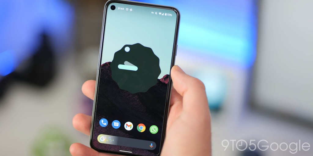
After launching the Android 12 Easter egg with Beta 4, Beta 5 is adding another layer to the popular not-so-hidden secret with a homescreen widget that gives you access to “Paint Chips” that tells you the Dynamic Color palette Material You is using.
You’ll need to activate the easter egg by heading to Settings > About phone > Android version and then tap Android 12 until the pop-up appears. Turn the clock hands to 12:00 and you’ll get the Android 12 logo with Dynamic Color bubbles. Now with that done you’ll be able to add a new “Android S easter egg” widget to your homescreen that shows Dynamic Color selection. Tapping a color square allows you to quickly share.
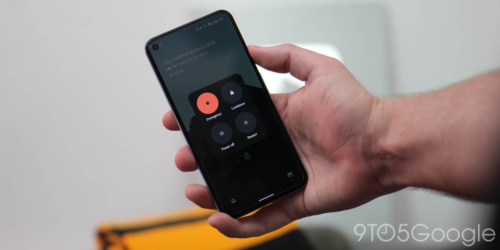
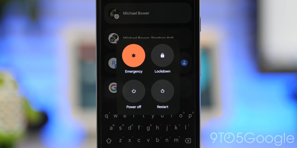
Lockdown mode cannot be disabled
Lockdown mode just turns off notifications and disables biometric unlocking of your device until you enter your PIN and access your device again. In Android 12 Beta 4, the feature is enabled by default and lives permanently in the Power Menu. You’ve probably never used the feature before, but it’s a bit annoying that you can’t disable it – although you do not need to use it.
Android 12 Developer Beta 5: What’s your favorite new feature?
Like any release prior, there are a few nice surprises to unpack in this build. In essence, this makes our small selection likely just the tip of the software iceberg. With that said, these are the most prominent user-facing features that we’ve found after delving into Android 12 Beta 5.
We expect to see more little things that might slip through the cracks over the coming days and weeks. We have a deeper dive into everything that has been added, including some features that require a little work to get fully operational in our full overview.
What is your favorite new feature, or do you have multiple features that you like? Let us know down in the comments section below!
More on Android 12:
- Android 12 Developer Preview 1 hands-on: Top new features [Video]
- Android 12 Developer Preview 2 hands-on: Top new features [Video]
- Android 12 Developer Preview 3 hands-on: Top new features [Video]
- Android 12 Beta 1 hands-on: Top new features [Video]
- Android 12 Beta 2 hands-on: Top new features [Video]
- Android 12 Beta 3 hands-on: Top new features [Video]
- Android 12 Beta 4 hands-on: Top new features
FTC: We use income earning auto affiliate links. More.


Comments