
Material You is the biggest story in Android design in years, but with a full launch of Android 12 around the corner, we haven’t seen many full makeovers to reflect the aesthetic. With Android 12 Beta 5, Google Clock has also picked up a massive Material You update.
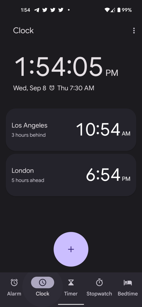
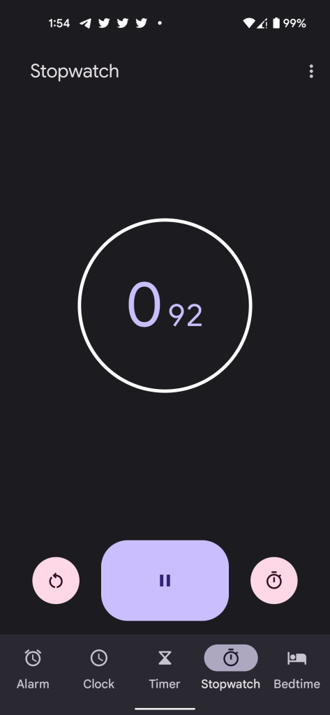
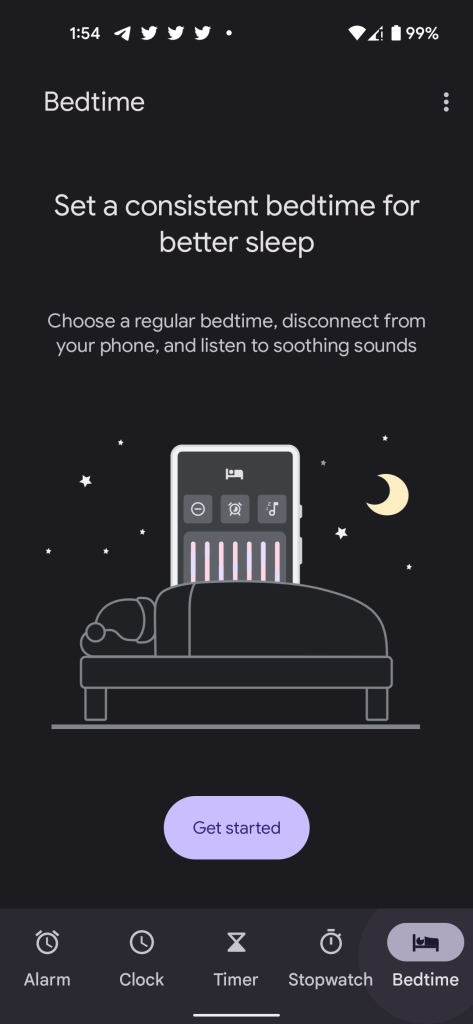
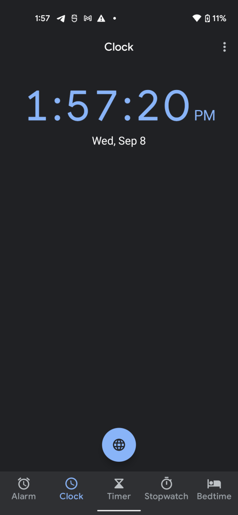
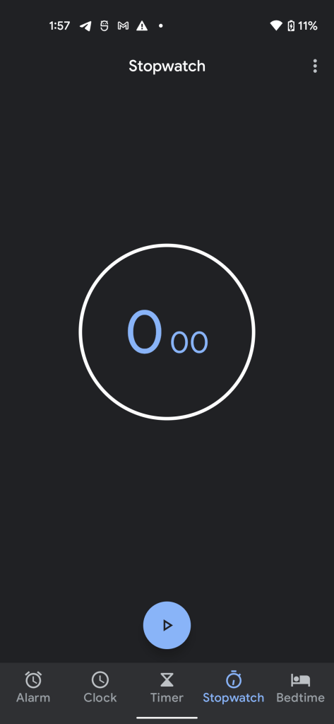
The new Material You version of Google Clock is only a visual update, but it’s a major update by any measurement. The entire app now responds to Material You colors with different elements on screen adopting different colors from your wallpaper/theme.
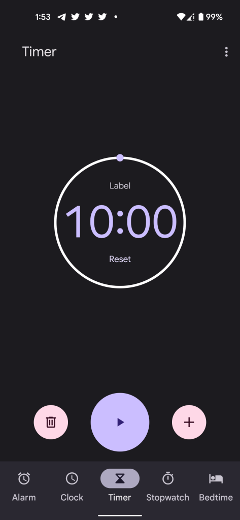
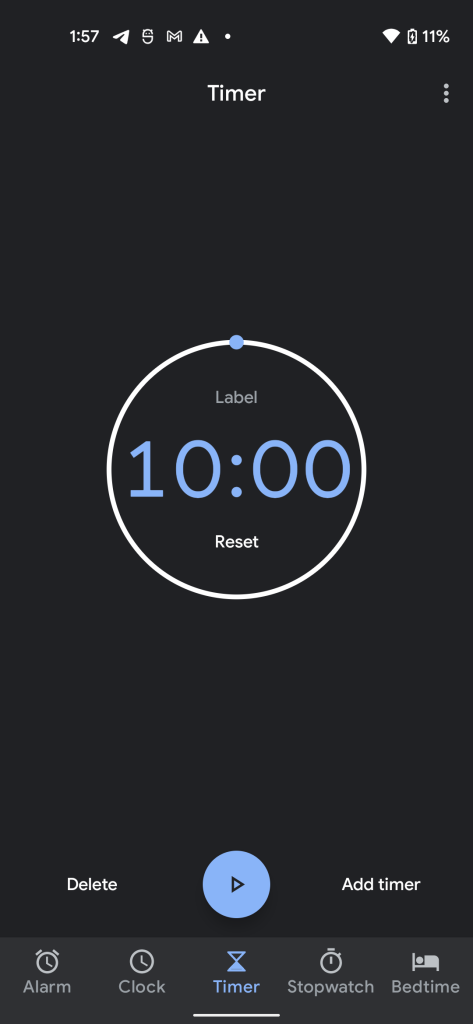
In my case, the app picked up purple and pink accents, but it’s obvious throughout the entire app. The “timer” page is the most obvious change, with a large purple start button and a shade of pink used for the “+” and delete buttons. Those touch targets are also considerably larger this time around, as the comparison below shows.
Notably, too, Google has also added rounded corners to the overflow menu for “Settings” and other options.
The new colors also extend to Google Clock’s truly delightful bottom-bar animations.

The best part, however, might be the extremely slick new animation when closing the app. If the Google Clock widget in on your homescreen, swiping to go home delivers a slick new animation that folds the app into the widget.

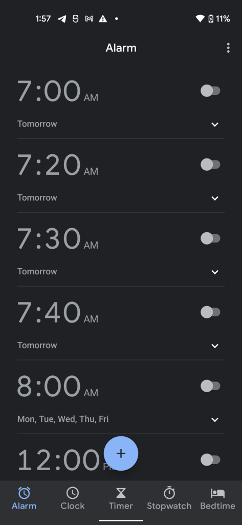
Finally, there’s also a new UI for alarms.

We’re still digging through Android 12 Beta 5 to find everything that’s new. You can see some of the smaller changes in our full roundup and if you’ve spotted something we haven’t, get in touch!
More on Android 12:
- Here’s everything new in Android 12 Beta 5 [Gallery]
- How to get the Android 12 Beta on Google Pixel
- Google rolling out Android 12 Beta 5 ‘release candidate’ for Pixel as final update
- Android 12 Beta 5: Easter egg expands with Dynamic Color homescreen widget
- Android 12 Beta 5: Material You clock widgets have arrived [Gallery]
FTC: We use income earning auto affiliate links. More.



Comments