While an emulator is never the best way to experience software, the newly released Android 12L is one that we simply had to get a closer look at.
At the moment, Android 12L is very much a “work in progress” build and only available via an emulator. That means that you’ll need to download and access the Android Studio to even give this early build a test for yourself. In our opinion, it’s probably not worth the effort for the “average” person out there, but we do have a simple guide on how to get it up and running on a Chromebook or Chrome OS, and it’s relatively easy to set up on Windows, too.
There will be actual Android hardware that will be able to run the Android 12L preview, but the Lenovo P12 Pro tablet is not yet available to buy but is set to ship very soon. That’s all by the by, as once it’s up and running, there are a few things you can try. When booting up the Android 12L emulator for the very first time, it’s actually difficult to ascertain what has changed, but things instantly become obvious when you start to play around with things.
Video — Android 12L early hands-on: What’s new? [Video]
Subscribe to the official 9to5Google YouTube channel
Multitasking tweaks and enhancements
While multitasking is by no means a mess on Android, Google is set to tweak the experience for larger displays and foldable devices with Android 12L. To make better use of the space available, this updated multitasking or “Recents” pane shows one app in large view with a new “Split” shortcut underneath. This added shortcut will allow you to skip the long press of app icons to get a secondary app on-screen which is a neat timesaving toggle.
All other applications within the Recents section are minimized in a 4×4 grid toward the left of your screen. You’re able to tap the floating app icons to quickly enter split-screen using the “Pin” toggle, but the experience remains the same while increasing the on-screen app information.
Taskbar
The “taskbar” looks set to be a huge component within Android 12L for devices with large displays. This looks very similar to the taskbar you’ll likely have seen on Chrome OS hardware. This only appears when you have an app open, but unlike a customizable dock, it mirrors the dock you’ll see on your homescreen — and is limited to just five applications.
Double-tapping does let you hide this, but at least at this stage it can be buggy and doesn’t always appear to work. This effectively just gives you quick access almost like on a desktop PC or laptop to your most used or regularly accessed applications at the expense of a little screen real estate.
For those worried that this will come to “normal” smartphone screens, in our testing, it doesn’t activate on smaller display sizes and only appears by default on larger panels — which mirrors the official developer documentation.
Split-screen
It’s also worth noting that this updated split-screen mode is very much tied to device orientation in Android 12L. If a foldable device is in Portrait Mode, windows can only be stacked on top of each other, and in Landscape mode, the split-screen windows will only work side-by-side. As one of the few OEMs with mainstream foldable devices on the market, Samsung’s method in One UI differs from Google’s implementation in that it allows for either option at either orientation. We’d wager that this will change as Android 12L develops and matures ahead of release later next year.
Split-screen mode works in tandem with the taskbar, as you’re able to drag and drop icons from this dock to initiate the dual-app view. The screen will “highlight” either side of the display where the app will be opened to help you ensure the perfect orientation. This feels incredibly intuitive even at this stage, but feels eerily similar to the implementation already used by iPadOS. However, that is not a bad thing, as it just highlights how smooth the feature is.
Notification shade
Yet another area that has received some work in Android 12L is the notification shade. This is an area that has seen a number of tweaks, courtesy of Android 12, but 12L enhances this quick panel on larger displays. Instead of just a single pane, the notification shade is split into two columns. The left section contains an expanded eight quick toggles, with your notification log to the right. You can expand the notification toggles out as you would on a “regular” smartphone running Android 12. This gives you access — via a left swipe — to any that you can’t instantly access or are hidden.
While this is undoubtedly a good change, it feels a little less useful when you have no notifications present. There is a ton of whitespace that can make the new notification shade feel sparse or barren as a result. Some might consider this a negative, but it is slightly better than the current implementation for larger displays.
Settings menu
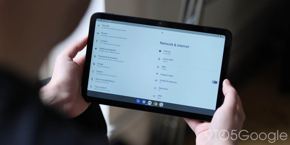
In much the same way the notification shade is being tweaked to take better advantage of larger displays, the Settings menu is also set to introduce a two-column approach within Android 12L. Effectively, this should save time having to “open” a specific section within Settings as the left side of your display will include the list of sections, while the right side will include the specific toggles and options associated.
For foldable devices and tablets, this will make a big difference, as all of your screen real estate is utilized effectively in one view pane. You may remember the side hamburger menu from Android Nougat – this new change in Android 12 L proves to be a substantial improvement over that previous implementation.
Deeper Material You + Dynamic Color tweaks
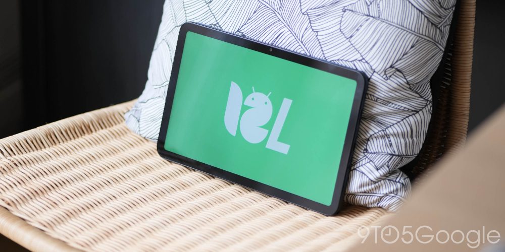
The upcoming Android 12L release now includes more tweaks to the wallpaper-based Material You theming with a slight and almost missable tweak to the boot logo. When rebooting or booting up a device running Android 12L, the actual “G” logo color will adhere to your system theming. This is currently limited to the dark theme, and it’s unclear if it will be limited to Pixel hardware.
FTC: We use income earning auto affiliate links. More.


Comments