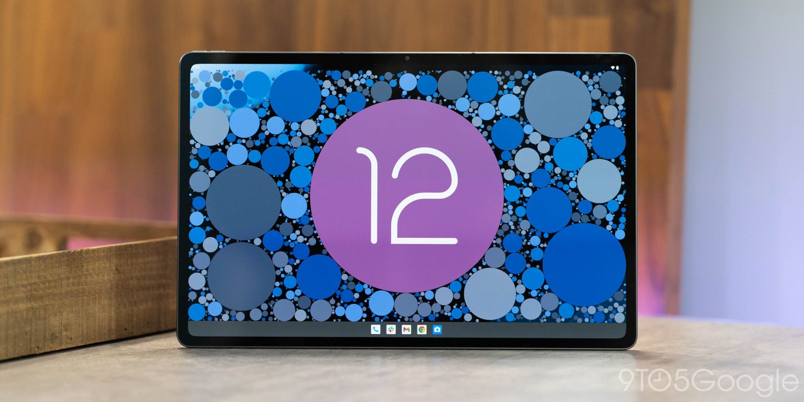
Google’s efforts to let Android better serve bigger screens is culminating in Android 12L, but the company’s decision to abandon in-house tablets leaves the upcoming version without a device to call home. However, the recent launch of the Lenovo P12 Pro gives Android 12L its one and only official large-screened development device – Here’s what it looks like.
What does the Lenovo P12 Pro offer?
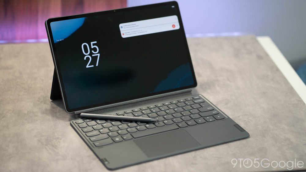
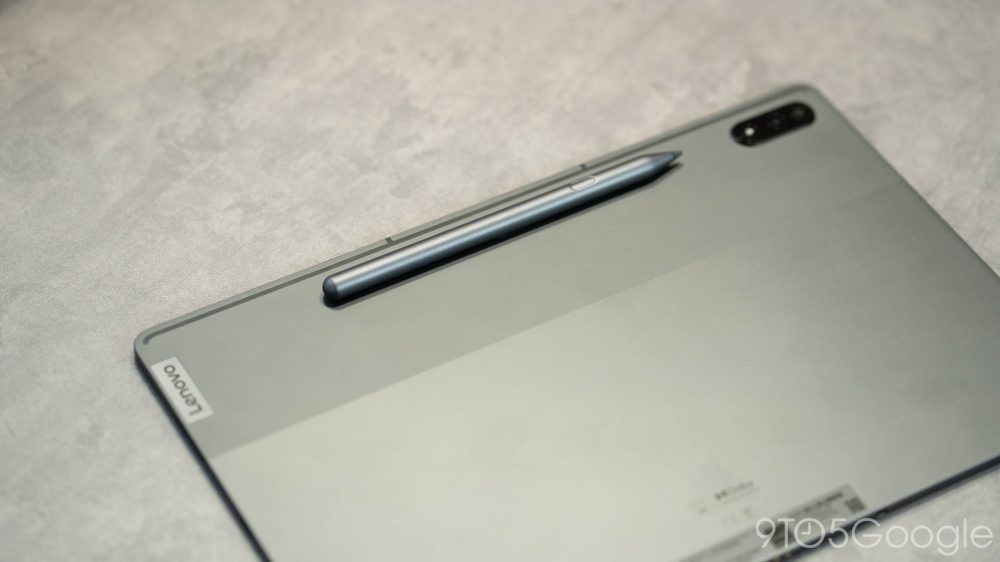
The Lenovo P12 Pro is, as mentioned above, the one and only tablet currently supported for the Android 12L developer previews and beta program. The $630~ tablet is a super-sized device with a 12.6 inch AMOLED display, included stylus and optional keyboard, and high-end Snapdragon 870 chip paired with 6GB of RAM. While it’s not the single most impressive Android tablet out on the market today, it’s a rare breed.
And really, I think Lenovo pretty much nailed it. The hardware here feels premium, and the size is a decent compromise between a massive screen and feeling too big, as I often feel with tablets over 11-inches. The Lenovo P12 Pro has great speakers, a good accessory lineup, and the performance on its stock Android 11 build was more than acceptable in my time testing it out.
But the point of attraction for the P12 Pro right now is that it supports Android 12L. Lenovo offers official Android 12L builds for the tablet that are specifically designed for developers. However, I will say that flashing those builds turned out to be a pretty big ordeal. It’s not as simple as flashing a beta on a Pixel, and the process led to a boot-looping device. Thankfully, Lenovo was able to finally help us get the beta running, but this is something to keep in mind if you’re considering buying a P12 Pro solely for the purpose of running Android 12L. It is not easy.
Does Android 12L improve the experience at all?
The real question with Android 12L at this point is if it’s going to manage to improve the experience at all. As it stands today, stock Android is not very well suited to big screens, but changes in 12L are meant to address that.
In this very early state, it’s hard to see how much of a difference Android 12L will make on a tablet like the Lenovo P12 Pro. These early builds are fully stock, and frankly aren’t well optimized for the hardware. Despite running natively, it feels like I’m running software that wasn’t designed for this tablet at all, with small icons and a clock that’s buried in the bezel really detracting from the experience.
That said, we can see how some of Google’s changes will shine through.
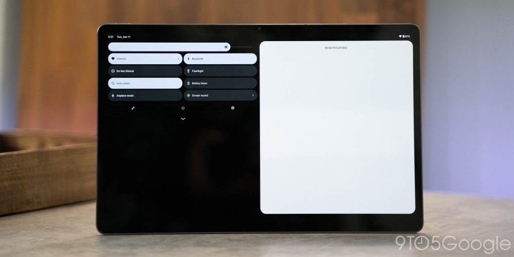
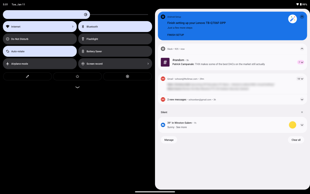
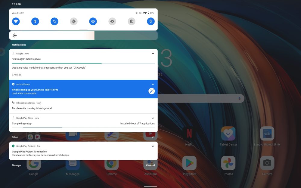
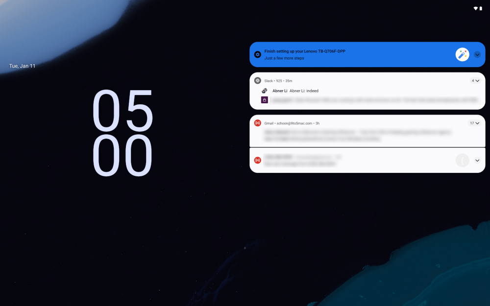
The notification shade is one of the obvious points that differentiates Android 12L, but I struggle to call it a better experience on this tablet in particular. The new notification shade covers up the entire display, whereas the old one only covered roughly half of the display. The advantage of the new design is that most quick settings are visible with a single swipe, but it also feels like a lot of screen real estate is being wasted, much like on Apple’s take on a tablet notification shade. I’d have loved to see the Quick Settings show more constantly, but right now it still shows the same pages of eight you’d see on a smartphone.
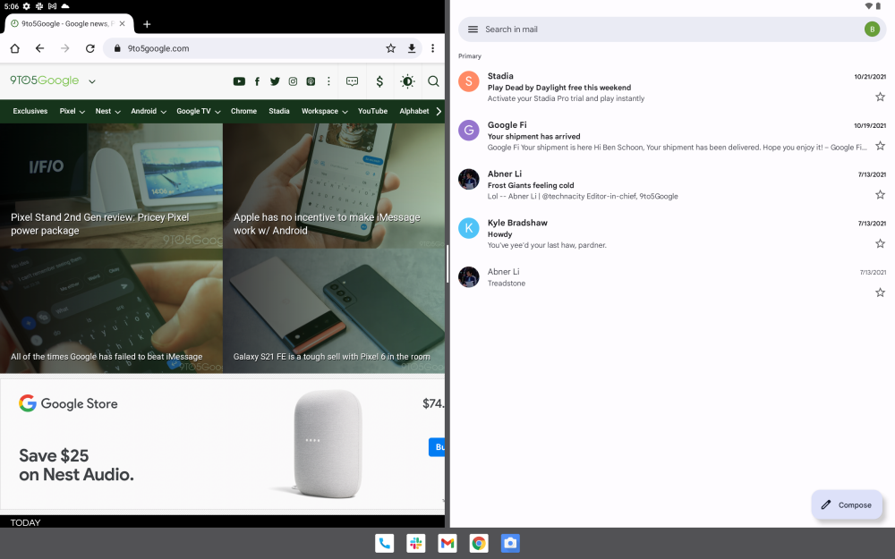
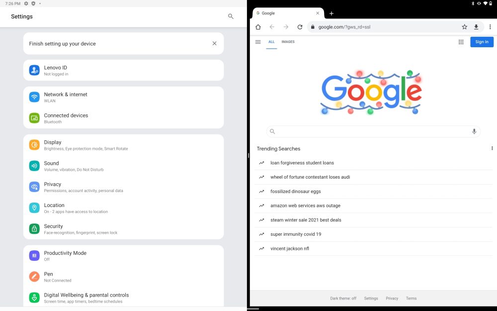
Another place where Android 12L makes noticeable changes is the multitasking setup, and this is where I felt real change and advantages. Android 12L adds a new shortcut for launching apps into split-screen and, beyond that, the constantly visible taskbar.
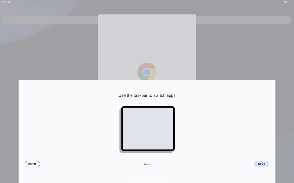
In our previous testing through an emulator, it was hard to envision exactly what the taskbar would feel like on a physical device, but I’m happy to say it feels natural and intuitive. The taskbar eats up very little space and makes switching between apps as well as launching apps into split-screen an absolute breeze. Further, I was able to see on the P12 Pro that Google has a tutorial for the taskbar that teaches users how to minimize the taskbar with ease – a simple long-press minimizes or restores it.
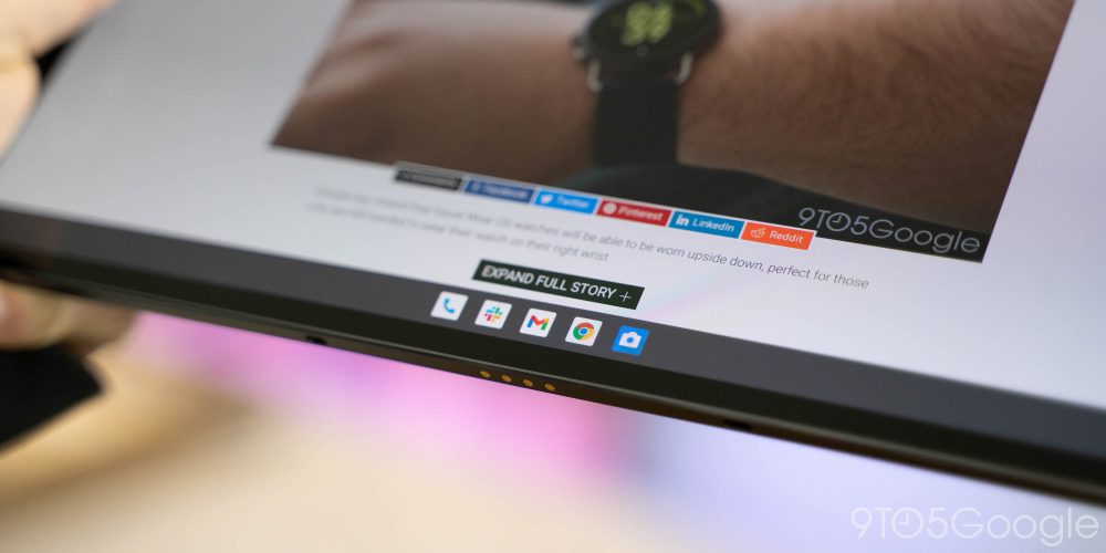
Compared to Android 11, this one change really makes a big difference in how productive you can really be on your tablet and how quickly you can get things done.
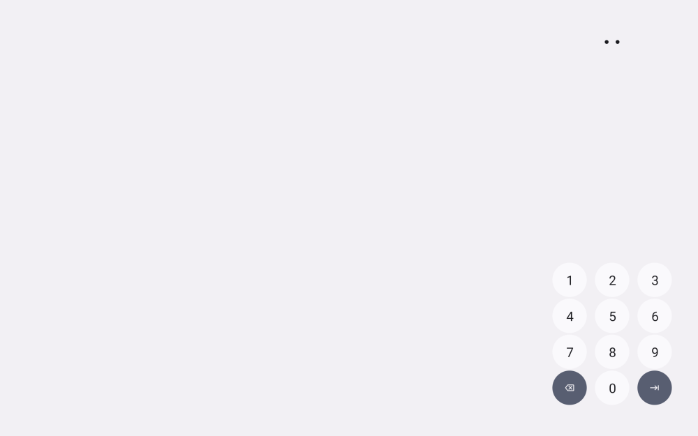
Another nice touch I quite enjoyed was on the lockscreen, where the PIN pad automatically moves to the side of the tablet you last touched to make unlocking a bit easier. Handy, considering this in-development build actually doesn’t support Lenovo’s fingerprint sensor.
But, it’s also clear there’s a lot of work to do. This current build of Android 12L that Lenovo has provided for the P12 Pro appears to be based on the original developer preview, not the more recent beta available on Pixels. It still lacks the revamped side-by-side settings menu and has extremely small homescreen icons compared to the overall size of the tablet. Fine-tuning will definitely be needed before this is ready for primetime.
While I’ve not really used Android 12L in depth at this point, my first impression at the moment is that it isn’t truly solving the core problems tablets face. Moving around some UI elements and a taskbar help, but it’s going to take time for app developers to really solve the biggest problem, which is apps that ignore larger screens. The saving grace here is that Google’s seemingly renewed interest in actually trying to make Android a better platform for tablets might inspire the apps to follow suit.
As it stands right now, it feels more like Google’s efforts so far are better suited to small tablets and foldables than they are 13-inch behemoths like the P12 Pro. It will be especially interesting to see how Lenovo and other Android partners alter Android 12L to their own needs, and how much of Google’s lead they’ll actually follow.
Stay tuned for our continued coverage of Android 12L, including the next beta which should be coming very soon.
More on Android 12L:
- Android 12L Beta 1 hands-on: Top new features [Video]
- Microsoft Surface Duo’s Android 11 update is right around the corner, Android 12L next [U]
- Here’s how the Android 12L taskbar works and what it looks like on the Galaxy Z Fold 3
FTC: We use income earning auto affiliate links. More.



Comments