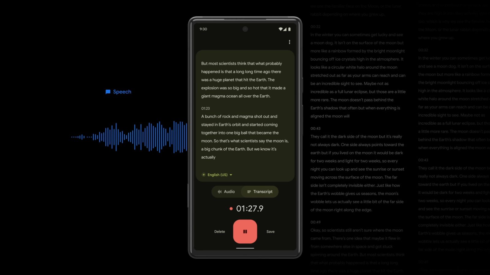
Back in October, Google updated its excellent Recorder app with a redesign. Version 3.5 of Google Recorder is rolling out today with a handful of Material You tweaks and a Quick Settings tile on Pixel.
The changes are primarily found on the recording view, though spacing has been improved on the homesceen and scrolling animations fixed on 12L, while there’s a small UI tweak (bar introduced) made to search.
It starts with the play/pause button switching from a rounded rectangle to a circle that is flanked by buttons to rewind 5-seconds and skip 10-seconds that are much larger than before.
Moving up on the screen is how the Audio and Transcript buttons are now housed in a pill-shaped switcher. At the same time, Recorder’s top/app bar with buttons for editing, search, and the overflow menu are no longer part of the audio waveform window and now have the same background as the bottom of the screen.
These changes are also found on the live recording screen where the pause/resume button is ever so slightly narrower.
Elsewhere, Recorder now has a Quick Settings tile that quickly lets you start a new session and then stop/save it. It also happens to note pause states, and can complement the notification. Other transcription apps offer a similar shortcut and it’s quite useful to have in Google’s.
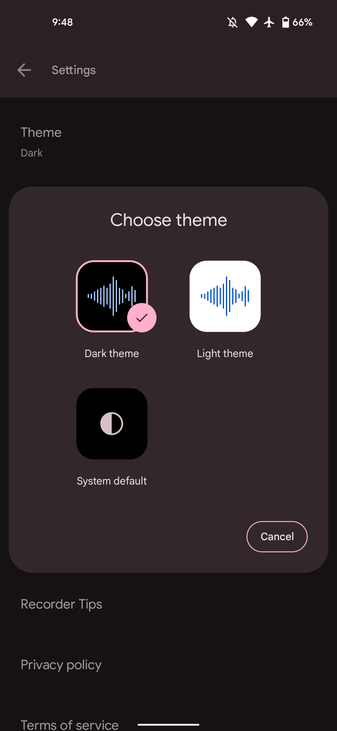
Under Theme in Settings, you can once again choose “System default” in addition to the manual Dark or Light backgrounds.
Version 3.5.430636922 (versus 3.0.4x) of Recorder is rolling out via Google Play to Pixel phones today. It’s not yet widely available for all users and we’ve only received it on one device this morning.
More on Google Recorder:
- Recorder gets Material You redesign, support for French, German, & Japanese on Pixel 6
- Google Recorder wider English dialect support begins rolling out
- Recorder 2.2 rolling out with Pixel audio backups, web app
FTC: We use income earning auto affiliate links. More.


Comments