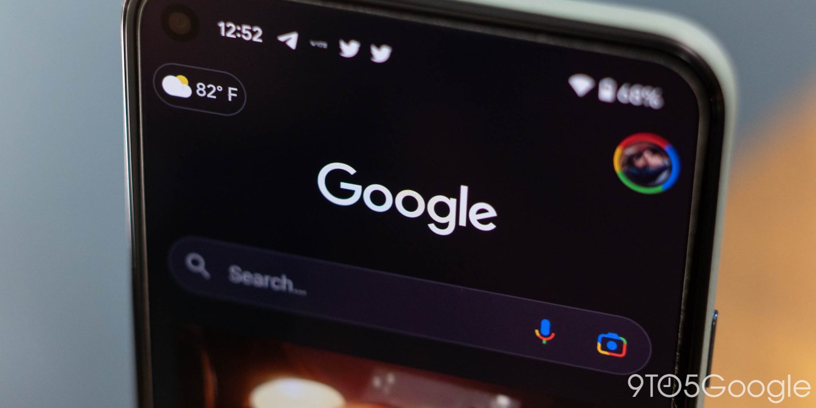
With Android 13, a revamp of the Pixel Launcher search experience is underway, and one aspect of it is now live with the latest Google app beta.
After installing version 13.20 — currently in the beta channel — this afternoon, opening the Google app and tapping the Search field reveals a new list design for autocomplete suggestions and your history/past queries. [Update: This looks to be an A/B test and not yet widely rolled out.]
Each item is placed in a card with the top and bottom one featuring rounded corners. The icon at the left noting whether something is a previous search term or a new query is placed in a circle. Touch targets are ever so slightly taller. The previous look just placed text on a background and remained unchanged for many years.
This new list design should also appear in on-device Pixel Launcher search whenever that’s fixed in a future Android 13 Beta. You only get app search on Beta 2 today with the list of web results below the blank, though still tappable.


Overall, it makes for a more modern look that fits in with Material You better than the previous design. Google Search on Android has not seen substantial changes for some time now, and it looks markedly different from other apps on the mobile OS. The last major update was the dark theme in 2020, while there have been minor tweaks here and there. For the most part, Search has kept to its own user interface across Android, iOS, and the web.
Google app 13.20 should roll out to the stable channel over the next week with no visual changes on Android 12 and older.
More on Google Search:
- Google Search’s futuristic new tools will be able to identify and filter products in the real world [Video]
- Discover feed tests showing like counts for articles [Update: More examples]
- Google unveils new Results About You page, ecosystem-wide Google Account Safety Status
- Search now lets you request address, phone number, and other personal info removal
FTC: We use income earning auto affiliate links. More.


Comments