Google announced today that Material You is coming to Gmail on the web in a redesign that also addresses complaints about the integrated view overhaul from earlier this year by introducing a “Gmail-only” view.
Material You redesign
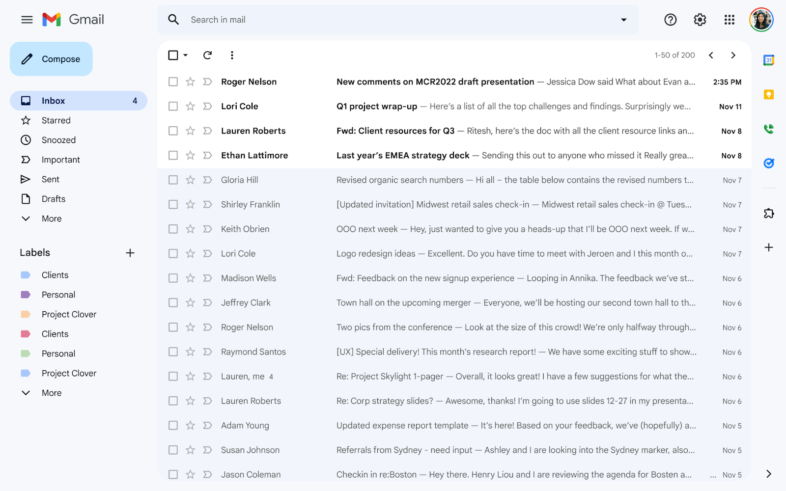
This redesign primarily involves the default white background being replaced by a faint/light blue of which there are several shades. For example, the left navigation menu is slightly darker, while read emails are blue and unread ones remain white.
The Compose button in the top-left corner drops the pill-shaped container for a rectangle with rounded corners, just like on the Android client, while the list of emails is more pronounced.
This is the most significant expansion of the company’s latest Material You design language to the web yet after Material.io and the Google Search Console. It comes as Gmail for Android got its MY redesign in September of 2021. Google has yet to bring Material You to its first-party iPhone or iPad apps.
‘Gmail-only’ view
Update: Google has clarified that “Classic Gmail” refers to the previous, years-old design before the integrated view. As part of today’s launch, the new design will automatically be enabled for some users, but the option to revert back will remain available. It was previously an opt-in launch (“Try it now”), but the default is now changing.
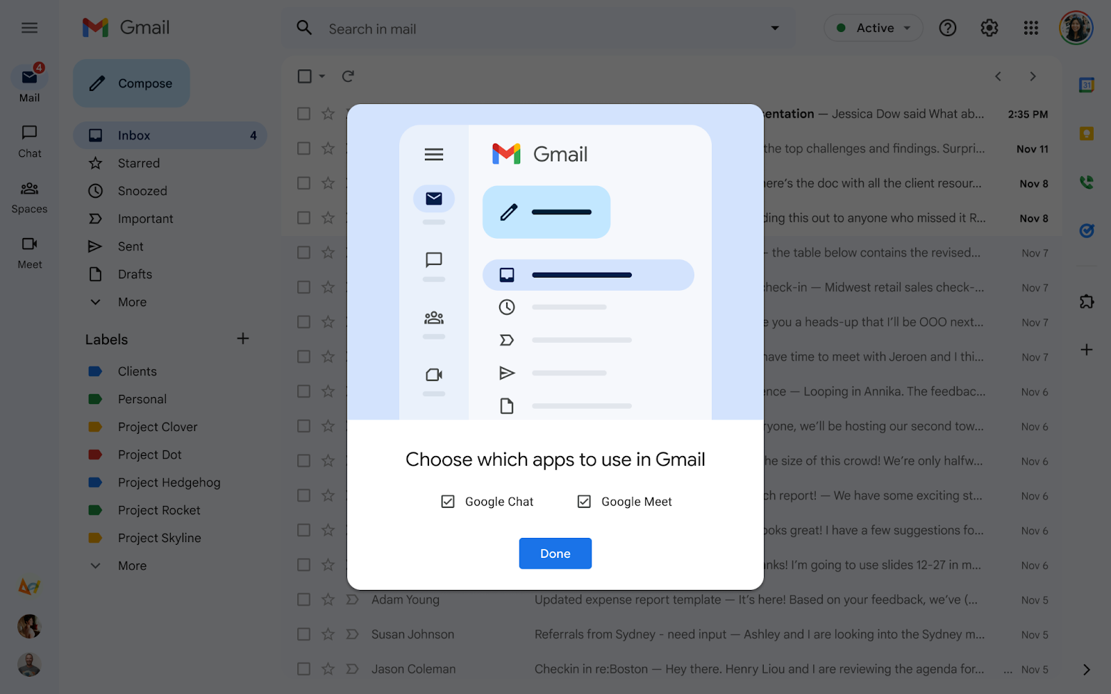
What’s new is how the Material You web redesign supports a “Gmail-only” interface that removes the combined Chat, Spaces, and Meet layout that Google pitched as letting you:
…easily switch between your inbox, important conversations, and join meetings without having to switch between tabs or open a new window. We hope this new experience makes it easier for you to stay on top of what’s important and get work done faster in a single, focused location.
The left bar is gone and you just get a list of default folders and labels at the left. The top search field spans more of the screen since the Chat status indicator has been removed. There’s still a side panel with Calendar Keep, Voice (if eligible), and Tasks at the right.
That said, you can just have Google Chat (with Spaces) or Meet appear from a new customization window.
This Material You web redesign with the Gmail-only view is rolling out starting today and will be:
- Available to Google Workspace Business Starter, Business Standard, Business Plus, Enterprise Essentials, Enterprise Standard, Enterprise Plus, Education Fundamentals, Education Plus, Frontline, and Nonprofits, as well as G Suite Basic and Business customers
- Also available to users with personal Google accounts, as well as Google Workspace Individual users.
- Not available to Google Workspace Essentials customers [which does not include Gmail]
More on Gmail:
- Gmail for Android, iOS add convenient ‘Storage used’ indicator
- Google plan would exempt political campaign emails from Gmail’s spam filter
- Google details when classic Hangouts will stop working as free Chat migration starts
FTC: We use income earning auto affiliate links. More.


Comments