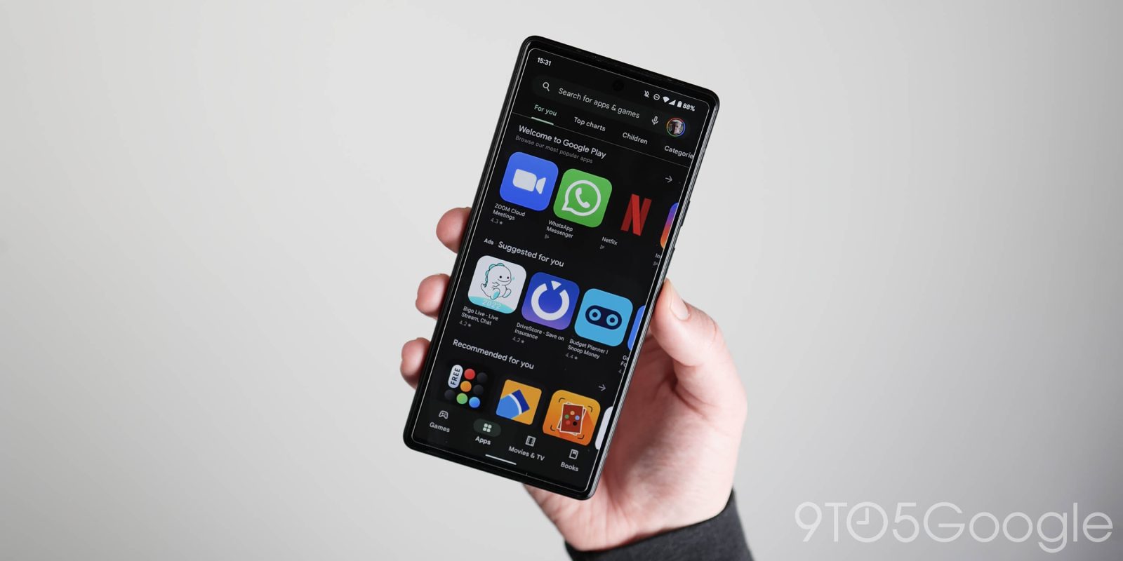
As we first enabled in March, the Google Play Store is getting more Material You tweaks in the form of new buttons.
The initial Material You update in October just updated the homescreen with a new search field, bottom bar, and Dynamic Color for those two key elements. Users are now starting to see pill-shaped buttons throughout the application. This new look replaces Material Design 2 rectangular buttons that feature slightly rounded corners.
On app listings, these changes apply to the “Install,” “Uninstall,” and “Update” buttons, while category chips/filters go in the opposite design direction. It’s the right trade-off as buttons see more use and generally are more prominent. The changes are also visible on the Manage apps & device page and search results.
However, the buttons do not feature Dynamic Color theming and remain mostly green. We’re so far seeing several reports of Material You buttons in Google Play.
Material You buttons


Meanwhile, despite the big redesign, Google Play on the web does not have Material You and was presumably already in development before the new design language.
Looking ahead, the Play Store is set to get a big overhaul on Android tablets and other large screen devices. As of today, those form factors do not have the Material You homescreen. The revamp will use a navigation rail, while the main feeds leverage cards for a denser UI.
Previous design


More on Google Play:
- The Google Play Store looks to be getting a new logo
- Play Store for tablets and Chromebooks gets Material You ahead of bigger redesign
- Wild Google Play Points promo is a peek into the world of mobile gaming whales
- Google brings Play Games PC beta to two more countries
h/t Encestral Z
FTC: We use income earning auto affiliate links. More.


Comments