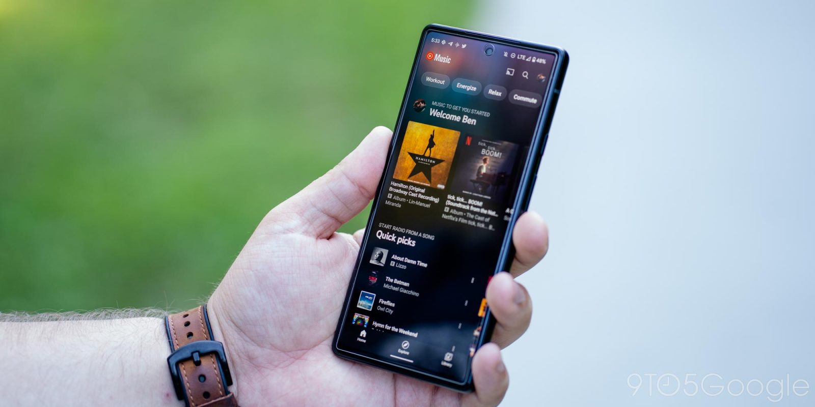
Back in June, YouTube Music rolled out a playlist and album view redesign to tablets, and the former is now starting to appear on Android phones.
The portrait UI starts with a much larger cover image than before with the creator (e.g., YouTube Music, you, or other users) and when it was last updated noted above. Said art also appears blurred in the background. The name appears next, and underneath that are controls for downloading, editing (details and order), shuffle or play, sharing, and an overflow menu that includes delete, play next, and more.
The track list follows, and at the very bottom is a song count and duration (on personal playlists only, not mixes). As you scroll down, a shuffle FAB (floating action button) appears in the bottom-right corner. On compatible devices, landscape orientations leverage a two-column view.
The redesign is definitely more modern and first came to large-screen Android devices like tablets and Chromebooks. Notably, it was initially introduced just for playlists before expanding to albums.


There was one case of the new YouTube Music UI coming to Android phones back in June, but there are now at least two reports of the redesign appearing. The rollout is again starting on playlists and not albums.
This server-side rollout is not yet widely available from several devices we checked today. Hopefully, it’s coming sooner than later to all users as the design was already tested on tablets. Meanwhile, the revamp has not appeared on the iPad.
More on YouTube Music:
- YouTube Music tests ‘Dynamic queue’ that changes as you listen
- How to upload your own music to YouTube Music
- YouTube Music updated to support new Android 13 media controls
- YouTube Music for Android is working on a sleep timer [APK Insight]
FTC: We use income earning auto affiliate links. More.


Comments