We’ve already done a deep dive into all of the core functions and features in Android 13 that you need to know about, but because not all additions are created equally, here is a handful of the best new OS update features.
Compared to last year’s behemoth Android 12 update, Android 13 is more modest. The changes are designed to enhance Material You and all of the revamped and reimagined areas of the best mobile OS around. Over 50 new user-facing tweaks and functions have been added this year, but we’ve whittled it down to 15 of our favorites. These are the top features in Android 13:
Table of contents
- Video — The top 15 features in Android 13!
- Vibration mode fine-tuning
- Increased “Basic color” within Wallpapers & style section
- New fingerprint unlocked setup UI on Pixel 6 series
- Brand-new photo picker
- Combined Security & privacy menu
- New QS tiles
- More accessible Power and Settings notification panel shortcuts
- Improved media player
- Per-app language controls
- Ability to pause app activity if unused
- Quick Tap includes flashlight toggle option
- Predictive back animations
- High battery usage notification in Settings section
- Better and smoother animations
- Compact pop-up card/windows when in landscape mode
- What are your top features in Android 13?
Video — The top 15 features in Android 13!
For more video content, subscribe to 9to5Google on YouTube.
Vibration mode fine-tuning
You can now adjust almost all aspects of the vibration menu within Android 13 thanks to a new enhanced Sounds and vibration section. Google has added control bars for “Calls,” “Notifications and alarms,” and “Interactive haptics.”
For the first time – outside of Gboard – on Pixel you can manually adjust the strength of vibration feedback for each notification type. The linear bar works in a similar way to volume controls. Joining this is a useful new toggle that lets your phone vibrate before a ringtone kicks provided you do not pick up a call right away. However, for this to work you will need sound enabled on your device.
The added ability to disable alarm vibrations from this menu is especially useful. Plus there is brand-new toggle to enable interactive media vibration. Few apps support the feature at this stage but haptics are used alongside speakers for more “oomph” when consuming media.
Increased “Basic color” within Wallpapers & style section
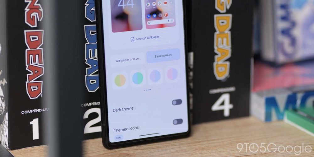
Material You is still at the very heart of Android 13 and Google has expanded the “Basic colors” available for device accenting with 16 colors that consist of seven simple tones and nine interesting dual-tone pastel colors to choose from. This is perfect if you want a bit more control over Dynamic Color theming but prefer to choose fewer colors rather than the regular four presets.
New fingerprint unlocked setup UI on Pixel 6 series
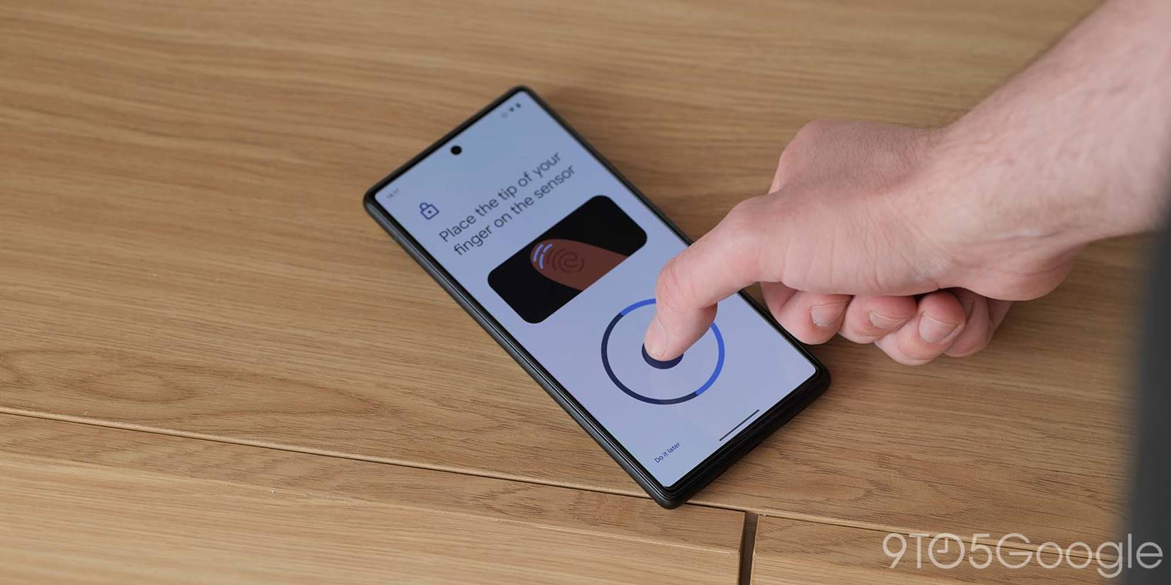

The Pixel 6 series has received numerous complaints over the in-display fingerprint scanner, and while it might simply be a coincidence, Android 13 has tuned the digit enrollment process. When setting up or adding a new fingerprint, a more precise guide animation shows to help you fully enroll your fingers. We’re still not entirely sure if this means more reliable scans, but it’s certainly far better than the abstract method used in Android 12.
Brand-new photo picker
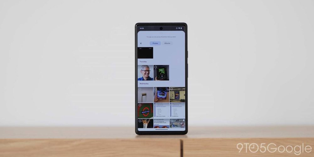
The introduction of a new photo picker in Android 13 is a top feature because of how this protects your on-device data. It certainly has better visual appeal than the older but functional pop-up panel, because the new picker only lets apps access the photos that you allow. This is great for privacy, but the visual aspect is vastly improved here too. When adding an image inside an application, the new picker slides in with a docked bottom pane. Images are categorized and, therefore, easier to find/select too.
Combined Security & privacy menu
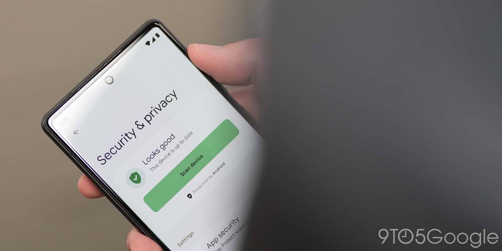
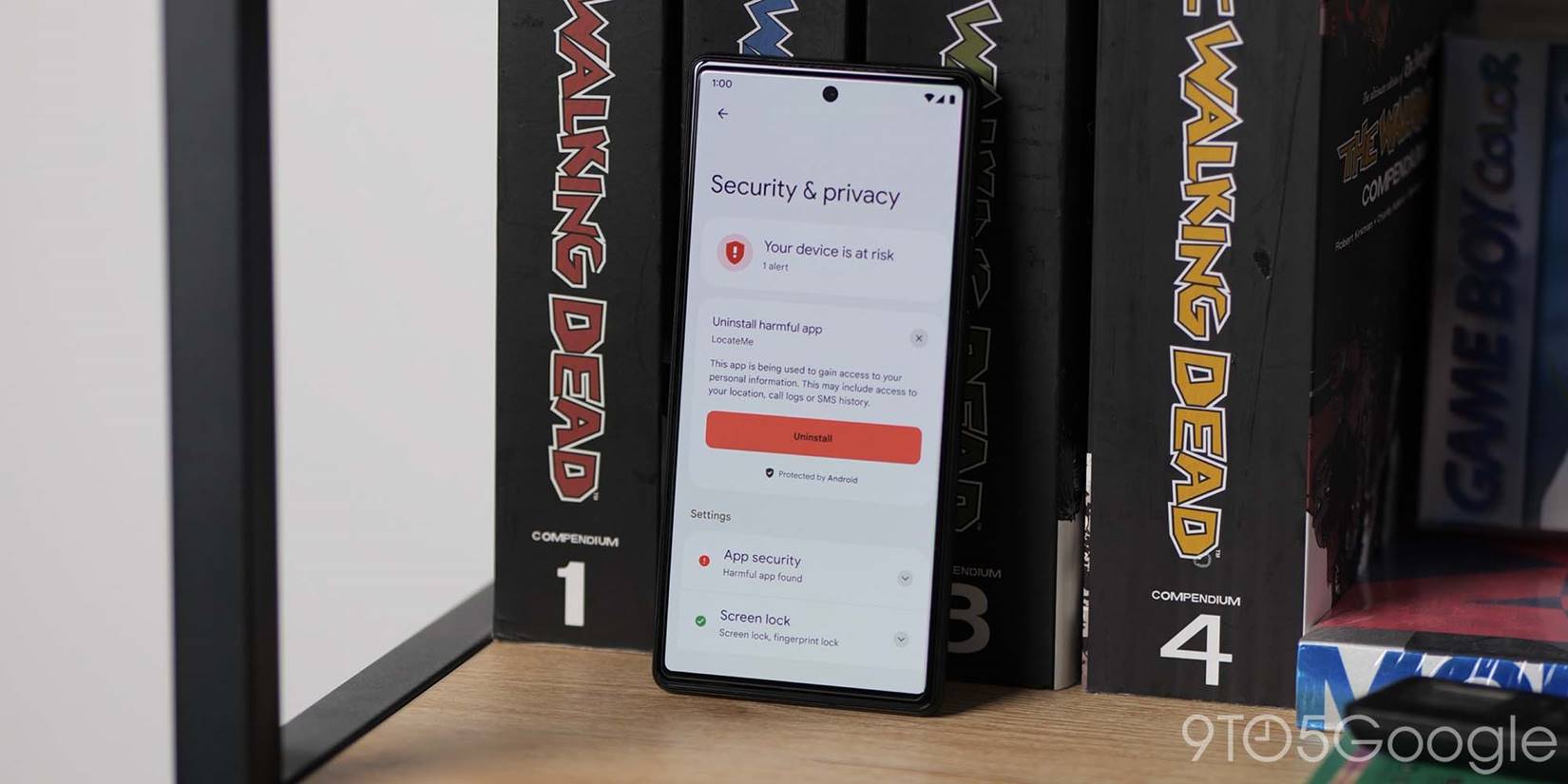
Coming later this year, Google is adding a brand-new combined “Security & privacy” menu that was detailed back at IO 2022. This one-stop shop fuses on-device and account settings into one easy-to-manage area rather than relying on multiple sub-menus and sections.
One of the most striking aspects is that it features color-coded safety status indicators and prompts to remove apps deemed insecure or potentially harmful. This might help those not necessarily well versed in data leaks or if their account has been compromised. Adding an extra layer of protection to your mobile experience.
New QS tiles
Android 13 adds two new super useful Quick Settings tiles that let you to access and activate the dedicated One-handed mode and add a much-needed QR code reader. The latter is powered by Google Lens and works with any and all QR codes. Previously you’d need to launch Google Lens then scan, but this works from any section of Android, saving time and effort.
Being able to enable and disable One-handed mode without diving into the Settings menu is another great timesaver that will be very helpful to many people. It means you can switch off the Reachability mode at any time when you need it from wherever you are in your device system.
More accessible Power and Settings notification panel shortcuts
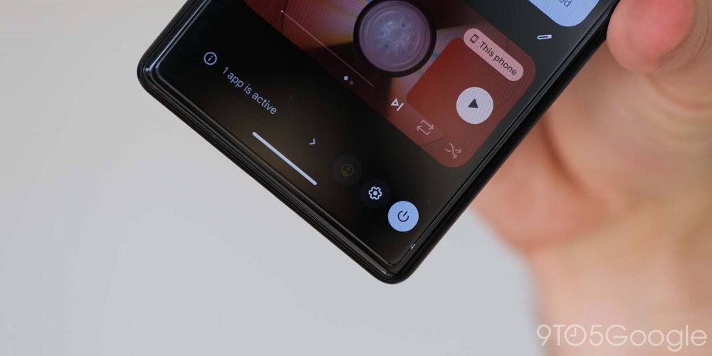
The shift of the access buttons for the Power and Settings shortcuts in the Quick Settings panel to an easier-to-reach bottom-left position cannot be overstated. This is especially useful on a large screen.
To help access, Android 13 features Power menu and Settings shortcut access buttons have moved to the very bottom-right of the Quick Settings panel. This means that you do not need to stretch up to access two important areas, and this also has the benefit of cleaning up the main notification panel.
Improved media player
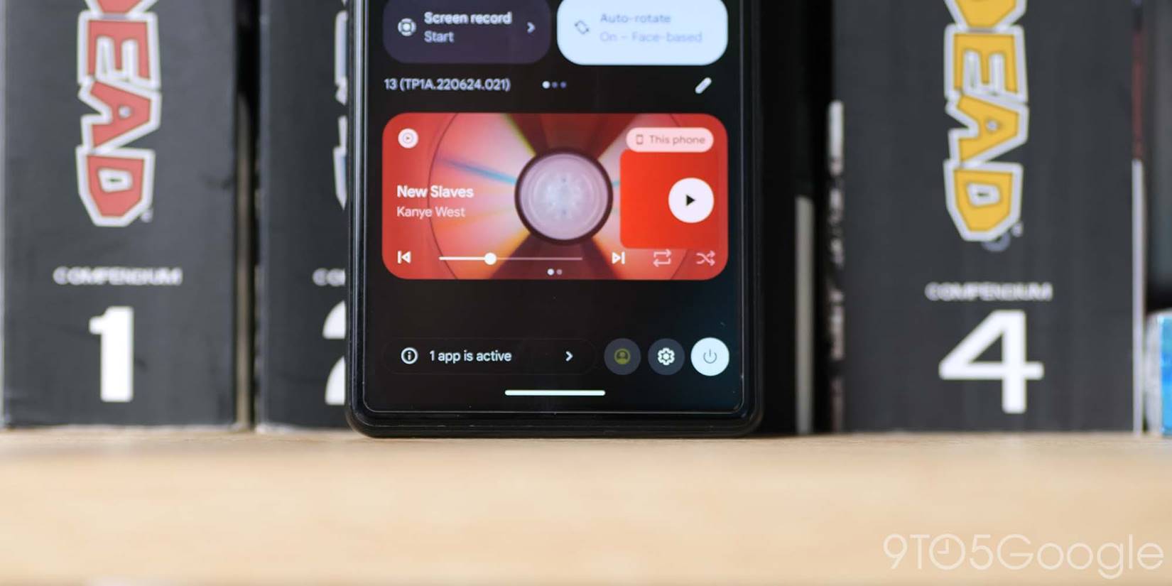
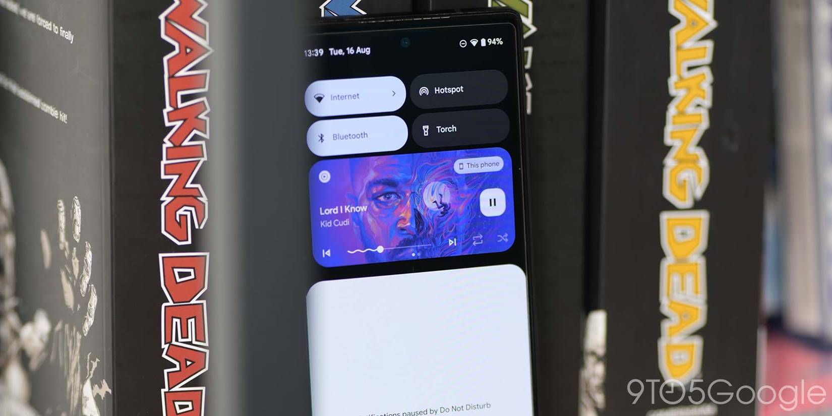
A major redesign has come to the Android 13 media player. It’s an area of Android that Google can’t keep tuning and tweaking, but the latest changes are not only useful, they’re also visually appealing.
If we had to pick the outright top feature added in Android 13, the media player redesign would be the most likely candidate. Google’s changes to the media player is not only more cohesive with Material You theming and iconography, but it also re-adds functionality that makes it even more useful.
Standard play/pause buttons are now placed off to the right of the mini player, while skip and back controls are now placed on either side of a reintroduced playback progress bar. This has an interesting “squiggle” effect for any playback progress.
As the playhead moves, the playback bar turns from a straight line to a squiggly line, therefore, making it even easier to determine how much has been played or completed. Contextual app buttons like shuffle and time skips will also appear depending upon what you’re listening to or watching. In yet another throwback move, Album art player theming has also returned in Android 13. No matter the content – including videos – the album art will envelop and theme the mini player in the colors picked out from the cover, thumbnail or video.
Per-app language controls
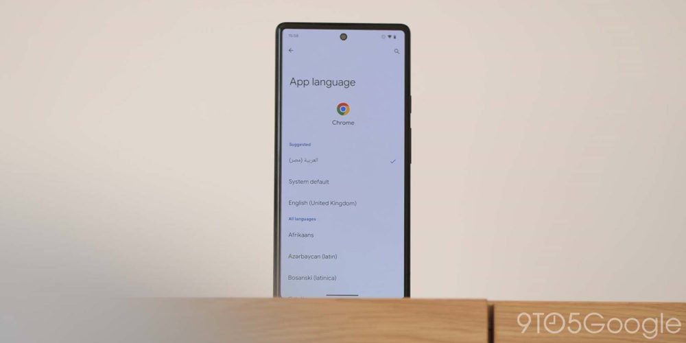
Another top feature in Android 13 is the ability to set app languages on an app-by-app basis without adjusting the entire system’s default locale or language. You may be learning a language or speak multiple dialects, which makes this a nice option to have. So long as apps support extra locales/languages, then you can head to Settings > Apps > Language and change to your desired local text. Because you can set this on an app-by-app basis, it means that it won’t affect any other changes you have made elsewhere.
Ability to pause app activity if unused
Killing off or stopping rogue apps when they are sapping at your battery or running in the background is something we think is certainly a top feature added in Android 13. A new section within a fully expanded Quick Settings panel will indicate just how many apps are running in the background.
Tapping will bring up a little floating pane showing just what apps are actively running. Often this will include apps like Google Fit, Samsung Health, and apps that require tracking or device resources to keep functional. However, certain apps may be running without your knowledge. You can stop these if you wish, which is the same as diving into the Settings menu and hitting “Force stop.”
Quick Tap includes flashlight toggle option
While the Quick Tap function is limited to the Pixel 5 or newer, it’ still a great option to have to automate specific things on your smartphone. While it’s fairly feature-rich given it’s a simple tap gesture, Quick Tap has gained an option to quickly toggle the flashlight on your Pixel. We love this as it not only is useful, it saves time as you do not need to access the QS tiles or unlock your device to enable the the LED flash at the rear of your phone.
Predictive back animations
Android 13 has a new almost experimental predictive back animation that you can enable by heading to Settings > System > Developer options > Predictive back animations. In simple terms, when using the back gesture from the right or left side of your screen, if you hold this action, you’ll get a preview of what screen will open once you let go.
Effectively, you’ll see just where you’re headed. While the back gesture is pretty easy to manage, this will make it clearer what screen is set to appear. Sadly, not many apps support the function just yet, but it’s a great option to enable for future updates.
High battery usage notification in Settings section
Although this should be more prominent, the “Higher battery usage” notification when you view the Battery menu is still a top feature in Android 13. This helps you better understand just what applications are sapping at your internal cell and could affect lifespan or reduce below regular daily use.
Tapping this prompt simply shows any applications are draining the internal cell the most. The pop-up panel also informs that you “may run out sooner than” the battery normally would. There is no option to force stop or disable these apps from this pane, so you’ll need to go into the deeper battery settings and force stop.
Better and smoother animations
The new fade-in unlock animation when opening up or unlocking your Pixel is really refreshing when combined with all of the improved animations and makes Android 13 feel like silk — even when compared to Android 12. A new post-unlock animation sees all apps on the Pixel Launcher homescreen fade and zoom into view.
Opening Settings section and associated sub-menus is also improved with screens sliding and fading into view more cohesively. Animation easing has been upped, and the result is that trademark “buttery” smooth feel with which Google’s clean version of Android has become synonymous.
Compact pop-up card/windows when in landscape mode
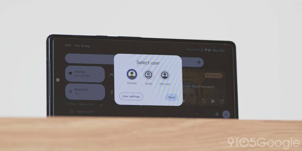
One of the most ridiculous changes in Android 12 was full-screen or wider pop-ups that filled the width of your display when opened. This was resolved for notifications and the Quick Settings panel back with the stable Android 12 release but it has taken until Android 13 for pop-ups to be fixed.
If auto-rotate mode is active, when expanding the Quick Settings panel or receiving pop-up notifications, cards, and windows are now centrally aligned and smaller. These options no longer take up the full-screen width and are much easier to manage. The visual uplift is also very welcome.
What are your top features in Android 13?
Have you installed the stable Android 13 update on your device? If you have, are you enjoying it and what do you think are the top new features added in Android 13? Let us know down in the comments section below.
FTC: We use income earning auto affiliate links. More.


Comments