Besides sharing that the Pixel Tablet is powered by Tensor G2 and has a Charging Speaker Dock, Google showed more of the Android UI and several Smart Display-inspired screens.
Android for tablet
Google explicitly said that the “foundation for Pixel Tablet is Android, including Material You.”
And just as our Pixel phones have always been the best and purest expression of Android, Pixel Tablet is the best way to experience Android on a tablet.
To that end, we see what the Pixel homescreen looks like on tablets. At a Glance, which is already getting a few upgrades with the Pixel 7, appears in the top corner and is again left-aligned, despite all that available horizontal space. Besides apps, the dock includes a Search bar with voice/Assistant and Google Lens access. The homescreen looks to be in a 6×4 configuration.


It’s interesting what apps Google chose to place and highlight on the Pixel Tablet homescreen. We see Recorder in an indication that Google will be updating the UI for tablets, which could look a lot like the existing landscape design. Along with Gmail, Drive, Docs, Sheets, Keep, the presence of Recorder reflects how Google told us it wants the Pixel Tablet to offer a good productivity experience, especially with the Workspace suite of apps.
Meanwhile, the tablet’s content consumption side is reflected by Google TV and YouTube, as well as Photos, though that’s also meant to reflect how image editing will be nicer on a larger screen. A more curious inclusion is the Personal Safety app; it’s not clear how exactly that will work.
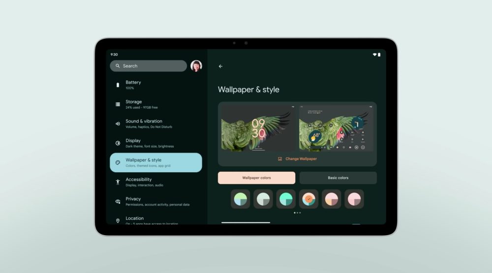
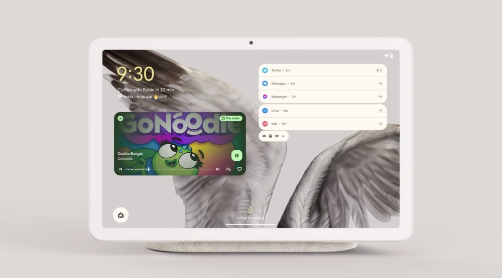
We get another look at the dual-column Settings app, which is again set to Wallpaper & style. We see that the lockscreen without any notifications just centers the two-line clock. Otherwise, alerts appear at the right with a maximum of five lines and icons for everything else in a tray. Underneath At a Glance, we see an even larger media player.

Top comment by Whispy_Snippet
Lastly on the lockscreen, we have a Home shortcut that takes you to smart device controls. The main UI is unchanged and just a grid, but tapping reveals how controls appear as a right-aligned pop-up window for the Nest Thermostat. This UI preserves context, and it would be good if that element made more of an appearance on Android.
Smart Display UI on Pixel Tablet
When the Pixel Tablet is attached to the Charging Speaker Dock and showing slideshows, the time and At a Glance appear in the corner, while the top-right features a Cast icon that notes “This tablet.”
Accessing Google Assistant when docked loads a bottom sheet UI that spans the entire width of the screen. (Going slightly narrower would not hurt.) This is the opposite of the Nest Hub showing command transcripts at the top, while Google is taking heavy inspiration for docked music controls. The Now Playing screen is very similar to the Smart Display version with large cover art, scrubber, play/pause, shuffle, rewind, and even Cast controls.
Android tablet apps
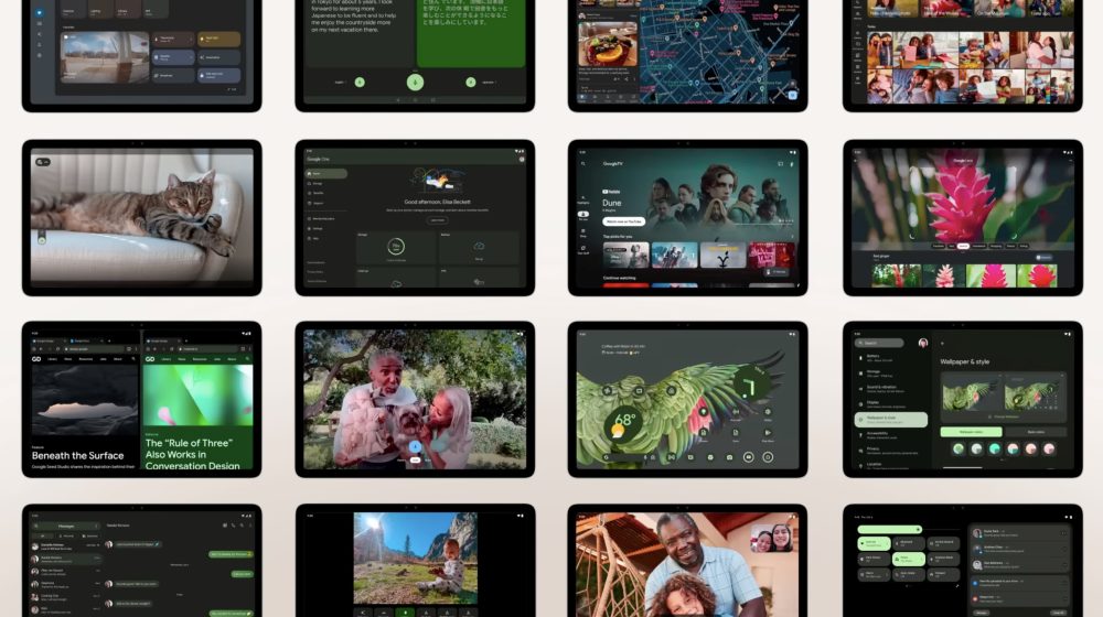
Google also provided a look at a handful of new tablet-optimized apps, and noted how it “partnered closely with developers to make sure apps take advantage of large screen features like split screen and stylus support.”
- Google Home: The design shown at I/O was based on the previous iteration. This new one still uses a navigation rail, but looks much better with five tabs instead of just two. We see the Favorites screen take advantage of the additional space for what should be a great tablet experience. We also get a look at the camera stream UI.
- Google Camera: Taking cues from version 8.7 on the Pixel 7 and 7 Pro, we have app controls housed at the left. This includes a top-left corner settings dropdown and a pill-shaped controller.
- Google One: Another look at the app, which looks like the website, and is still not yet live.

FTC: We use income earning auto affiliate links. More.


Comments