We’ve been waiting for a tablet redesign of Google One since I/O in May, but until then the Android app is getting a new homescreen that lets you see more details about your subscription at a glance.
The last major update to Google One for Android was just over a year ago. That Material You redesign featured Dynamic Color theming and brought a dark theme to the bright app.
Today’s revamp just applies to the Home tab with a graphic and time-of-day greeting up top. A summary of Google One follows: “Back up your phone, manage account storage, and learn about member benefits.” “Learn more” curiously opens a web page rather than an in-app resource.
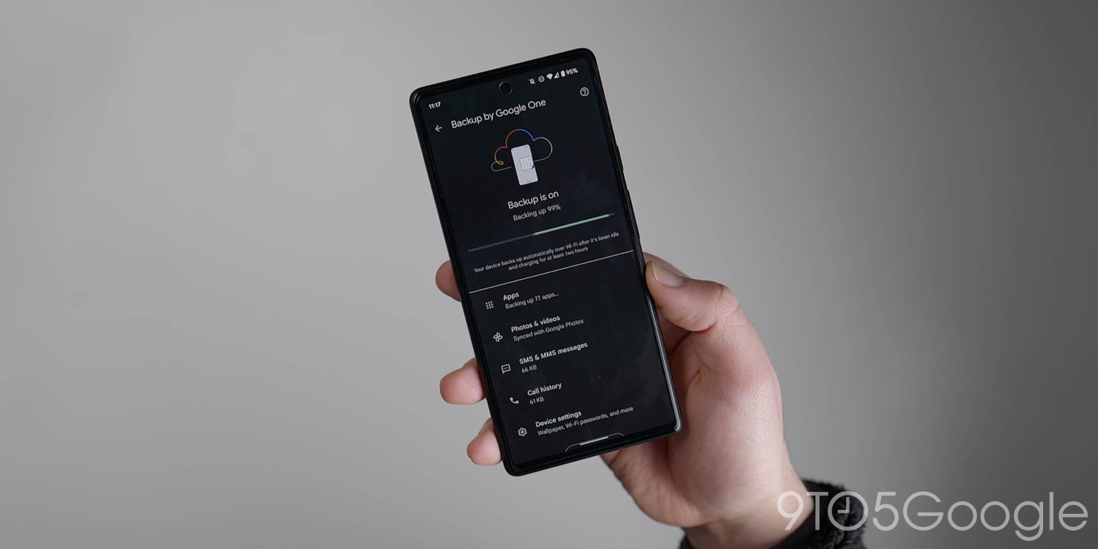
The main change today is a 2×2 grid of cards that starts with a look at your Google One storage. This circular design replaces the previous linear progress indicator that appeared lower in the feed, while also giving you a percentage. “Backup” status with your current device’s most recent one is next, and that’s followed by a “Clean up” card that shows how much space you can regain.
If there’s one downside, it’s that the Google One VPN card is no longer the first thing in the feed, but it’s still on the first page.
That grid is followed by a carousel detailing “Extra Google Photos editing features,” “Premium Meet calling,” and the VPN again, while the last two shortcuts are for family sharing and a “Manage” card that also notes how long you’ve been a member.
This Google One redesign is not yet widely rolled out on all devices we checked today. It’s delivered via a server-side update. Overall, it matches one.google.com on the web, which is basically what the tablet revamp aims to do by replacing the bottom bar for a navigation drawer.
More on Google One:
- Pixel 7 and 7 Pro getting free Google One VPN in December
- Wear OS backups will cover watch faces and tiles as Wallet preps more on-wrist features
- Every Google app with an Android tablet UI [U: Gboard, Play Store, Chrome, and Sheets]
FTC: We use income earning auto affiliate links. More.


Comments