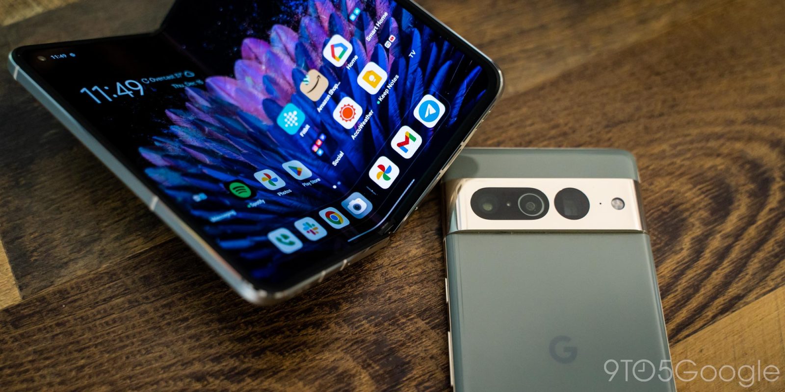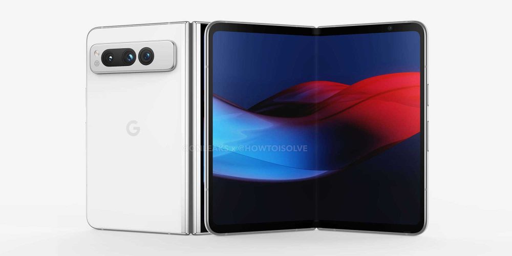
It’s no secret at this point that there’s a Google Pixel Fold in the pipeline, and all signs point to the hardware being quite similar to the Oppo Find N2. Is that the right choice? Personally, I have mixed feelings.
What we know about the Pixel Fold’s design
The Google Pixel Fold has gone through a lot of behind the scenes work, but at this point we have a pretty clear picture of what could arrive as soon as May 2023.
Related: Third time’s the charm: Everything we know about the Google Pixel Fold
As it stands today, we know that the Pixel Fold will have a design that looks like a mix of the original Oppo Find N and the existing Pixel 7 series. But the big thing to consider is its size.
It looks like the Google Pixel Fold will measure in at 139.7 x 158.7 x 5.7mm when it is unfolded. For comparison, the Oppo Find N2 measures 132.2 x 140.5 x 7.4 mm when unfolded, and the Galaxy Z Fold 4 at 155.1 x 130.1 x 6.3mm when unfolded. Just based on that, Google’s first foldable is going to be large, being considerably wider than the Fold 4 while only a little bit taller than the Oppo Find N2.

Pixel Fold is a bigger Find N2
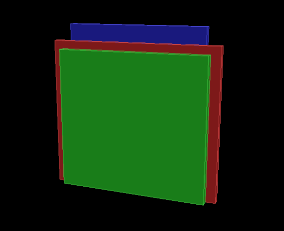
When you look at them all side-by-side, it’s pretty clear what we’re getting – the Pixel Fold is basically just a bigger Oppo Find N2. To illustrate, we put together a quick 3D model showing the dimensions of each phone side-by-side.
The Pixel Fold is the widest of the bunch by a long shot, being almost 20mm (roughly 0.78-inch) wider than the Oppo Find N2 which is already 10mm (~0.4-inch) wider than the Galaxy Z Fold 4. The Pixel Fold thankfully won’t be quite as wide as the Surface Duo 2, though, which measures 184.5mm when opened up.

This is definitely notable, as it presents a totally different experience compared to Samsung’s fourth-generation foldable. For one thing, it’s going to have much more room on the display. While the Fold 4 isn’t exactly small with its 7.6-inch display, the near-square shape isn’t always ideal. It’s not two phones side-by-side, but rather 80% of two phones. The wider aspect ratio that Oppo, and soon Google, have opted for allows for apps to fully breathe even in split-screen modes.
But it might not all be perfect.
The potential problems this Pixel Fold design could face
A consensus that has been formed by many around foldable smartphones to date has been that Samsung’s aspect ratio, while not terrible, may not be the “right” layout for a folding phone. The nearly square internal leads to a super tall and narrow outer display that can be hard to get used to, while apps on the inner display don’t always show a tablet-focused interface because the OS is considered to be in a “portrait” orientation. It’s a valid critique, and one that Samsung has worked on over time.
The shift from the Galaxy Z Fold 3 to the Galaxy Z Fold 4 was not major by any means, but it saw Samsung adjust its aspect ratios to deliver a marginally wider outer display, and a shorter but wider inner display. It’s led to many more apps, but still not all of them, to be treated as tablet apps.
The Oppo Find N2, meanwhile, has a super wide inner display that always triggers tablet interfaces, with an outer display that’s small and roughly the same width as your average smartphone. But in active use, I struggle to consider the experience on Oppo’s form factor better than what you get on the Galaxy Z Fold series. There are pros and cons all over the place, and I somewhat worry that the Pixel Fold will see some of the same problems.
For instance, the YouTube app is a dramatically better experience on Oppo’s device. Every page on the Find N2 is tablet-optimized and shows much more content, while on the Fold 4, you get a blown-up phone interface that can really only show one video at a time in searches or recommendations.
YouTube on Oppo Find N2 (L) and Galaxy Z Fold 4 (R)
But on the other hand, there’s the Reddit app. The official Reddit app has numerous quirks and issues, but one thing that totally broke the experience on the Find N2 for me was that videos are forced into full screen, and the wide aspect ratio breaks all controls. Trying to view the comments on a post with a video is impossible, but it works just fine on the Fold 4.
Then you have the current big trend of vertical videos. Foldables are well-suited to content consumption, but these vertical videos are going to be wasted on the wider tablet-like displays of foldables. On the Find N2, more space is wasted by TikTok-style videos (Instagram Reels in my case), where you can appreciate the added screen height on the Fold 4 in this case.
Much of these two examples, though, comes down to simple optimization. TikTok itself, for example, has made great strides in improving its design on foldables.
Instagram Reels on Oppo Find N2 (L) and Galaxy Z Fold 4 (R)
There are other downsides to the wider aspect ratio. On the Find N2 there’s a lot less room for content when you’re typing. Gmail provides a great example here, with not much space available to show the content you’re typing after factoring in the keyboard and from/to/subject fields.
Gmail on Oppo Find N2 (L) and Galaxy Z Fold 4 (R)
Of course, the Google Pixel Fold might be able to get past a lot of the Find N2’s issues just by its sheer size. The Pixel is going to be a much bigger phone than what Oppo has been working on, and that alone might fix many of my gripes in apps.
There’s also that clear benefit in multi-tasking. Apps just have more room to breathe in the width of the Find N2’s screen. It’s a minor difference, but one that might actually be better on the Pixel Fold’s bigger screen.
Chrome and YouTube on Oppo Find N2 (L) and Galaxy Z Fold 4 (R)
But at the same time, a bigger version of the Oppo Find N2 has the potential to be cumbersome on a physical level. An open foldable in this form factor is almost always a two-handed experience. But I’ve found over time that Samsung’s form factor is a bit more forgiving in that regard. It’s a device I can hold and do some basic navigation on with one hand – perhaps moving through a recipe while cooking or moving between a video and an article. The Find N2 is a bit harder to use in the same way because, one-handed, I can barely reach the center of the display. It’s a minor point, definitely, but one that might be worsened quite a lot by using the same form factor in a larger size on the Pixel Fold.
No one has perfected it just yet
It’s all a matter of preference, really. The Find N2 is better at some apps, while the Fold 4 is better at others. Each aspect ratio has its advantages and disadvantages. But after using both of these phones and their predecessors, I keep walking away with the same conclusion. At this exact moment in time, I feel Samsung’s form factor is better suited to handling the transition from traditional phones to foldables.
This could change in time, and the Google Pixel Fold could play a huge role in that. Google’s Pixel devices aren’t the most widely-sold smartphones out there, but they do help developers push forward in optimizing apps and experiences for the general public; that might come at the expense of early Pixel Fold adopters being a little less than satisfied with the app experience on their phones.
What do you think? Would you prefer a Pixel Fold that copies the Oppo Find N’s design, or one that’s closer to the Samsung Galaxy Z Fold 4?
More on Pixel Fold:
- Third time’s the charm: Everything we know about the Google Pixel Fold
- Pixel Fold renders seemingly confirm device design and dimensions
- ‘Pixel Fold’ renders leak design with $1,799 price and May availability rumored
FTC: We use income earning auto affiliate links. More.


Comments