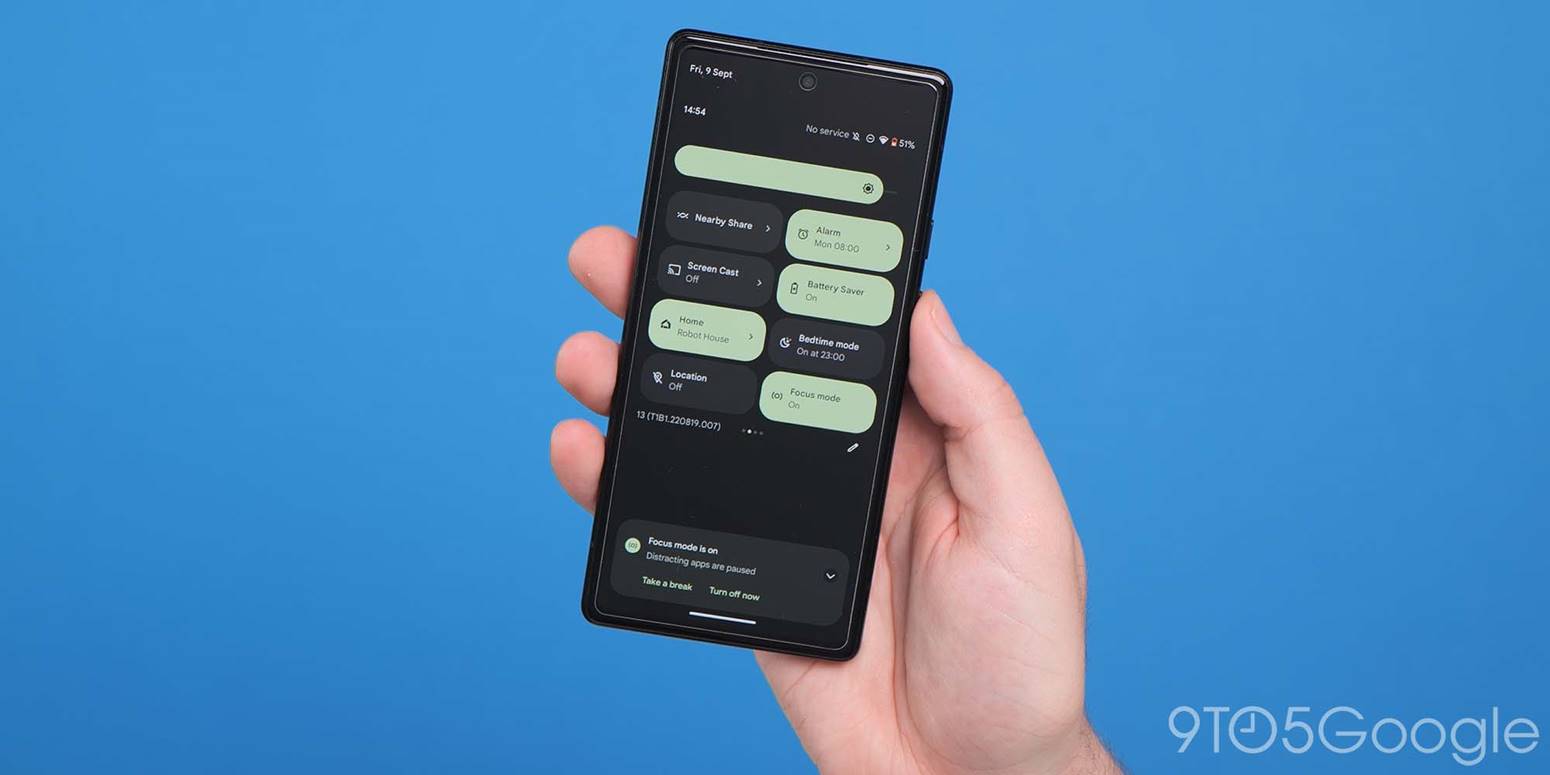
It’s been well over a year since Google gave Quick Settings a big Material You overhaul with Android 12. Initial impressions were centered around the sparseness of the new UI, but now that more time has passed, what do you think of Quick Settings?
The Material You redesign
To recap, a single swipe down gives you four pill-shaped Tiles arranged in 2×2 grid instead of six circular buttons in a row. This was/is the primary critique of the design with some, if not most, users needing more.
Fully expanding the sheet, with Google opting to make Quick Settings a fullscreen UI, provides eight controls. This is up from six in Android 11, which integrated the media player, though it was nine before that.
Android 10 vs. 11
These rectangular Tiles are taller and much wider than before, but an upside to that is how all information is now housed within a container that’s easier to tap and can be themed with Dynamic Color.
The vast majority of system Tiles let you turn settings on/off. Those that act as shortcuts or open another UI entirely feature arrows at the right. Internet is the only Tile that opens within Quick Settings, while Screen record clears the screen to show a pop-up. Device controls and Wallet bring up a separate fullscreen UI, with Nearby Share sliding up a bottom sheet.
For third-party developers, Google’s guidance is to create Tiles for “specific functionalities that you expect users to either access often or need fast access to (or both).”
Tiles as of late
Since the overhaul, Google apps have launched a few new first-party Tiles. On Pixel phones, Recorder’s Quick Settings Tile lets you immediately start and stop a session. The Calculator shortcut lets you launch the app, which is something Google actually recommends against: “Avoid using tiles to launch an app.” Google One has a Tile to turn on/off the VPN, while Health Connect’s is entirely responsible for opening the app.
The most recent addition is Security & privacy, which launches a fullscreen UI that can start a scan, identify problems, open the full Settings menu, and display the Camera, Microphone, and Location Tiles.
On Android 13, apps can prompt users to add Tiles to Quick Settings in a boon to discovery.
Quick vs. in-depth Tiles
Top comment by David Torres
1. When I swipe down once I would like to be able to swipe between pages of quick settings rather than swiping down twice to do it.
2. Clicking on the bluetooth tile brings up a window to change what I am connected to or to turn it off (like with the internet tile).
Just last week, Google made it so that the Wallet QS Tile on the Pixel 7 and 7 Pro just opens the full app rather than the legacy intermediary screen. It’s important to remember that Wallet and Device controls originally belonged to other parts of Android before landing in Quick Settings. The Wallet change, which is related to security and just on one device family, speaks to keeping Quick Settings, well, quick.
On the other side, the new Security & privacy tile points to Google wanting Quick Settings to provide an in-depth experience that’s more interactive than fast. After all, Android just redesigned it to be a fullscreen UI instead of a transparent overlay.
The full Settings app can be daunting and an unnecessary open at times, while quick settings are a widely understood concept at this point. One thing that would help this drive is making secondary UIs more native and integrated into Quick Settings, like Internet’s.
Chime in with your thoughts (which will presumably be all about the Bluetooth QS Tile) in the comments below!
FTC: We use income earning auto affiliate links. More.


Comments