Google seems to redesign the official logo for Google Lens every two years, and like clockwork, the app has once again gotten a new logo on Android devices.
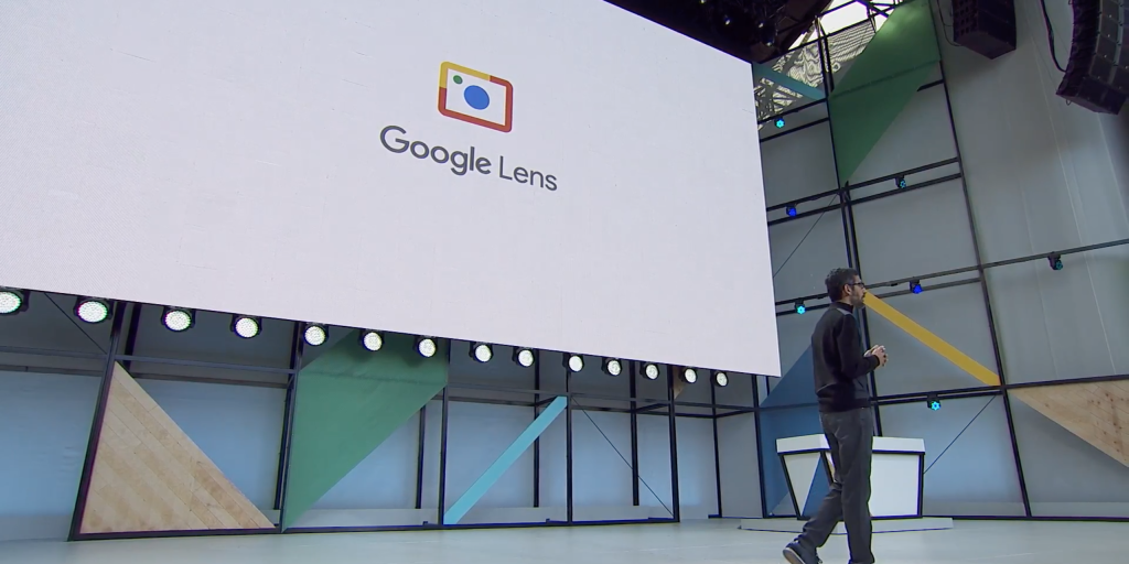
Google Lens has been around since 2017, though it has roots going back to the original “Google Goggles” app from 2010. When Lens first debuted at I/O 2017, it did so with a logo styled after a traditional camera, but this design was replaced by a rounded square with two circles before the app’s launch.
Two years later, Google revamped the Lens logo again by spacing out the corners of the square, evoking the idea of objects being selected within the viewfinder. This 2019 redesign coincided with a suite of new visual search features.
Next, in 2021, Google shook things up with a new icon that was shaped like an SLR camera, calling back to the very first design. Given the app’s placement in the Google Search bar, your app drawer, and Google Photos, the intent was to make it clear that opening Lens would launch your camera. This look was also well-suited to Google’s effort to redesign seemingly all of its app icons to use the company’s four-color style.
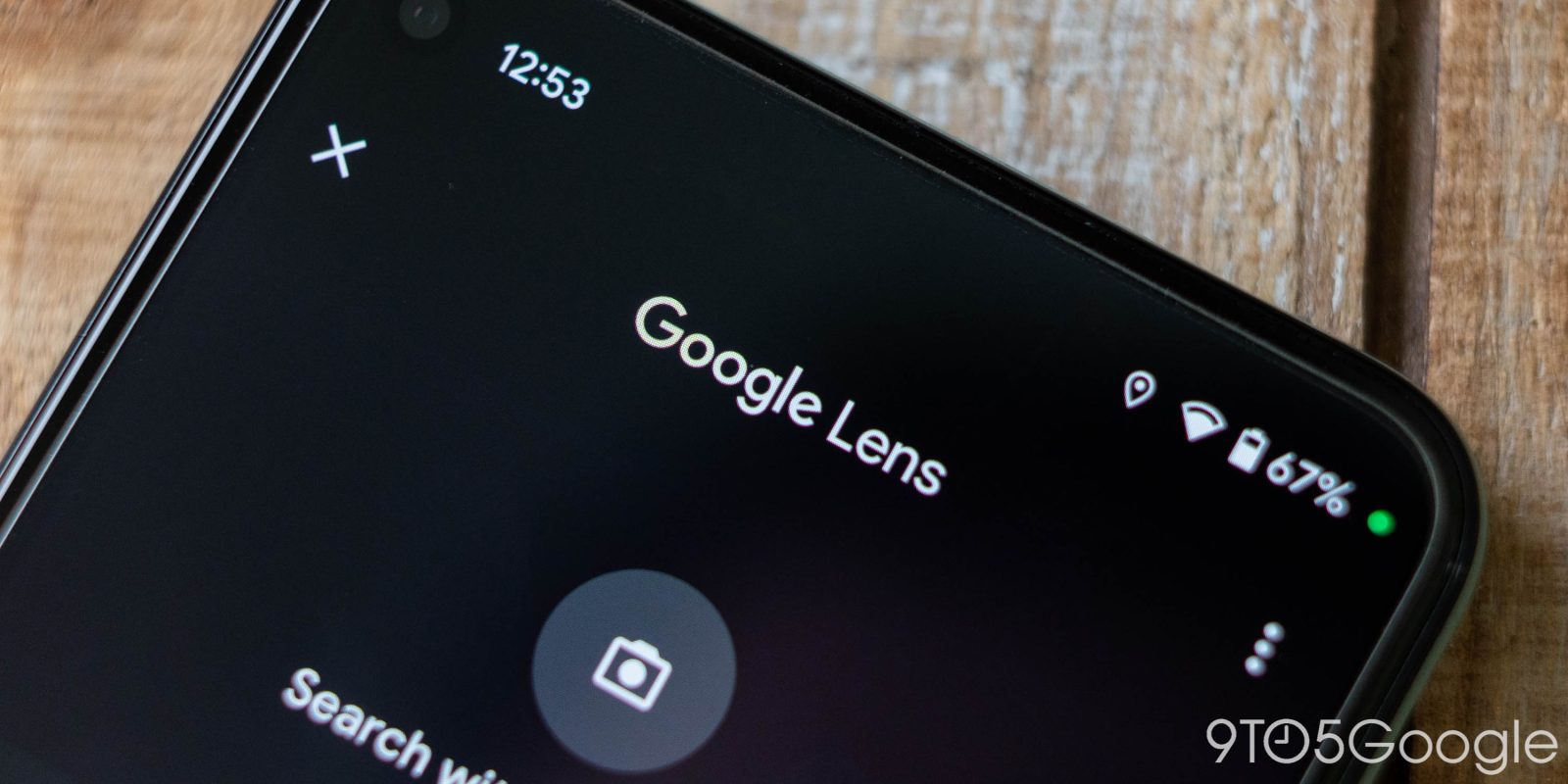
Right on schedule – as spotted by my colleague Dylan Roussel – with the latest beta update to Google Search on Android (version 14.17.16), the Lens icon that appears in the app has been changed to one that tries to find a happy medium between the two competing designs.
As before, the main inspiration is a traditional camera, complete with the usual space for flash and a viewfinder. The left and right sides of the logo are now split, a signature element of the 2019 logo. Meanwhile, the bottom-right corner now features the familiar second dot which appeared in every iteration of the Lens logo except the 2021 design.
For now, the new design only appears in Google Search, but it likely won’t be long before it rolls out to other surfaces like Google Photos, the dedicated Google Lens app, and the Pixel Launcher.
9to5Google’s Take
In some ways, these repeated design changes make it seem like Google can’t decide what it wants Lens to look like. That said, it’s interesting to watch the design iteration process.
With this latest change, the logo makes it clear that your camera is involved while also staying true to the signature style of Google Lens.
FTC: We use income earning auto affiliate links. More.


Comments