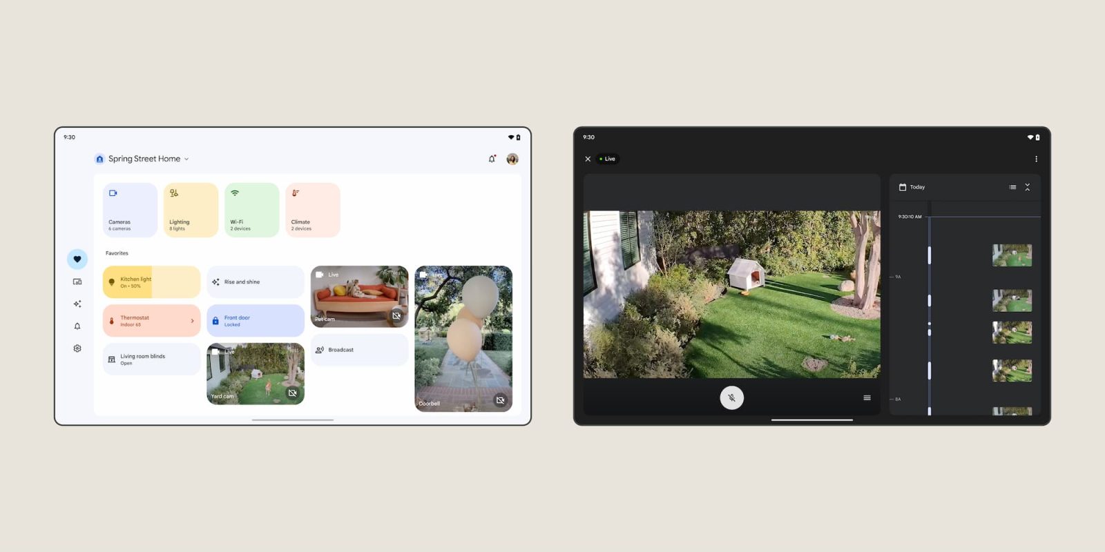
As the big redesign of the Home app exits preview, Google is rolling out a handful of refinements announced at I/O 2023 with version 3.1.
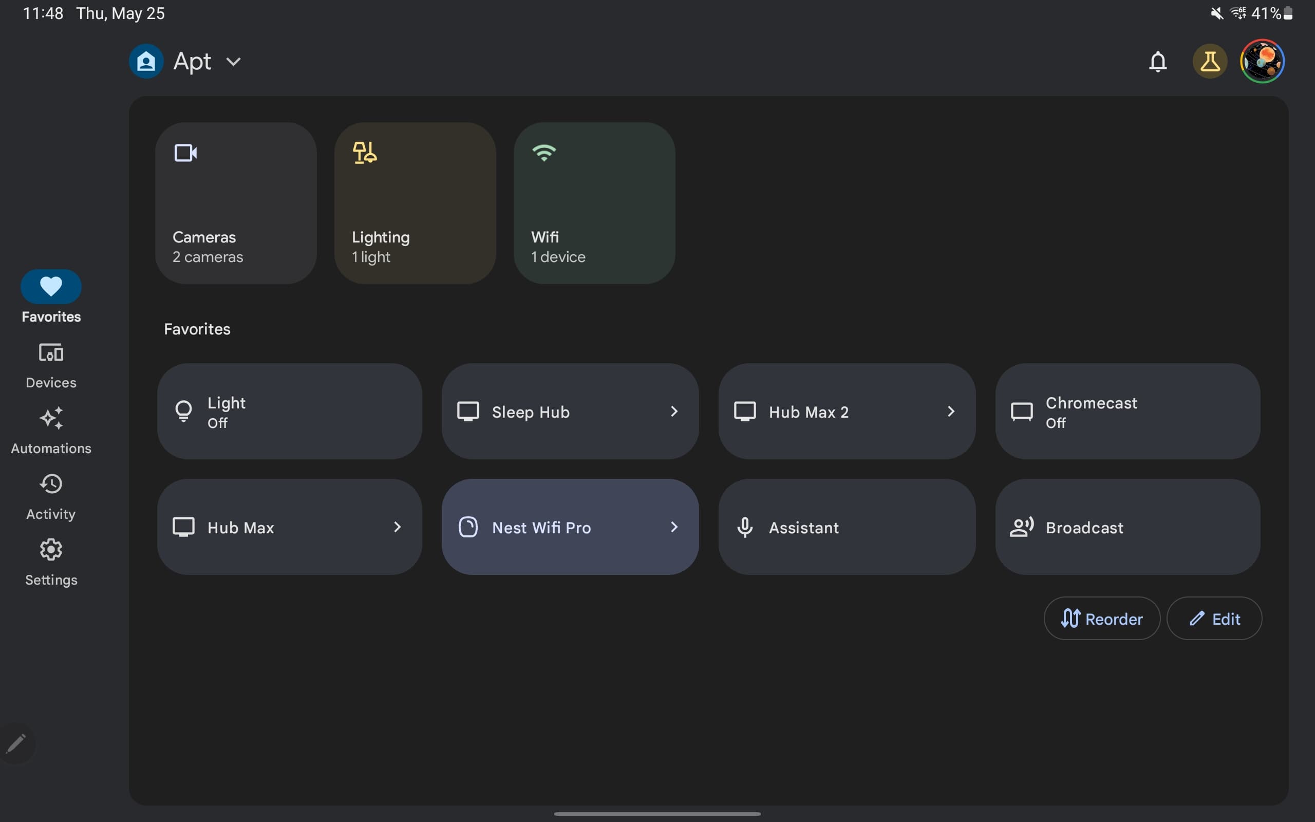
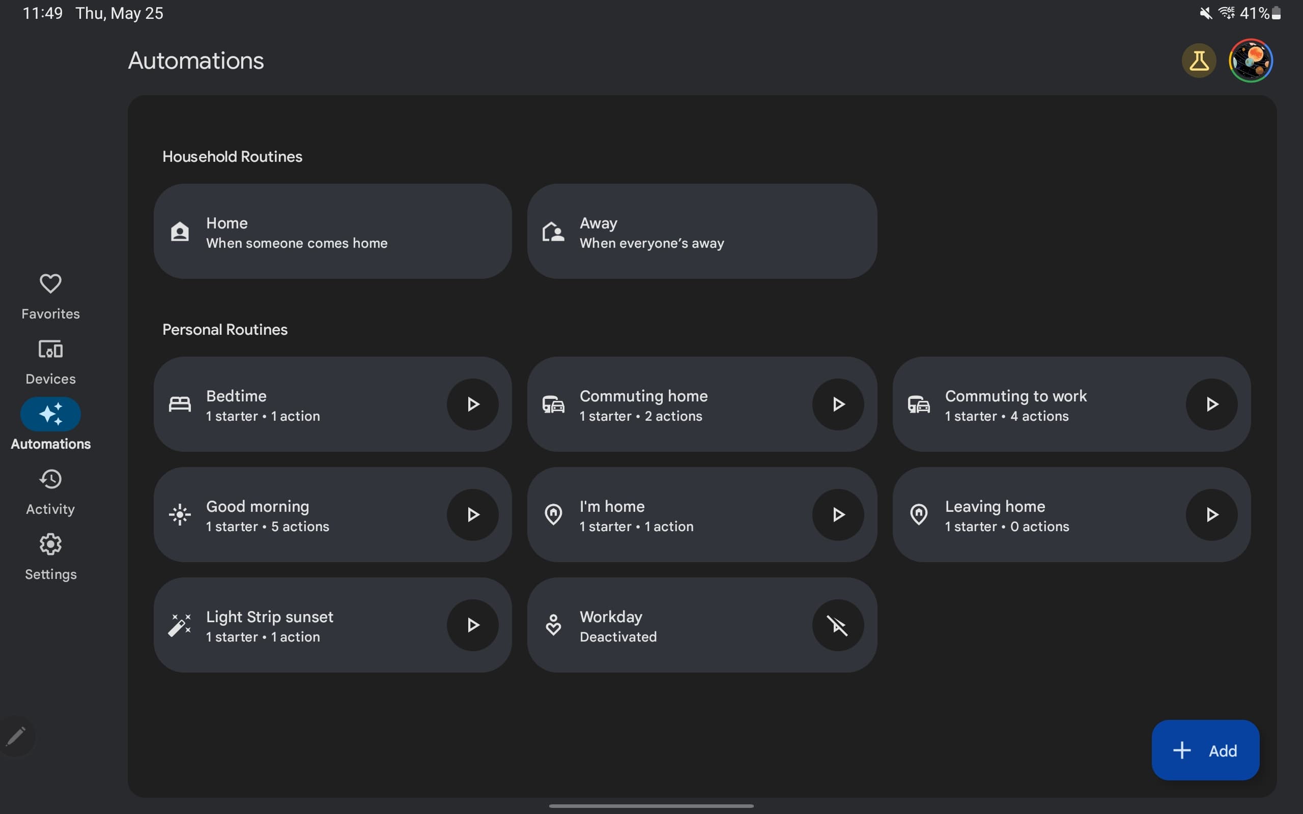
On tablets, the contents of each tab – Favorites, Devices, Automations, Activity, and Settings – are now placed in a new container with rounded corners that’s distinct from the navigation rail and top app bar. The latter components are displayed against a different background (light blue when the dark theme is disabled).
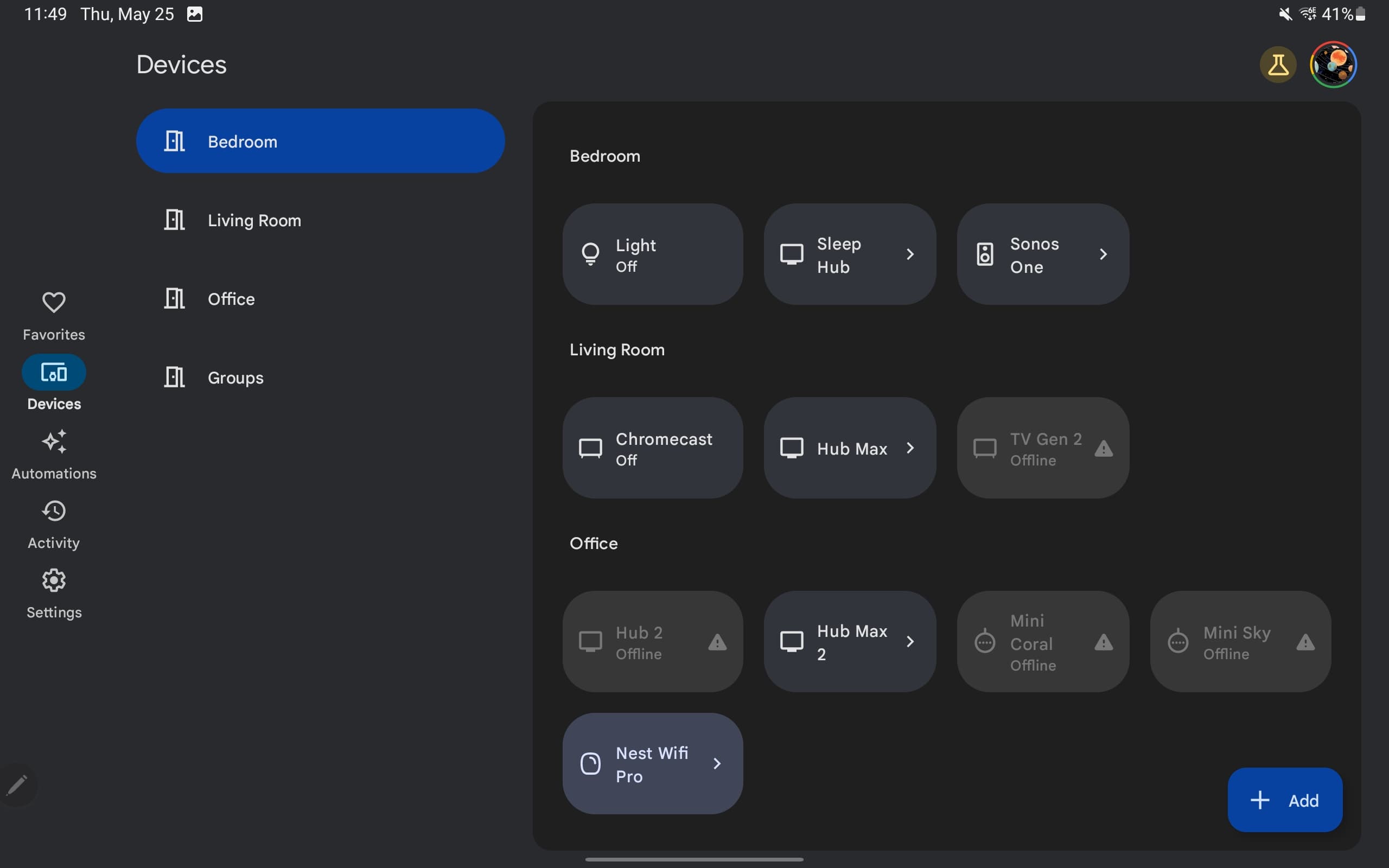
The other major change sees the Devices tab adopt a secondary navigation element that lists each room. Selecting one will immediately scroll you to that grouping, with each device tile narrower as a result. The bar does not appear in portrait orientation, though the nav rail still does.
Update: A modified version of this bar appears in the Favorites tab for Spaces (Cameras, Lighting, Wi-Fi, and Climate).
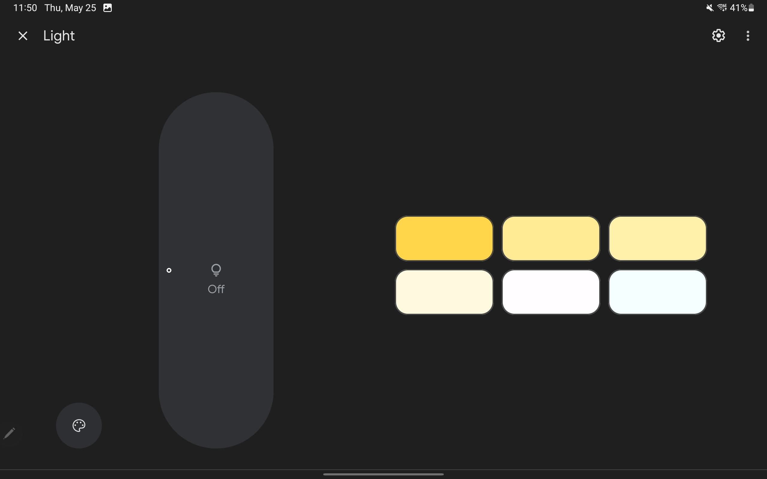
Speaking of lighting, version 3.1 of the Google Home app on Android rolls out the new lighting controllers.
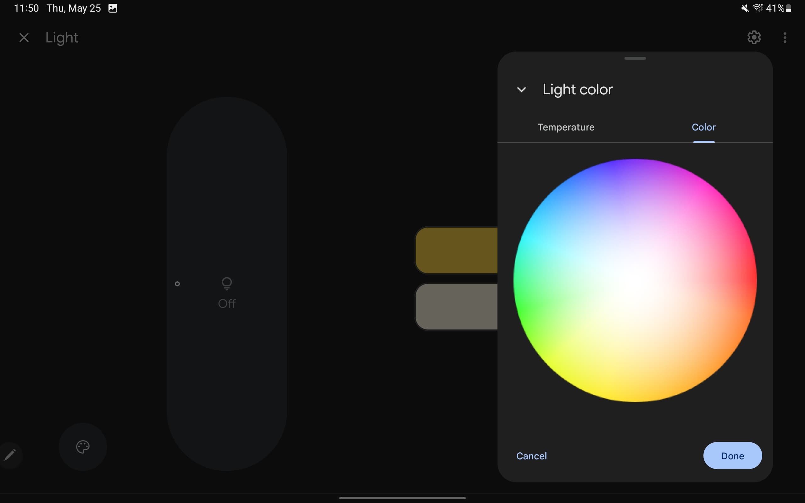
The brightness arc is replaced by a slider in the shape of a pill with six quick temperature options below. A lighting FAB brings up a new sheet with two tabs. The first shows a strip to control temperature, while you have a circular color picker in the next tab.
Google has also tweaked the controller page for other devices so that the name is now in the top-left corner instead of being centered. Suggestion chips might appear higher up on the page, while now playing information now appears underneath controls.
Google Home 3.1 is now rolling out via the Play Store.
More on Google Home:
- Google Home’s animated camera notifications on Wear OS rolling out in June
- How to use Automation Routines in Google Home
- Google Home app will fully support legacy Nest Cam starting in July
- Google Home 2.66 for Wear OS rolling out: Redesign, Favorites, media controls, & more
FTC: We use income earning auto affiliate links. More.



Comments