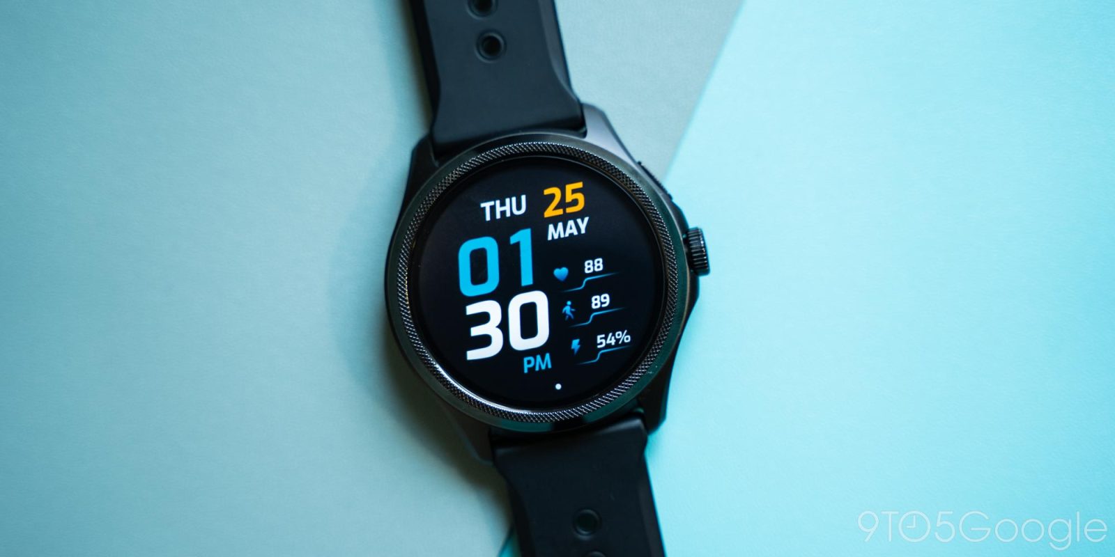
Android smartwatches have been in a rough state for years now as they’ve watched the Apple Watch become an absolute juggernaut to compete against. But the debut of Wear OS 3 and some proper hardware has breathed new life into Google’s efforts and has also now given us the TicWatch Pro 5, a powerhouse smartwatch that literally outlasts the competition.
The TicWatch Pro 5 is, at its core, the same TicWatch Pro that’s been beloved in years past. It’s a full smartwatch with a big battery and OLED display, but with the trick of throwing another display on top of that one to help save power in always-on mode. And, just like in years past, it’s a very clever solution to a real problem – one that functions wonderfully.
Mobvoi has built on what that outer display is capable of over this generation and the one prior too. You can do more with that second display, such as showing step and heart rate data and integrating with workouts. The backlight can even change color based on your heart rate while tracking a workout, which I thought was super neat. Functionality on that second display is improved across the board, and with all of the best features of past models including the ability to customize the backlight color.
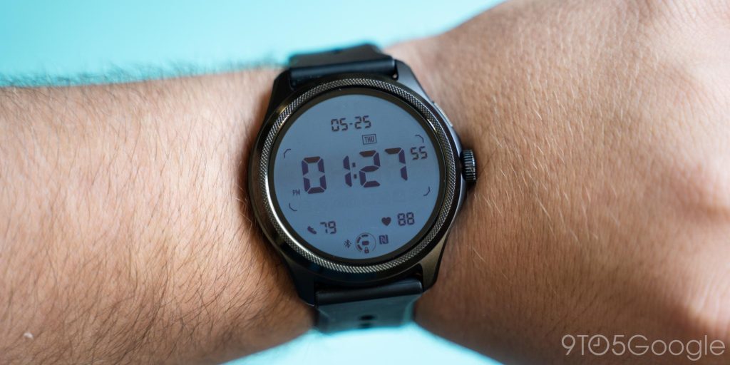
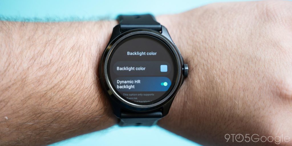
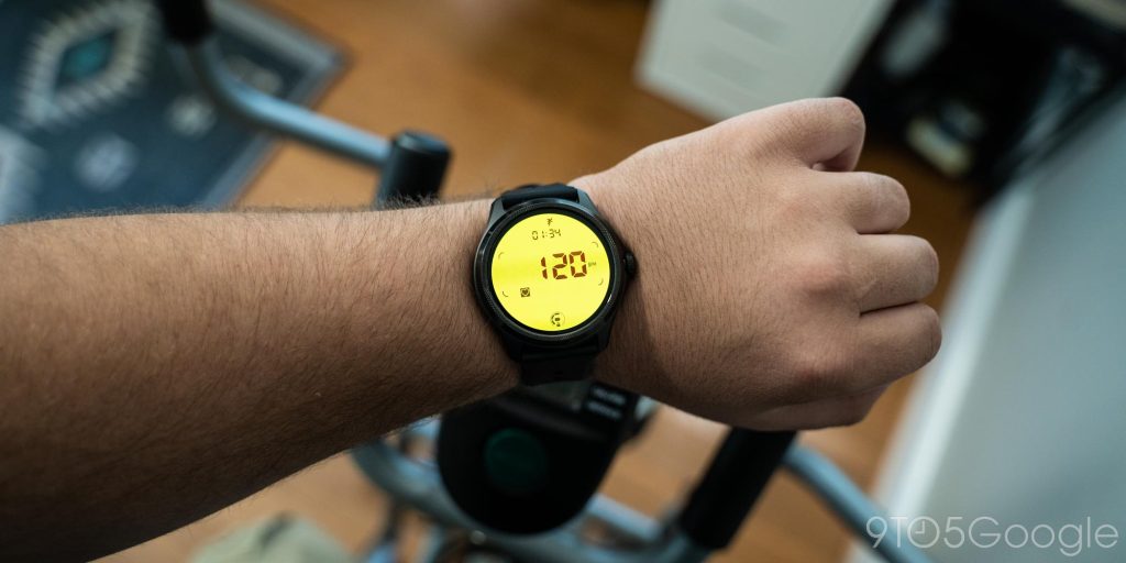
The biggest boost to that second display this time around is the various improvements to “Essential Mode.” That mode disables Wear OS almost entirely and just uses that low-power panel. The result is weeks of battery life without killing all the features. Along with showing the time, you’ll see steps and your heart rate. There are also “tiles” which can show your heart rate on a bigger screen, calories burned, and even a compass. This doesn’t really change anything to the Wear OS experience, but it’s a useful feature if you forgot your charger on a trip, or if you’re going camping.
But that said, I was a bit disappointed in the dual display this time around. It just feels… not great. The dual-layer construction leads to an OLED panel that feels sunken and not as sharp, and more so not as bright and crisp as competing options. I think this has always been the case, and it just took some real competition in Wear OS to show how far away Mobvoi is on quality. Do the pros outweigh the cons? For me, not really, but I think there are plenty of folks who would appreciate the dual-layer tech enough to deal with these negatives.
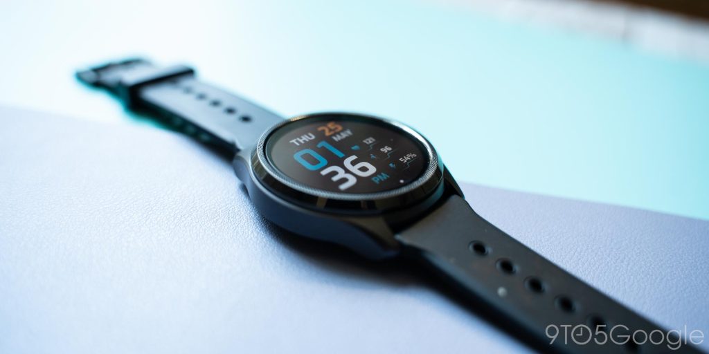
It is a compelling argument, after all. Mobvoi’s top layer provides this smartwatch with killer endurance.
So, on that note, let’s talk about the biggest selling point for this smartwatch.
In my use over the past couple of weeks, the TicWatch Pro 5 has easily been a two-to-three-day smartwatch. I generally saw as little as 20% of battery used in a single day and up to about 40-50% if I used the watch to track a workout or was away from home for an extended period. That’s with the dual-layer always-on display enabled and all default power-saving measures in place.
And really, that’s incredible for a full Wear OS smartwatch.
Charging was also speedy, with Mobvoi’s claim of 65% in 30 minutes being pretty much dead on in my testing. Topping off power is really just a complete afterthought with this smartwatch, which is probably a good thing as the charger itself is not good. The charger uses pins to deliver power, a method that other Wear OS watches from Fossil also employ, but Mobvoi’s tiny connector and weak magnets make charging annoying. I wish the company would just follow the industry trend and use a “dock” shape.
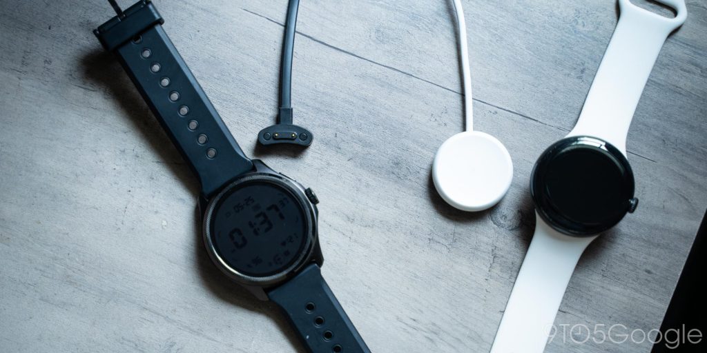
However, I can only fault Mobvoi so much here because the rest of the hardware is quite good. This watch doesn’t really scream “premium” or style, but it does deliver a utilitarian look that pulls in elements from traditional watch designs, such as the knurled bezel. The watch is using aluminum and steel, but it doesn’t really feel like it. It all feels rather plasticky, even though I know it isn’t.
It is a big watch, though. The 48mm width felt cumbersome on my wrist at first after a few months on the Pixel Watch, but the big screen certainly felt like a worthwhile benefit.
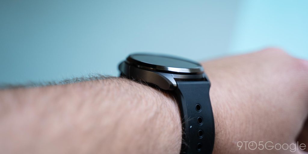
I’m also not a fan of the band situation. The good is that it’s a classic spring pin system, but the bad is that Mobvoi has switched from the 22mm size used on all past TicWatch Pro models to a new 24mm size. Why? The company told me that it was purely an aesthetic choice – one I’m sure loyal TicWatch Pro fans will just love.
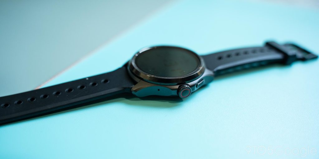
Plus, the TicWatch Pro 5 finally adopts a rotating crown. The power button can now be used to scroll through content on screen and integrate with some apps, such as Google Maps and Spotify, for additional controls. The button itself can be used to wake the watch, go back to the watch face, go to a recent app (double-tap) and open the app drawer. Above that, you’ll find a smaller button, which is used for the power menu, recent apps menu, and Google Wallet on a double-tap. This is identical to Google’s Pixel Watch, though there’s no Google Assistant support on this watch.
On the software front, this is Mobvoi’s first smartwatch with Wear OS 3 – finally!
Mobvoi’s take on Wear OS 3 is clean and nearly identical to what you’ll find on a Pixel Watch, just like the navigation as mentioned. The only real difference you’ll find comes from Mobvoi’s preloaded apps, of which there are a lot.
- Essential mode settings
- Mobvoi Privacy
- Mobvoi Treadmill
- One-tap measurement
- TicBarometer
- TicBreathe
- TicCare
- TicCompass
- TicExercise
- TicHealth
- TicOxygen
- TicPulse
- TicSleep
- TicZen
- TimeShow
You’ll find those apps loaded up on the TicWatch by default, and most can’t be uninstalled.
While many of these are totally reasonable, like Essential Mode settings and the exercise and health apps, the whole setup is messy. Why do I need seven apps for health and fitness? Why is there an entire app for privacy settings? Why is there an entire app – that I can’t remove – for recommending mostly paid watch faces? Why is there an app for Mobvoi’s Treadmill that I don’t own?
It’s easy to see the reasoning for a lot of this – with health apps, Mobvoi is taking Apple’s lead, and they’re not the only ones who have done that. And for others, it’s simply a necessity and there’s no better way. But the necessary and the bad mix together for a bloated experience that I just didn’t like. It’s cluttered, and it takes way too long to scroll the app drawer as a result.
Mobvoi needs to let users skip installing these during setup – they have that choice now that the TicWatch Pro 5 pairs in the Mobvoi Health app – or at least leave them able to be uninstalled.
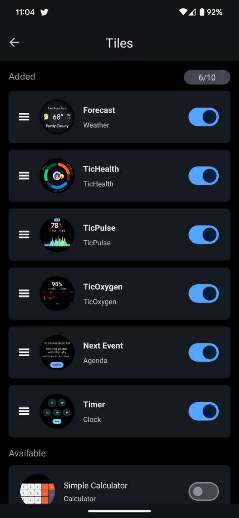
But really, there’s more good than bad with Mobvoi’s software. There are a bunch of added tiles for actions such as a calculator, goals, and health/fitness tracking.
The TicHealth suite works quite well. The exercise app can track a huge variety of workouts, and the aforementioned integration with the secondary display is really unique and useful. Health tracking overall was solid but reinforced the point that you shouldn’t rely on raw data captured by devices like this. Step counts on the TicWatch Pro 5 were lower by 30-40% versus a Fitbit Charge 5 on my other wrist, though the heart rate sensor was within 5 bpm on average. This reinforces that this sort of data should only be used to find trends, but I’ve got to say, the undercutting of data compared to my Fitbit only left me discouraged with my activity levels – like my efforts were in vain. It seems that Mobvoi’s suite is more geared towards more serious workout regimens, rather than more casual activity such as aerobics and walking.
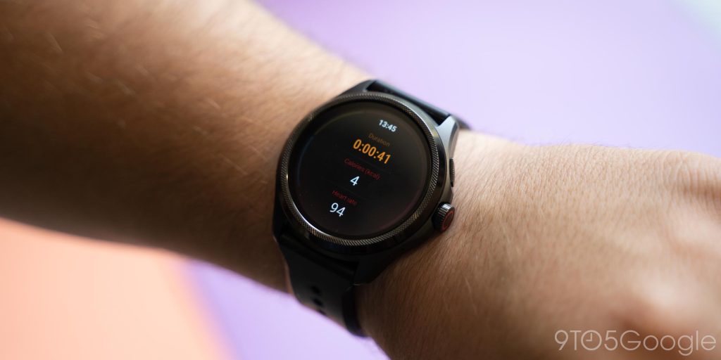
Another perk here, though, is that Mobvoi’s software doesn’t care about what smartphone you’re using, unlike Samsung’s Galaxy Watch. Every feature will work with every Android phone. And when it comes to those health features, Mobvoi’s full feature suite comes at no added cost, where the Pixel Watch’s Fitbit suite locks a lot of options behind a subscription. Fitbit offers a better overall suite in my opinion, but Mobvoi’s works very well.
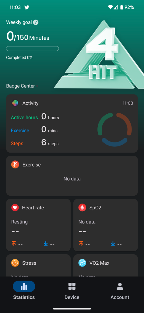
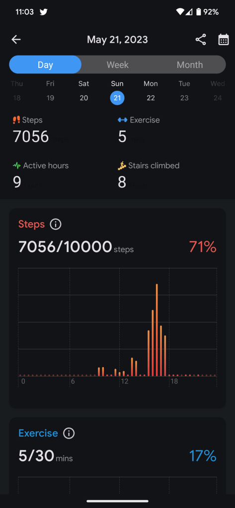
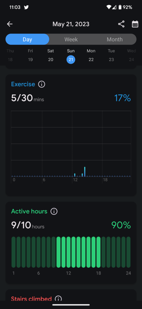
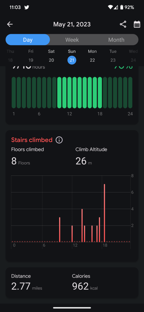
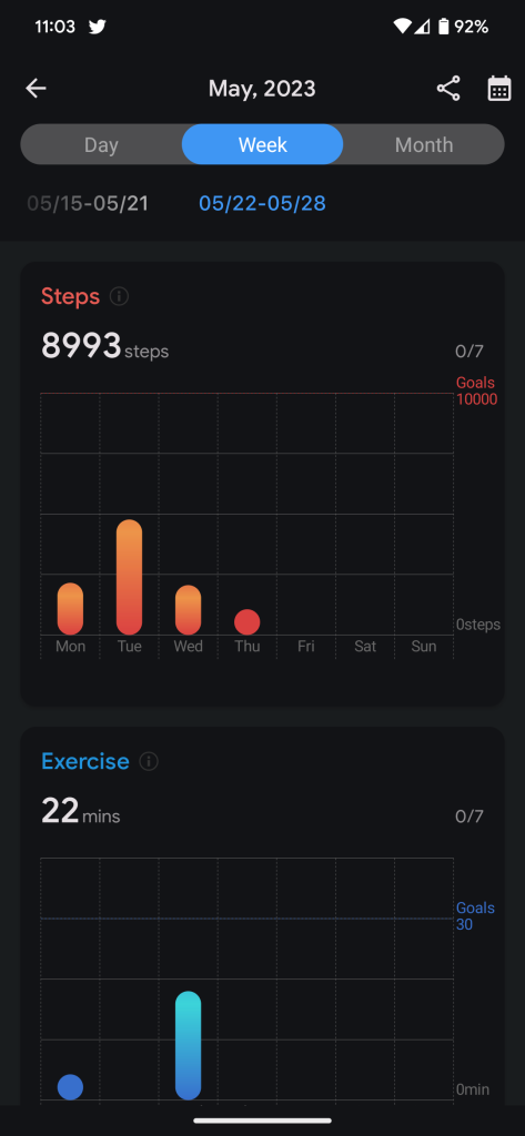
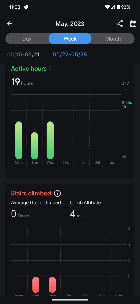
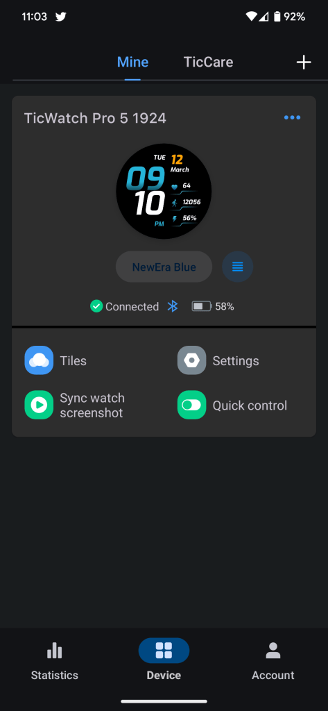
The new Mobvoi Health companion app on your phone is also good overall. I didn’t find myself needing to open it very much, but it does a pretty decent job of capturing health data in one place. It’s not abundantly obvious how to see historical data in the app, but you can find it and compare trends.
I am worried, though, about the future of Mobvoi’s software updates. The company is still essentially in the early days of bringing Wear OS 3 to older models, seven months after Fossil, a brand not exactly known for quick updates. I highly doubt we’ll see a leap of Wear OS 3’s magnitude during the TicWatch Pro 5’s lifespan, but Google’s commitment to bringing more regular and major updates to Wear OS has me really wondering if Mobvoi will be able to keep up because it’s clearly not the company’s strong suit.
When I asked Mobvoi about any updates on its plans for Wear OS 3 on older TicWatch models, the company didn’t have any response aside from its previous update that didn’t really give any information. With that in mind, I wouldn’t expect a Wear OS 4 update on TicWatch too quickly after the Pixel Watch gets it.
Despite that concern, though, the one thing I’m extremely happy with is performance. The Snapdragon W5+ Gen 1 chip under the hood is speedy, making the whole UI snappy. Outside of waiting for networks, I rarely found myself waiting long for apps to load up. Compared to the Pixel Watch, I found that apps were quicker, but the UI as a whole felt roughly the same in terms of smoothness.
Snapdragon W5+ Gen 1 seems to be a brilliant chip based on what I’ve seen here, and one I’ll be excited to see in other watches down the line.
Final Thoughts
The feeling I can’t seem to get past with the TicWatch Pro 5 is that it might just be a little too late.
Mobvoi’s new smartwatch is playing catch-up in a lot of ways, and even though it has brand new tech in Qualcomm’s Snapdragon W5+ Gen 1, it’s facing some stiff competition. Google’s Pixel Watch, despite its flaws, has better health tracking (albeit with much of it paid, where Mobvoi’s is free). Fossil has better and more versatile designs. And Samsung’s Galaxy Watch, albeit with a totally different software experience, does everything better than the TicWatch for a much lower price.
The only reason anyone should buy a TicWatch Pro 5, in my eyes, is for the sake of battery life. Despite its shortcomings, it’s hard to argue against the absolutely stellar battery life this smartwatch offers, and it does so for a lower cost and a less obnoxious design than Samsung’s Galaxy Watch 5 Pro. But even then, it’s hard to tell you to pull the trigger – Google has a new Pixel Watch on the way and plenty of areas to improve, and Samsung is just a few weeks out from the Galaxy Watch 6 series.
The TicWatch Pro 5 is available now for $349.
Where to buy TicWatch Pro 5
More on Smartwatches:
- Source: Google planning to launch Pixel Watch 2 with Pixel 8
- Google announces Wear OS 4, Gmail and Calendar for watches, more
- Galaxy Watch 6 Classic leaks with the return of the rotating bezel [Gallery]
FTC: We use income earning auto affiliate links. More.


Comments