
I’d like to believe that Google’s modern hardware division could have released a tablet primarily for content consumption – like the Nexus 7 – at any time since its inception in 2016 but just chose not to. Made by Google’s high-level MO is to add unique aspects to its products. On the Pixel Slate, that was deemed to be productivity, and it did not work. In trying again with the Pixel Tablet, Google clearly still believes it needs something unique, and that’s how we have a Nest Hub Smart Display UI sitting – literally – on top of Android.
Table of contents
Hardware
Design: Screen, buttons, and coating
In designing the Pixel Tablet, Google didn’t just take the screen portion of the Nest Hub Max and call it a day. It sure looks and feels like that initially, but there’s a bit more nuance.
The bezel surrounding the 10.95-inch LCD is nice to have and has a reasonable thickness, so you can always rest your thumb without obstructing the screen. The bezel comes in either white or black, depending on the model you buy. The white frame is fine, but black makes more sense in more use cases. Google argues that the white bezel is better for using the device primarily as a smart home device, but we’d say black fits in quite well too and looks better in use as a tablet. The darker look is slimming and just blends in with the screen most of the time, especially to hide the front-facing camera and sensor cutout. Meanwhile, the “Rose” pink rear is very light and could be mistaken for white, with the green “Hazel” shade being the most distinct.
A single tap of the display can turn it on, and there’s also lift-to-wake. It’s bright (500 nits), sharp (276 PPI), and vibrant, with good viewing angles.
However, I’d recommend you turn off Adaptive Tone, which “dynamically adapts the display to warmer or cooler tones based on ambient lighting.” It might be nice for ensuring a Smart Display doesn’t stand out as a distracting bright screen in your home, but for regular browsing, it makes everything dull and unappealing. The company, however, told us that Adaptive Tone was optimized for text legibility, especially during extended reading periods.
Regardless, I find it to be a poor out-of-the-box default setting on Google’s part and one that was not shown during setup. I would have appreciated an option that would enable Adaptive Tone only when docked.
To me, the screen – which is protected by Gorilla Glass 3 (like on all past A-Series phones) – can easily depress with what I’d consider an average, non-forceful tap. It’s not noticeable when you’re typing, and the only reason I bring it up is that it just feels different from the flagship phone you’re used to and a lot of tablets too. There’s no real impact on functionality or durability, with Google telling us it conducted thorough testing.
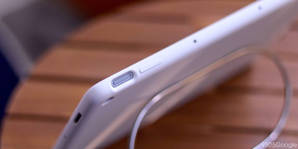
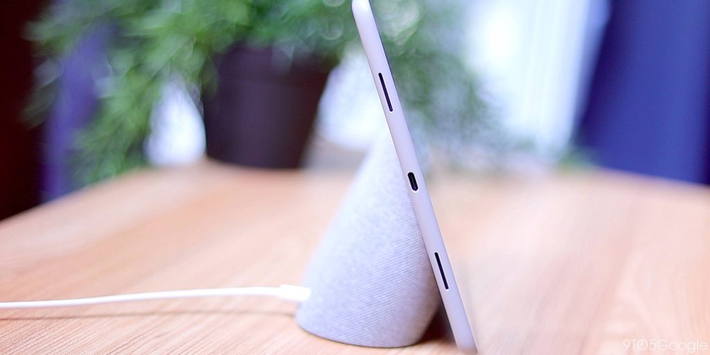
There’s a reliable fingerprint sensor (up to five digits can be saved per user) in the power button at the top-right corner. Given the placement and angle, your index and maybe middle finger are the only ones that can comfortably reach it every time. Regardless of whether the display is on/off, you can just lay your finger (instead of clicking) on the reader to unlock the tablet. That’s good because this sensor-button combo is a bit repressed and basically flat with the edge of the Pixel Tablet. This is fine for a fingerprint reader, but it somewhat hides the power key, with the already minimal camera bump in the corner being more prominent/distinct when you’re blindly trying to unlock/lock.
Funnily, in the first few days with the Pixel Tablet, I kept trying to unlock it as if there was an under-display fingerprint reader. I’m just so conditioned to it after two years on the Pixel 6 and 7. In that regard, I wish there was Face Unlock here – its lack is a result of Google opting for a cheaper camera component that doesn’t have dual-pixel auto-focus (DPAF) – for cross-device consistency, but the biometric sensor we have is more than reliable and works every time, unlike the Pixel 6 and 7.
Next to the power button, you’ll find a shiny volume rocker that I wish was slightly longer. It also should have been a bit tighter because there’s a left-right wiggle to it.
On the bottom edge, you’ll find two strips of rubber that can prop up the Pixel Tablet when it’s laid against a surface, such as a wall. It’s more secure than if there were no feet, but I didn’t find myself doing this too often as it still feels precarious. It’s the first of two truly unique design additions on Google’s part, but there is a downside. Holding the side with feet when the tablet is in portrait orientation is awkward. It feels like you could peel them off every time your finger brushes against the slivers of rubber.
The Pixel Tablet feels refreshingly light coming from the 12.9-inch iPad Pro and even Samsung’s 11-inch Tab S8. It contributes to the floating screen effect when you’re reading or watching. When holding it, I’m particularly fond of the rounded sides and corners that don’t dig into your palm. At first, you’ll find yourself covering the bottom speakers, but your grip will adjust over time.
To me, the nano-ceramic, porcelain-mimicking coating that Google talks a lot about feels overly grainy. It feels like there’s a layer of fine powder on it at all times that I, specifically, am compelled to try to remove. This certainly helps with grip, and I will say the Pixel Tablet’s coating is slightly more grippy than metal but not enough that it justifies the different approach.
Underneath the coating is an aluminum body that’s obvious to the touch, feeling like a nice metal when it’s cold. However, it weirdly feels like plastic when it’s at surface temperature or higher, whether because you’ve been using the device for a bit and it’s gotten warm or because your hands are already sticky/sweaty. In these instances, it decidedly doesn’t feel premium. I thought the company was aiming for the Pixel 5’s much smoother and thicker-feeling bio-resin. It’s a real shame that Google didn’t just return to that.
In all, the hardware is good. Nothing more, nothing less. It is slightly more premium in hand than it looks, but the Pixel Tablet doesn’t scream flagship compared to modern Google hardware. If I were to place it in the phone lineup, I’d say the Pixel Tablet was an A-Series device that is good enough but with compromises, like not using the best available materials, for the sake of price. However, in this case, I wonder if Google overengineered the coating in aiming for a unique porcelain feel that not all people will appreciate. Would a standard metal body have been better, if not simpler?
Accessories, or lack thereof
One of my favorite aspects of the Galaxy Tab S8 is its optional case that has a silo in the book-style spine for the included S Pen. Compared to the iPad Pro and Apple Pencil, it’s less likely to get dislodged. I bring this up because always carrying a stylus is great. Typed-out notes suffice more times than not, but sometimes you want to scribble things down or lay out information spatially.
The Pixel Tablet has support for the USI 2.0 standard but no first-party pen and no obvious place to dock or charge it. As a note, USI 1.0 pens will not work on the Pixel Tablet as the standard does not offer backward compatibility. Since the Android team was talking up pen input so hard for next-gen apps, I thought a Made by Google stylus was guaranteed for this launch, especially given Google offered one for the Pixelbook and Slate, but nope.
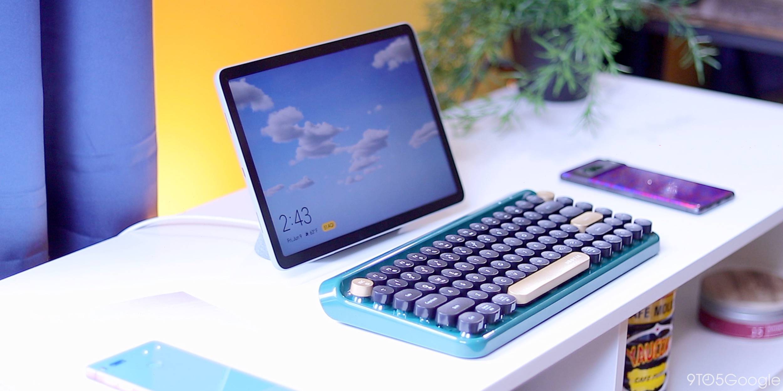
There’s also no official Google keyboard/case combo, which means the Pixel Tablet doesn’t end up being a dedicated productivity device. Workspace apps like Drive and Docs/Sheets/Slides have been well-optimized in the past year to take advantage of extra screen real estate, and they don’t feel like stretched-out phone apps. However, a first-party keyboard would have solidified the use case. Instead, the only options are generic third-party accessories.
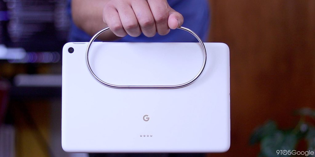
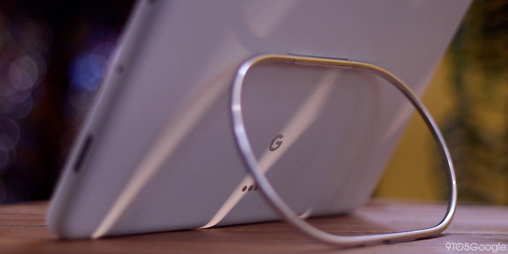
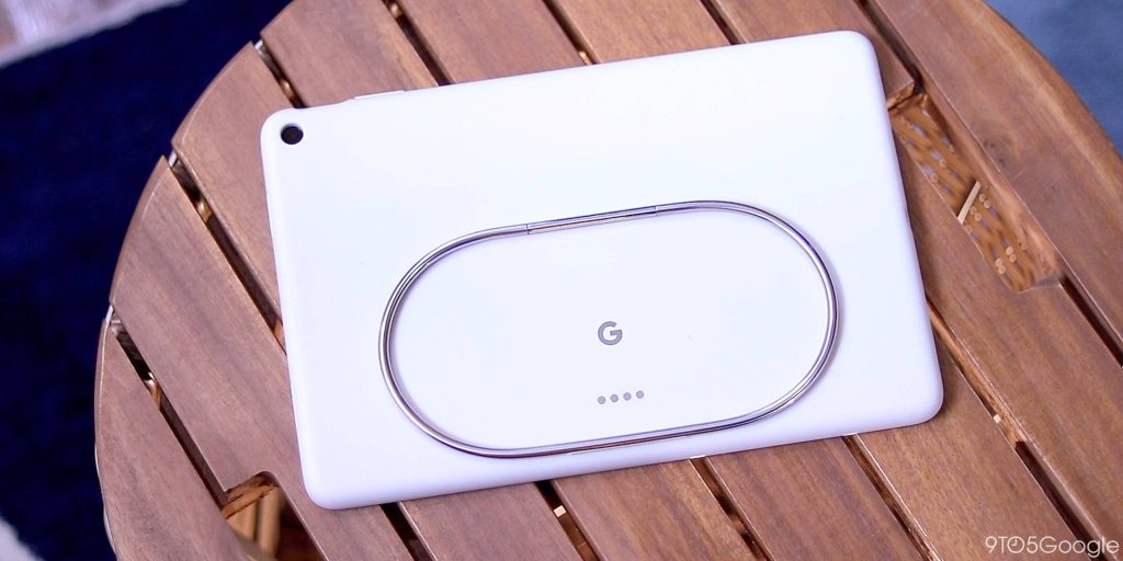
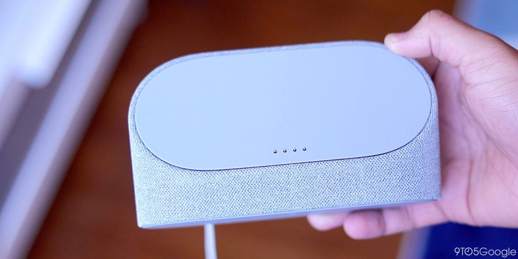
The first-party accessory you can get is a substantial rubber case with a novel kickstand using a pill-shaped ring that’s very on-brand for Google – virtual design becoming physical. The case is solid, and the pill is the same size as the surface of the Charging Speaker Dock. It serves as a physical docking guide that is weirdly satisfying. In using the ring as a handle, the Pixel Tablet Case is quite versatile and supports everything from upright to flat. When it’s in the latter position, you can use it as a hook point to elevate the screen. It doesn’t feel like too precarious of an arrangement, and the Pixel Tablet is light enough. Placing the handle that way also allows you to carry around the Pixel Tablet like a briefcase. This is another example of uniqueness and perhaps overengineering but one that’s successful and delightful.
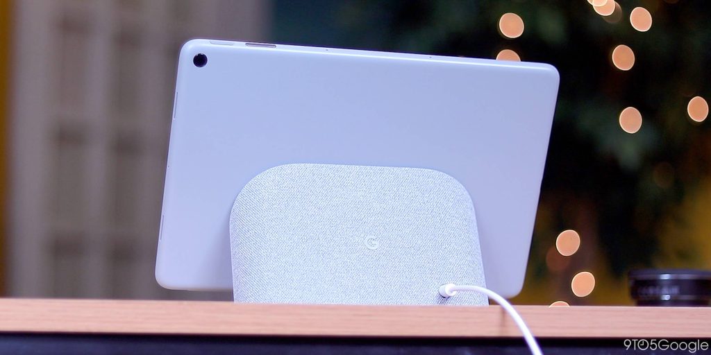
You never need to take off the case, with passthrough pogo pins on the rear for charging from the dock, but it’s worth noting that removal is kind of hard, with some prying required.
Charging Speaker Dock
The Pixel Tablet’s Charging Speaker Dock, which you assign to a room in the Google Home app, is included in the box. Google set out to surpass the 2nd-gen Nest Hub with the hardware (43.5mm full-range speaker with 78dB loudness and 71dB bass) instead of the Hub Max. It does feel better than the tablet alone, but I wished Google aimed for the Max’s speaker, given how weird-looking the dock, sans tablet, is. If I’m going to have this awkward form/object in my home, I want it to be powerful and have a bit more utility.
That brings us to the fact that this stand cannot be a standalone Google Cast target when the Pixel Tablet isn’t docked. (When connected, it can be added to a Speaker Group.) The stand costs $129 standalone if you want to add more to your home. However, additional docks make too much sense from a value standpoint if they can’t even replace a Nest Mini.
There are magnets on both sides of the connection. It’s solid, with downward pressure, such as when adjusting the volume or long-pressing for Assistant, not causing the tablet to separate from the dock.
Google says you can use one hand to dock the tablet, but two hands, one placed on each side, are advised for removal. (You’re supposed to slowly rotate the tablet downward/clockwise to undock.) The dock could be heavier as there is always a little bit of lift on removal. It’s possible to undock with one hand, but the official recommendation works more often.
A virtual wave emanates from the center of the screen upon docking, but that was preceded by a loud physical thunk, which explains the next thing I noticed.
The pogo pins on the dock can give off the appearance of scratching the Pixel Tablet’s coating. In my testing, this happened immediately, with vertical, pencil-esque lines consistently emanating from the four metal contact points. Google equates this phenomenon to chalk on a chalkboard and that (70%) isopropyl alcohol wipes can remove — we confirmed — the markings. The markings can be an eyesore, but you don’t often look at the back of your tablet and can wipe the marks away as needed.
Performance & Battery
Inside, the Pixel Tablet is powered by Google Tensor G2 with 8 GB of RAM to power Assistant voice typing, “high-quality” video calls, and multitasking. Here, Google earns a premium moniker because Android and Material You feel polished. Two-app multitasking with a picture-in-picture window never slows down the tablet. Tensor running hotter during longer sessions remains the case on the Pixel Tablet, but heat is slightly more dispersed given the wider surface area and is at least not present on the left and right edges.
The 8 MP front-facing camera is physically identical to the one in the back corner, but only the selfie lens offers Portrait Mode and automatically keeps you in the frame on Google Meet video calls. There’s a physical green indicator light next to the camera on the bezel when either the front or rear lens is active. It’s paired with three far-field optimized microphones.
The cameras are fine for video calling and when you need to take a quick picture. If I was saving something for posterity, I’d obviously use my phone.
There’s an Ultra-Wideband (UWB) chip for “accurate ranging” that’s not currently used for anything. Google tells us this connectivity will “power new cross-device capabilities in the future.”
The Charger Speaker Dock, with its 15 W max charging rate from a barrel plug adapter, means your Pixel Tablet is always ready whenever you need it, to the point that battery life for in-home usage is a non-factor even with just overnight dockings. You’ll always have more than enough battery for even the most extended of sessions, and I think you’ll be charging more than once a day anyway if you’re making a point of using it as a Smart Display.
By default, Google limits a docked device to 90% charge to protect the battery, with a shield icon appearing in the status bar, though that can be overridden as needed in Settings. You can also, of course, charge via USB-C with a port that’s centered on the left edge of the tablet. But, notably, there’s no USB-C cable in the box and no (USB-C) charging brick either. Google expects you to rely fully on the included charging dock and provide your own cable for other charging situations.
Google officially touts 12 hours of video playback with a single charge of the 27 Wh (7020 mAh) battery. It has been hard to gauge the Pixel Tablet’s battery life since I primarily use it on the dock because that’s a physically convenient position when I’m at my desk working. Meanwhile, it has quickly become second nature to return it there once finished.
On two separate weekends, I left the Pixel Tablet off of its dock to put the battery life to the test. From a full charge on Friday afternoon (5 p.m.), it was around 20% by Monday morning (7 a.m.), with no dockings performed in between. This involved bouts of very heavy usage with frequent unlocks, multitasking, and video streaming.
Software
Android at its best
Google has been working on improving the tablet experience since Android 12L, and Android 13 continues that path. The Pixel Tablet is the first device that fully exhibits all those Android improvements, and it’s delightful.
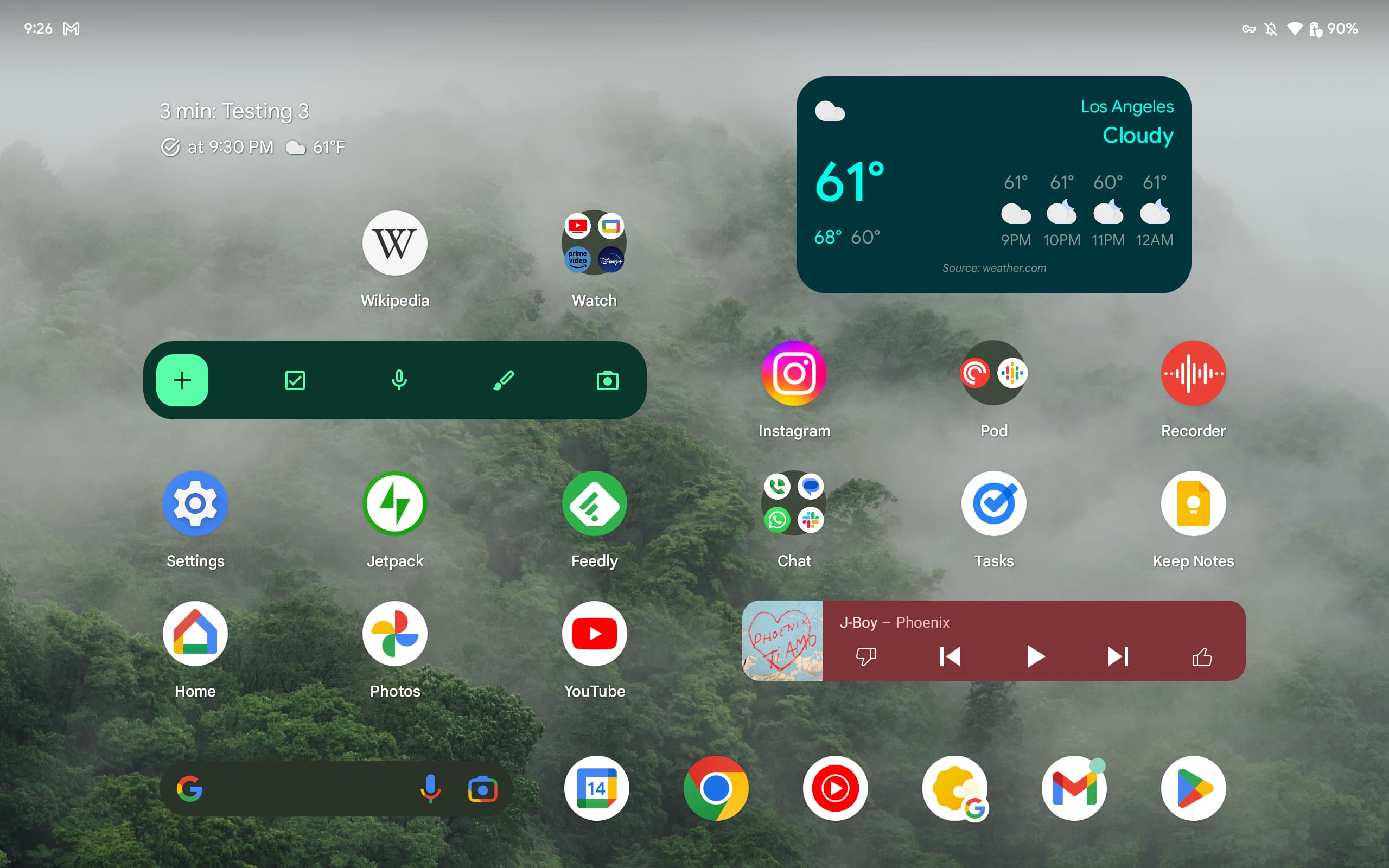
iPadOS still sometimes feels like a stretched-out version of iOS, while Samsung’s One UI skin on the Galaxy Tab S8 I’ve used for over a year is a bit too heavy. I like the Pixel Launcher and Google’s thoughtful flourishes. There’s a good homescreen layout on the Pixel Tablet that lets you place apps/widgets to the right of At a Glance, while I like the Search bar in the dock as it’s something I use regularly to launch apps.
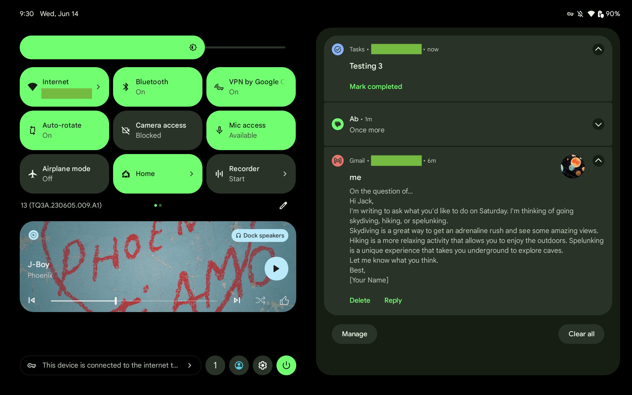
Quick Settings is like a live dashboard, with control toggles and dedicated media controls on the left while notifications are in the right column. Outside of this view, notifications don’t span the entire width of the screen, only taking up the right half.
Multitasking is handled in several ways. Compared to the Galaxy Tab S8 and how Samsung typically inundates you with choices (e.g., floating window), the Pixel Tablet is simpler and less overwhelming.
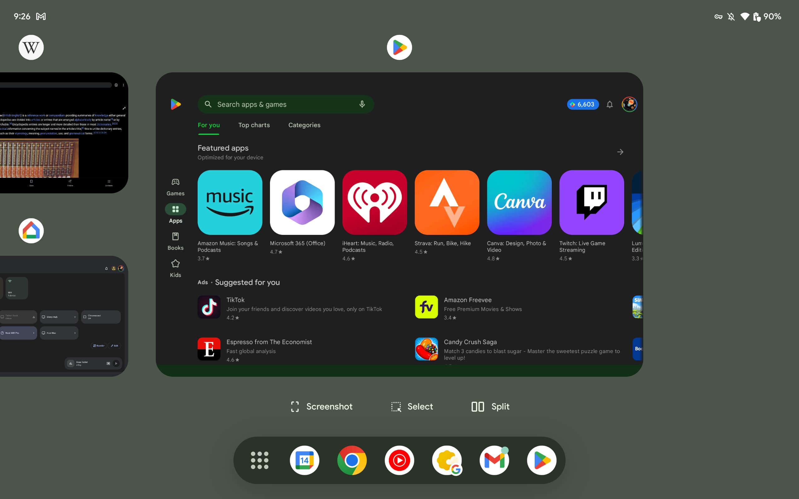
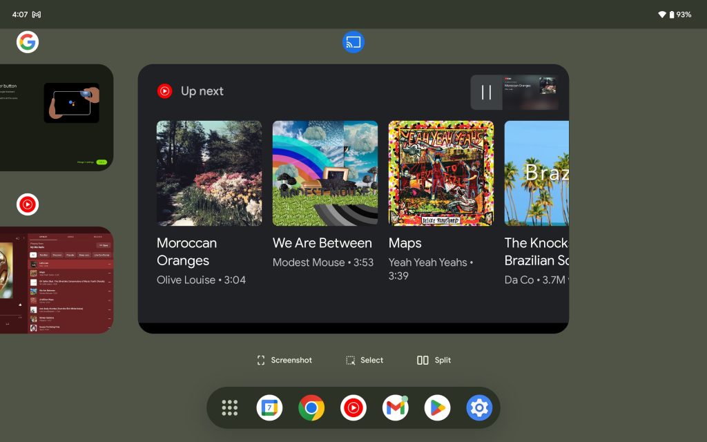
Swipe up from the bottom of the Pixel Tablet when you’re in an app to bring up a Taskbar and then drag an icon from it to open in split-screen. This tray is not permanent, with Google previously testing a bar that would stay docked at the bottom of the screen. Having used that design on the Galaxy Tab S8, I can see why Google changed direction (i.e., it can be a waste of space), but being static had its benefits, especially if you’re doing heavy multitasking and frequently switching between apps to accomplish a task.
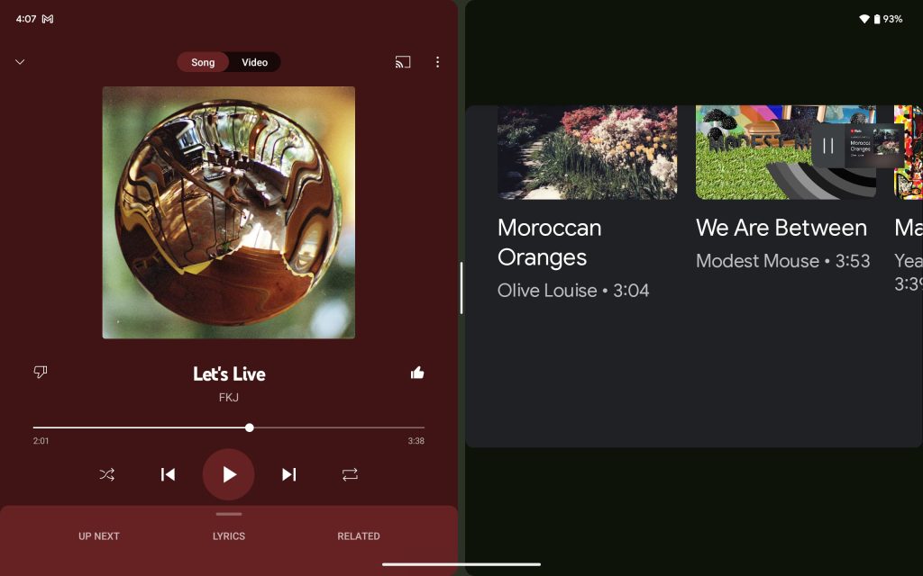
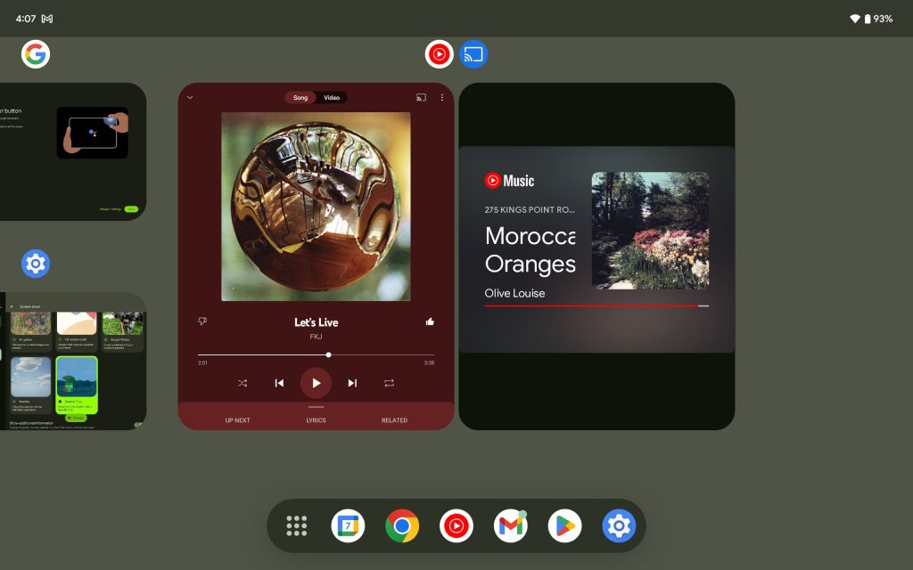
You can also long-press on an app icon, including from the launcher and Recents multitasking, to start split-screen. When there are two apps side-by-side, you can drag the vertical divider to adjust window size, while double-tapping that black/white pill will swap the app positions. Speaking of Recents, split-screen pairs are shown together for quick access, while many apps let you drag and drop images.
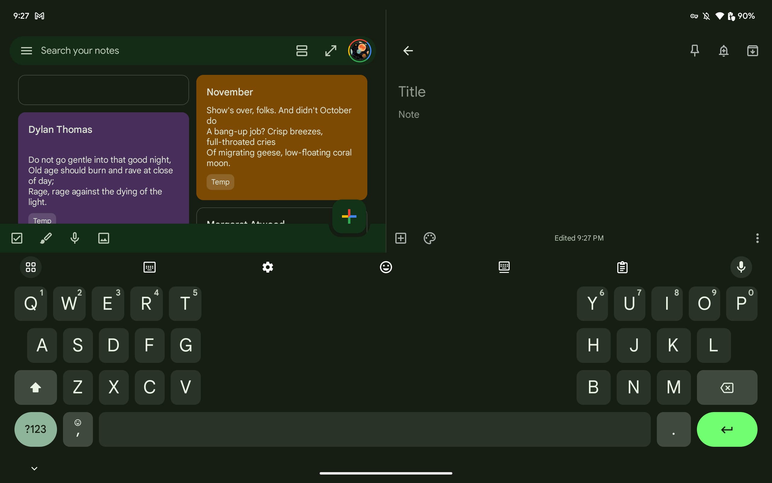
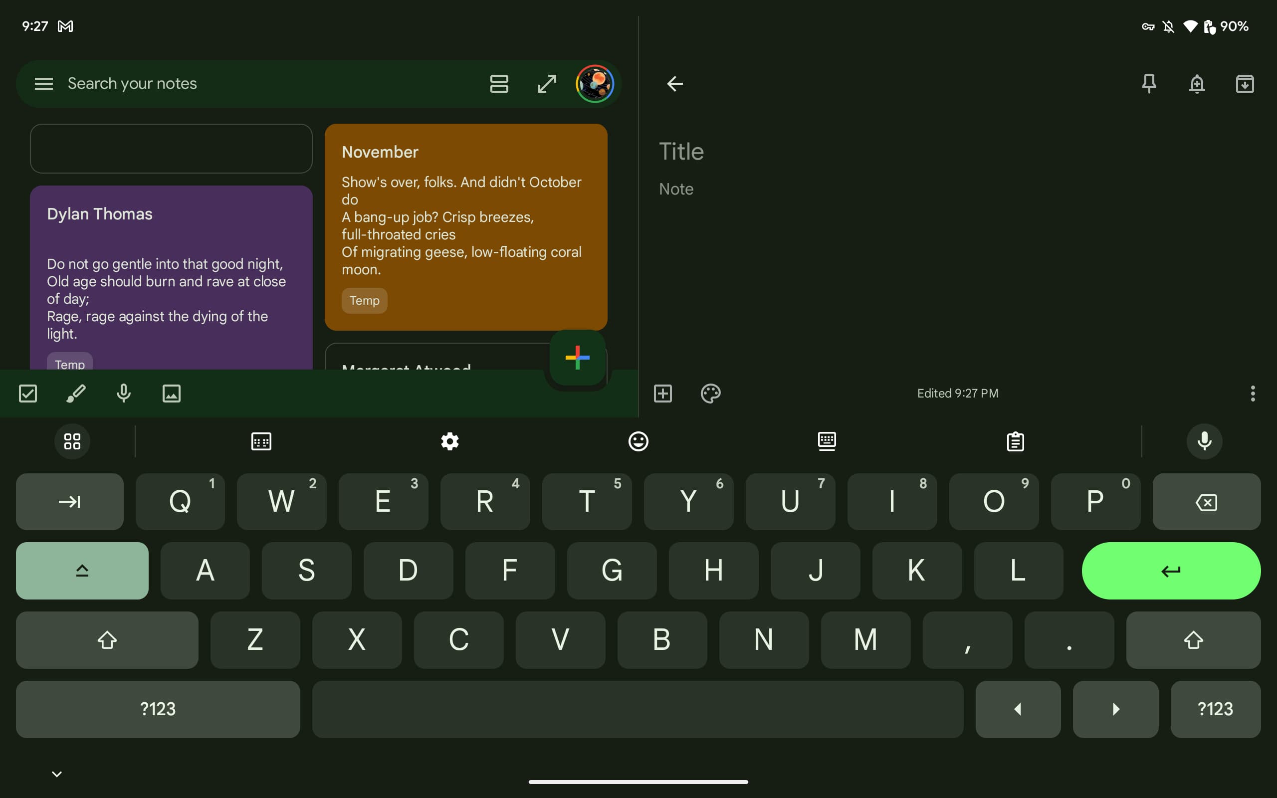
Gboard’s split mode, in which there is a huge gap in the middle of the keyboard, is really the only way to type when you’re holding the Pixel Tablet in landscape by its bottom-left and right sides. I also recommend holding the device in one hand and activating the floating mode that gives you a phone-sized keyboard. Use your free hand to peck or swipe. The full keyboard is mostly for when you’ve laid the tablet down on a nearly flat surface or on your lap.
There’s a user switcher in the status bar to the left of the Wi-Fi and battery icons. It shows a profile avatar and first name and lets you switch users, with the Pixel Tablet supporting up to eight profiles of separate homescreens, apps, and other data. If you only have one profile, the user switcher does not appear. The Pixel Tablet also supports Google Kids Space, a customized launcher for children that focuses on games, books, and videos.
On the app side, Google’s app teams have really delivered. Some highlights:
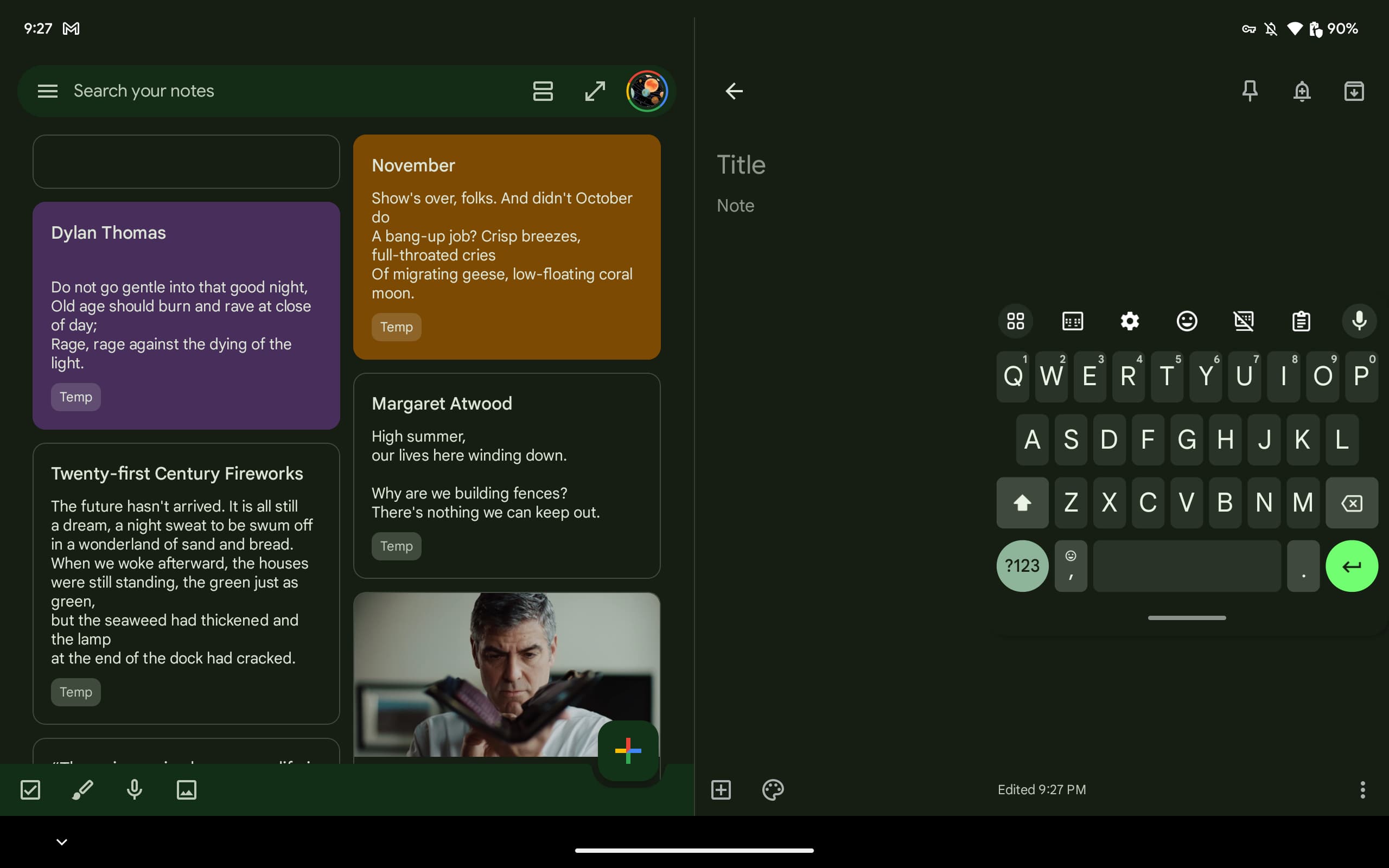
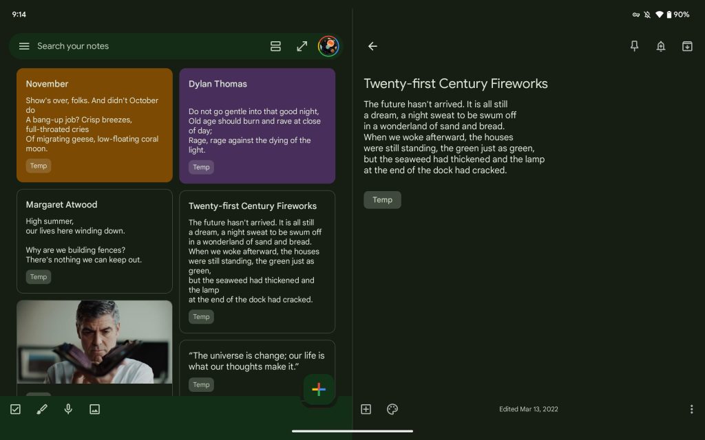
- Google Keep has a really good dual-column view in which you get to see all your notes on the left and open one on the right.
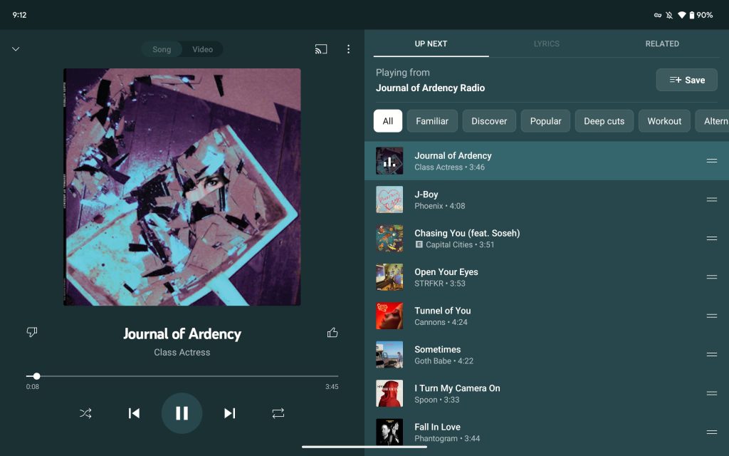
- YouTube Music is an absolute joy to browse, from the Home feed to the Library tab, while Now Playing always showing your Up Next queue is great.
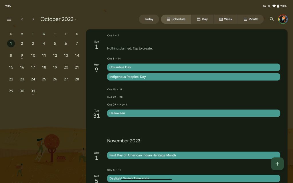
- Google Calendar is also good and is now my favorite way to check my schedule compared to phone and even desktop apps.
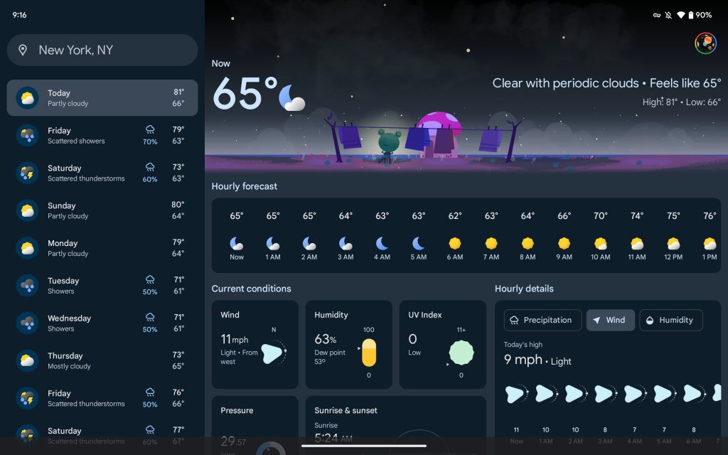
- The Google app’s Weather experience has been redesigned with a dual-column layout that makes use of cards to show various bits of information in a clean, info-dense manner.
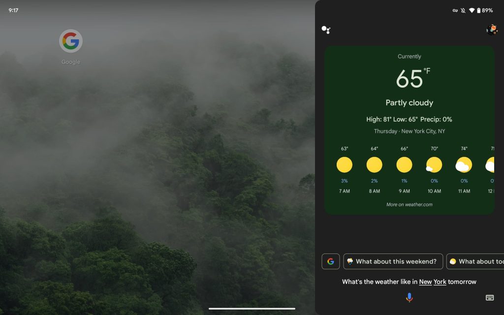
- Google Assistant launches as a thin strip at the bottom of your screen, but results open in a right-hand panel that’s not too much wider than a phone.
However, there are still some apps that have not been updated. In those cases, Android will open the application in a letterbox mode in which the window is phone-sized, and your wallpaper appears to the left and right. You can tap the empty space to move the app closer to either edge, with the Pixel Tablet remembering your letterbox preference. Instagram and Fitbit were the biggest offenders, though both looked fine in portrait orientation.
Meanwhile, the Google Messages experience on Android tablets continues to be bad. The messages.google.com/web experience is fine on desktops but is no longer acceptable on Android tablets. It’s just not instant and requires you to first set everything up – open on the tablet to reveal the QR code and then scan with your phone – before you get to send a message or view past ones. I could live QR scanning if the app was at least native and not a website (e.g., you can’t scroll if you have a dialog open and there’s no search). Google tells us this is the intended Pixel Tablet experience for the preinstalled Messages “app.”
I wish there was an always-on display (AOD) with a large clock and notification preview when you’re away from your desk/dock or are using the tablet with the kickstand. An AOD would make the Pixel Tablet a great impromptu ambient surface wherever you are. (Maybe this can happen in a future version.) Instead, when there’s an incoming notification, you get what looks like an AOD for a few seconds, but it’s basically just the two-column lock screen where the background is black. “Wake screen for notifications” can be disabled under the lock screen settings.
Smart Display Pro
Again, the Android side is really good, and then you get to the Assistant Smart Display aspect. It speaks to the versatility of Google’s OS that you can append a whole other form factor on top and have it work. I previously kept a Nest Hub Max by my desk primarily for Casting and to display the time. I’ve always wished it could do more, and now that the Pixel Tablet is in its place, I can get the tablet functionality that I’ve always wanted because it’s just Android.
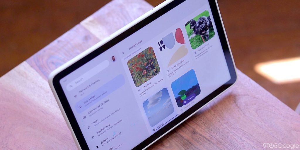
When connected to the Charging Speaker Dock, the Pixel Tablet enters a Hub Mode with five screen saver options when the device isn’t being used. There’s a full-screen clock, animated Weather conditions background, the Weather Frog, and swipeable slideshows from Google Photos or curated art galleries.
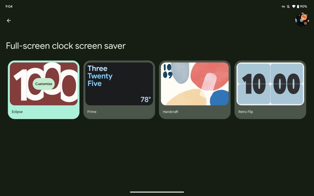
Google’s selection of full-screen clock screen savers includes the sliding Eclipse, Retro Flip, and wordy Prime options from the Nest Hub, while the abstract Handcraft is new. Each can be customized with a handful of different colors and light/dark themes. The ability for third-party developers to make clocks here would be interesting and could create a third-party ecosystem.
There’s a shortcut to open the Home Panel in the bottom-left corner, which is basically the Favorites tab of the redesigned Google Home app. Meanwhile, Hub Mode can also be set to activate when plugged in via USB-C, with some screen savers offering good portrait versions.
If you’re already playing music on the tablet, docking will transfer it to the louder speakers. (The tablet’s internal audio and the dock’s speakers cannot be on at the same time.) If you do the opposite, audio transfers back to the tablet uninterrupted. When docked, the Pixel Tablet acts as a Google Cast target for audio and video from other devices.
You can hold down on the power button to invoke Assistant without the hotword, even in Hub Mode, courtesy of that Android feature. Assistant features, like setting timers and alarms, leverage on-device processing and thus are available even when there’s no internet connection.
Anytime the tablet is locked, including when in Hub Mode, any media-related voice command is handled by what’s essentially the Nest Hub UI and UX. More specifically, this fullscreen window is a “Chromecast built-in” app, while you’ll notice the Assistant bottom sheet/strip has ever so slightly larger text compared to Android’s new Google Assistant version.
When you issue a verbal music or video request or Cast from your phone/browser to the Pixel Tablet, it opens in a “now playing” screen with large touch targets borrowed straight from Smart Displays. Behind the scenes, this is a Cast session and (in the music case) not a standard media session from the YouTube Music Android app. (Notably, this is a resolved issue on Android TV with Cast Connect, through which the full app opens to handle the Cast session.) There’s a weird disconnect, but it doesn’t really interrupt the music-listening experience. Google says they want to make sure you can play music in more scenarios without having to unlock the Pixel Tablet.
When you want to use the full Android app, it’s obvious why (full browsing experience, recommendations, search, etc.), and it’s easy to do so. However, you do get amusing instances where you’re able to split-screen the Chromecast built-in window because it appears as just another app.
This approach feels uniquely Google in that it’s not the most seamless. However, it doesn’t impact functionality too much, and Android more than makes it possible. Future versions would stand to benefit from a more native experience (with first- and third-party developer buy-in), but it’s a fine reuse of existing elements today.
I wish there was a physical camera and microphone privacy switch on the Pixel Tablet to truly honor the Nest/Google Home roots of the device. However, the software-based toggle in Quick Settings can be turned on/off even when the device is locked, as well as in Hub Mode, unlike on phones. This is meant to let anybody in your household disable/enable it as needed.
This might seem basic, but all I really want from a Smart Display is to show the time, as well as the weather, and the Pixel Tablet achieves that easily. However, because it runs Android, I’m using it to play so much more music than I already did with the Nest Hub Max because I can just access the full YouTube and YouTube Music apps. Don’t underestimate the niceness of a dedicated music-listening device on your desk that’s always in a fixed position and has meaningfully better speakers. It’s also leading me to more casual app browsing.
Conclusion
Google fundamentally had a unique idea with the Pixel Tablet. Get people to use Android on large screens more by appending the beloved photo gallery-showing Smart Display form factor.
Buying the first generation of any product, especially from Google, can be a gamble. However, the Pixel Tablet is fundamentally a good Android tablet with a Nest Hub add-on that is well executed. There’s room for improvement in future models, but this is a better start for Google compared to past form factor debuts.
The Pixel Tablet is the best way to experience Android’s progress on large screens, from the core UI to first- and third-party apps. The $499 128 GB device feels better than it looks, and my takeaway is that you won’t regret getting this instead of a Galaxy Tab or even an iPad. The Pixel team’s take on a large-screen OS is more thoughtful than Samsung, and it starts to approach Apple’s ecosystem cohesiveness. The extra kick over both is the Smart Display layer, Hub Mode. You will get meaningfully more utility as it turns a large screen into a key part of your smart home thanks to the included dock.
Where to buy
FTC: We use income earning auto affiliate links. More.









Comments